← All projects

Case study · Steady

Building Steady's marketing site.

Building the marketing website for an AI cycling coaching app while sharpening the product's brand positioning — a case study about the process and the skill unlock coming from AI tools.

Duration February 2026
Role Brand direction, content strategy, visual design, animation, front-end build (via Claude Code)
Team Me (design & build), co-founder (product positioning, cycling domain)
Method Iterative design, market research, AI-assisted build

Steady is an AI cycling coaching app for serious cyclists. It builds science-based training plans, reviews every ride, and adapts every week. The way a human coach would.

It was born out of frustration: training apps too opaque, human coaching too expensive. The product positioning came from a pilot my co-founder ran, coaching 3 strangers through WhatsApp and a custom GPT. We learned that cyclists wanted structured plans that explained the why, and that AI could generate those plans responsibly when a human who knows training science oversees it.

Once the app MVP had a direction, I designed and built the marketing site (along with the app). The goal at the beginning was to collect waitlist emails, then it became the landing page for new users. Through the process, we sharpened our positioning and how we communicated the product.

Most cycling and fitness apps are loud. Neon accents, graphs everywhere, numbers that manufacture a feeling of progress.

Steady's users are serious cyclists who want clarity, not a dashboard. The visual language needed to feel like a coach speaking clearly and explaining the "why" of each workout. The look and feel uses softer blues and violets, and the UI lets coaching text shine over charts. The app and the site share that direction.

Calm over loud

The brand should feel calm and confident, highlighting the coaching and consistent progress.

Lead with what's different

Communicate the two core product decisions: plans are science-based, not LLM-generated, and the coaching loop is high-touch.

Animate what matters

Use motion selectively to draw attention to the things we most want users to understand — and give a feel of the app.

Steady's calm visual treatment
Steady's UI — coaching text leads, charts stay supporting.
Competitor app visual density
Competitor fitness apps — dense graphs and numbers everywhere.

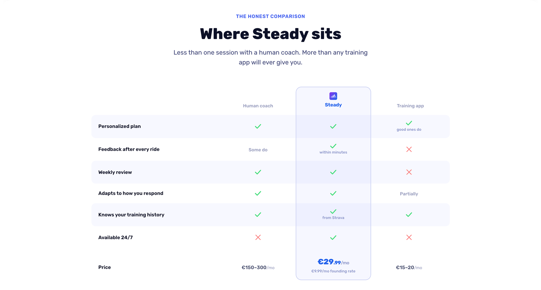
The first version of the site led with plan generation as the main differentiator — the science, the periodization, the gap analysis.

During pricing research, two findings changed the hierarchy. First, many AI-based training apps already generate plans — that alone isn't a differentiator. Second, platforms like TrainingPeaks price around coaching touch frequency: the more you interact with your coach, the higher the tier, and prices climb fast.

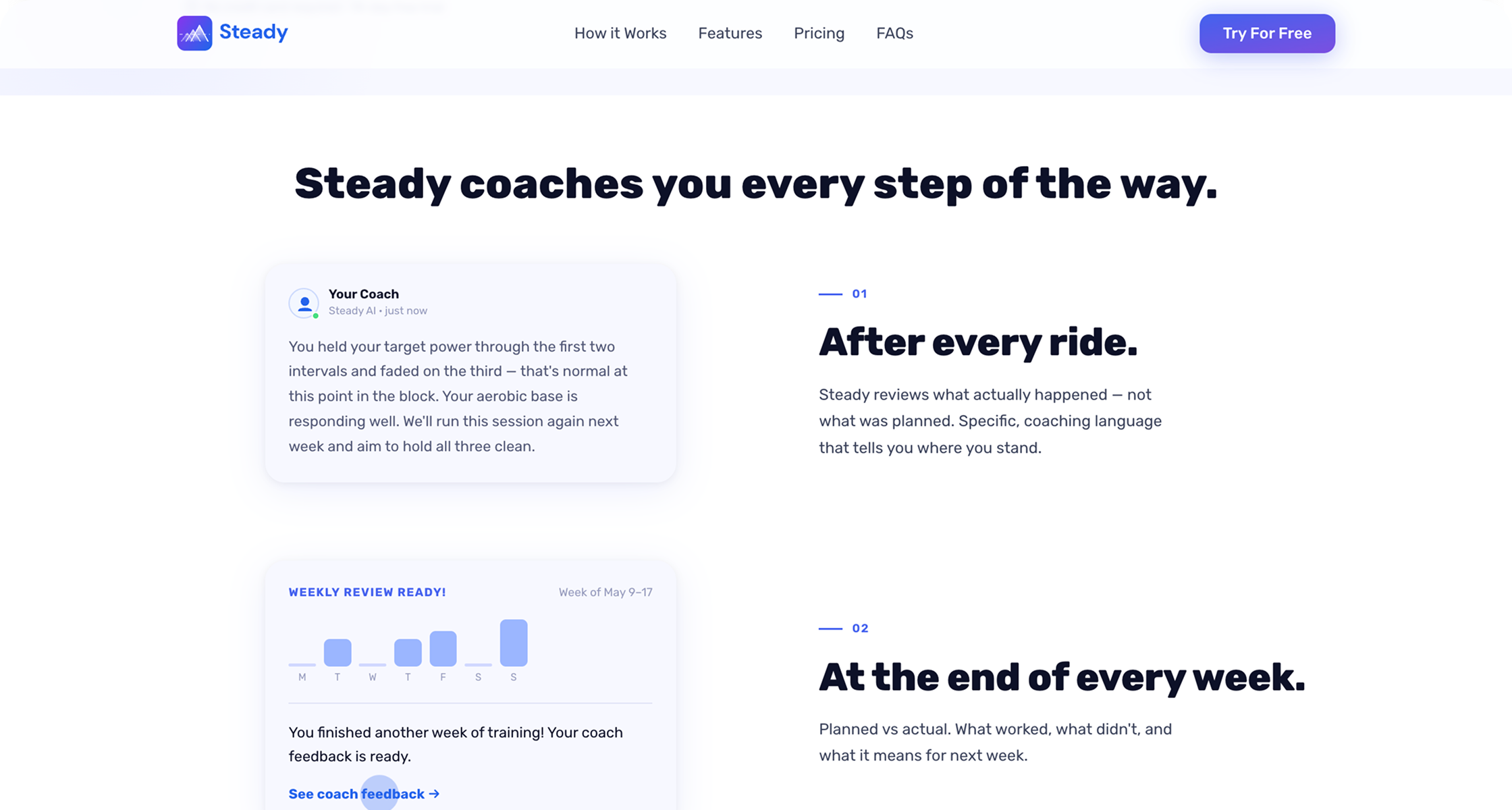
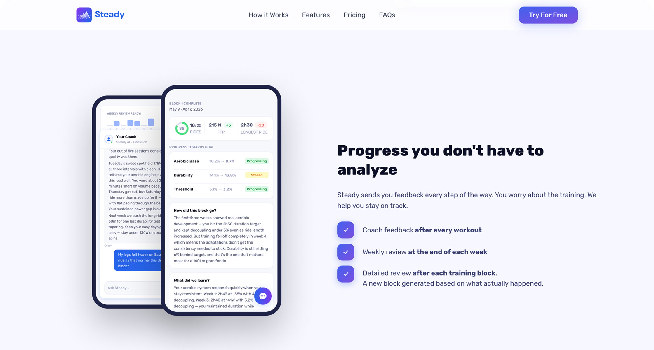
We restructured the site to lead with the coaching loop. Plan generation moved to a supporting credibility section, alongside the training science — since most AI apps in this space are LLM wrappers rather than deterministic, research-backed plans.

Clear positioning

An alternative to a human cycling coach

Steady positioning — slide 1
Steady positioning — slide 2
Steady positioning — slide 3
The insight

"Steady's differentiator isn't that it generates a plan. It's that it coaches you through the plan."

AI wasn't one tool — it was a partner across content, visual design, and frontend build. Three themes stand out.

I iterated with Claude, ChatGPT, and Gemini across many rounds. The coaching-first hierarchy came from market research done partly with AI, partly through our own desk research.

I was also able to build a full knowledge base in 2 days with the help of Claude Code because it also had access to the app and how it worked.

The Figma ↔ Claude loop. Start in Figma, use Claude via the Figma MCP for exploration, pull options back into Figma to refine within my own system. AI generates options; the designer's job is having a point of view — without one, the output stays generic.

Logo. Built entirely in Claude Code through iterations. This wouldn't have existed without AI — brand design wasn't in my skill set.

The biggest unlock was being able to add animations to the site with a small learning curve. The first site was fully static. Working with Claude Code, I added animations to the moments we wanted readers to stop on — the hero cycling through three goal types, the coaching loop walkthrough. In PostHog, I could see users pausing at those sections and engaging with the content.

The coach chat animation — one of the most watched moments in PostHog.
The onboarding animation — one of the moments users stopped on in PostHog.

AI as a skill unlocker

AI gave me capabilities I didn't have, such as brand design, animation, and front-end code. For a founding designer working without a team, this changes what's possible. However, we still need to give clear direction, create boundaries, and know exactly how the end product should look and function.

AI as a thinking partner

AI can be a huge creativity booster and mind opener in product development. The best results came when I was able to work with the various tools as if they are a partner in building together. For example, using the Figma MCP in a two-way design jam made it faster to reach better results. Again, the caveat is that the design is ultimately made by the designer.

Content decisions are product decisions

Restructuring the site around the coaching loop wasn't a copywriting exercise. It was a product positioning decision that came from competitive research and shaped everything downstream, including the comparison table and the pricing framing.