#1 Moving activities up the page
Pushing bookable activities down was causing confusion around our value proposition. We pulled the activity list back toward the top of the page.
Case study · GetYourGuide
Helping travelers in the research phase of planning a trip — from an initial concept that failed in A/B testing to an iterative, research-driven solution that finally moved every success metric.
GetYourGuide is one of the world's largest travel-experience marketplaces, connecting travelers with activities run by local operators. Its mission is to "give the world access to unforgettable travel experiences".
While it was very successful at capturing high-intent users from search engines, the performance earlier in the traveler journey was poor. In mid 2020, we kicked off a project to improve the product for travelers who knew their destination but not yet their itinerary of activities. This would allow us to play a bigger part in the travel planning space.
GetYourGuide's target audience is the "Modern Explorer".
A traveler who goes on vacation frequently (4–6 times a year) to experience new cultures. Travel is part of their identity; they take pride in it as a hobby. They want both the tourist spots and the off-the-beaten-path.
Based on visitor data, we identified three levels of intent.
Travelers who have already decided on the experiences they want to do. Most likely have booked their flights and hotel.
Travelers who know their destination but are still researching experiences they want to do. Most likely have booked their flights and hotel.
Travelers who are still deciding on their destination. No flights or hotels have been booked.
"Help mid-intent customers understand what makes their destination special, and discover experiences that match their interest and needs."
Many solution ideas were floating around the company. The main challenge was synthesizing organizational knowledge and customer data into a cohesive first concept — both to align scope internally and to get direction-level feedback from users.
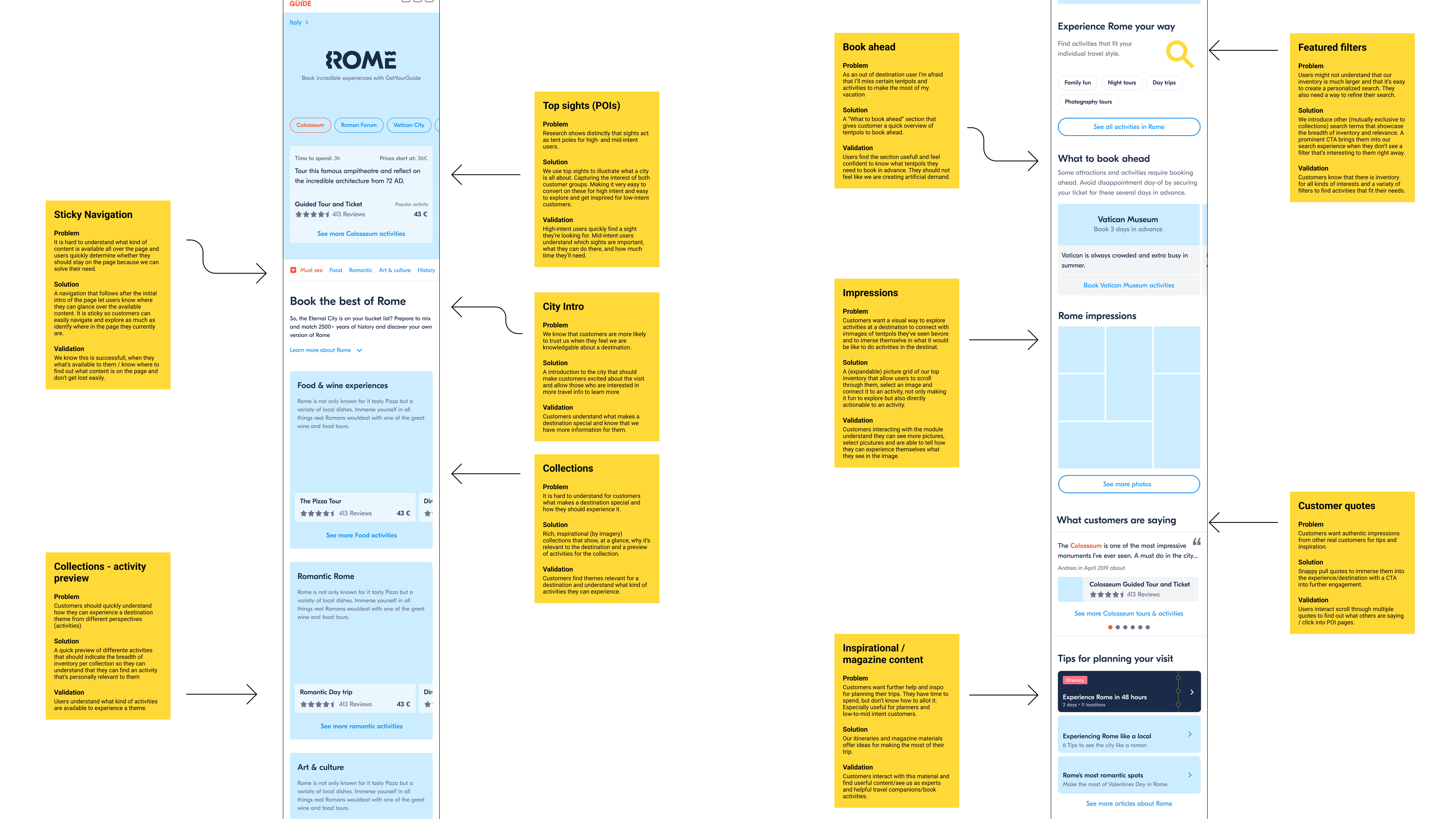
We built a cohesive first concept that combined three ideas: a short city intro with key information, top sights to anchor travelers to a destination, and interest-based collections to help narrow down choices.
Methodology for the testing was a RITE study.
I worked with the UX team to define scope and support communication. I focused on craft, gave feedback on design options, and co-designed solutions when the team got stuck. My feedback emphasized information architecture and content over interaction complexity, and making sure activities remained prominent.
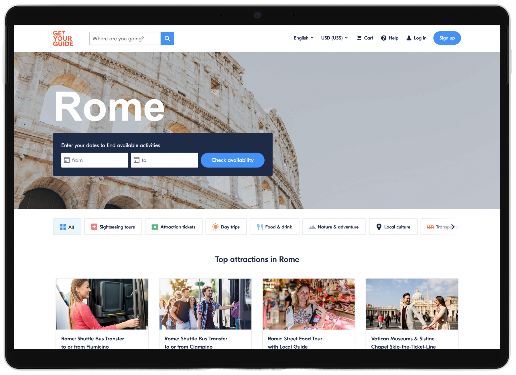
Experiment 01 — initial design
The first A/B test kept most of the components from the concept prototypes — a city intro, top sights, and curated collections — with minor adjustments for page navigation and technical feasibility.
We launched in 26 cities with curated collections. The experiment ran for 21 days at the end of 2020.
Unfortunately, the success metrics went the wrong direction — a 10.5% drop in quoter rate (visitors clicking an activity) and 17% increase in bounce rate.
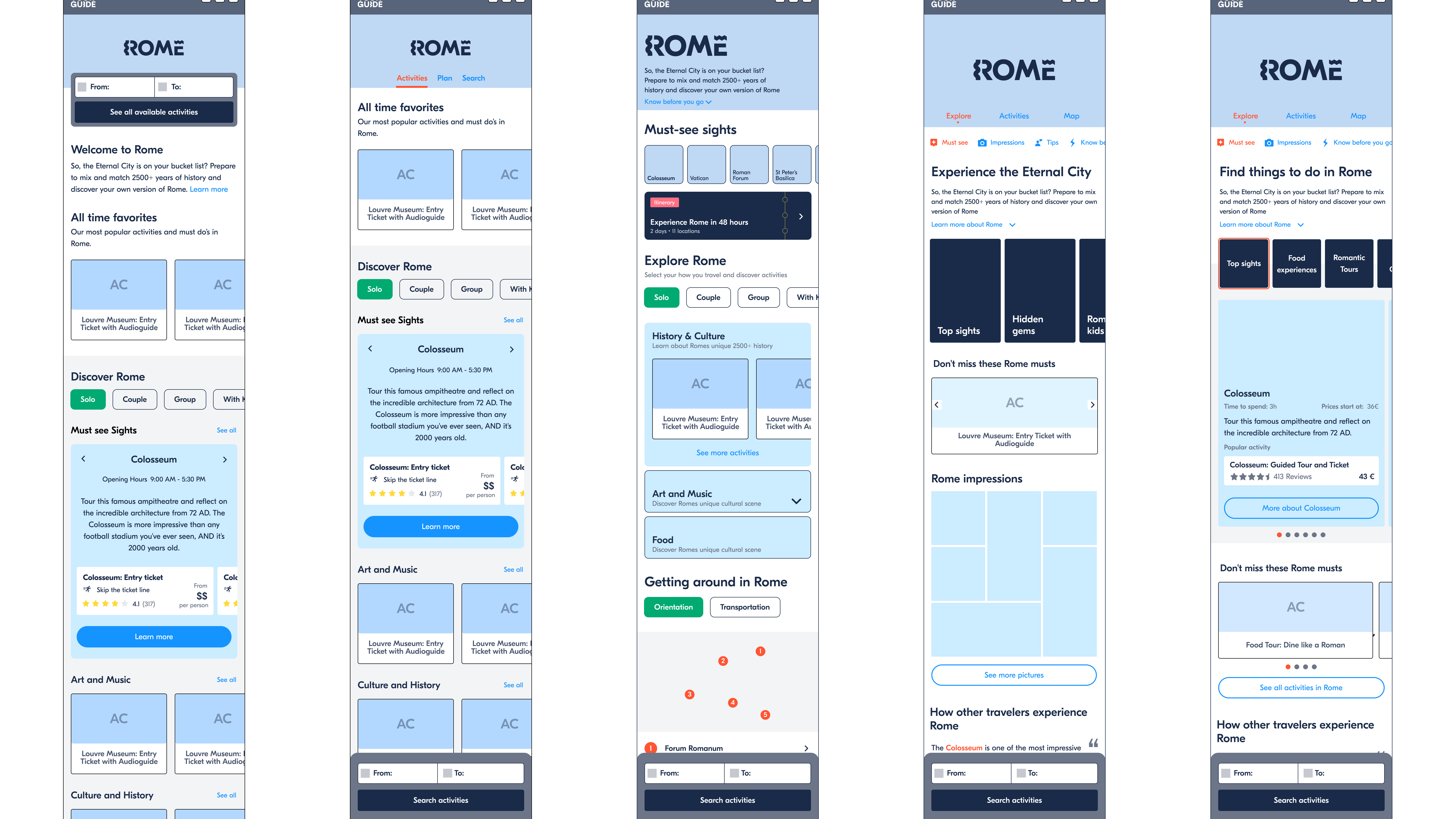
Over the next 4 months, the team launched 5 experiments, to isolate hypotheses and learn from experiments.
The biggest challenge was iterating on a highly optimized part of the product while data volumes were suppressed by COVID-19. My role during this time was to help define success and clear hypotheses, and keep motivation up and feedback cycles rapid.
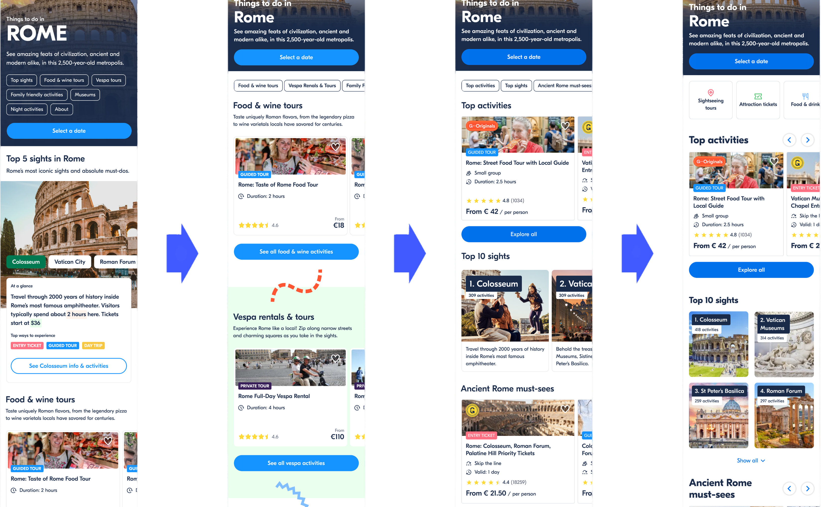
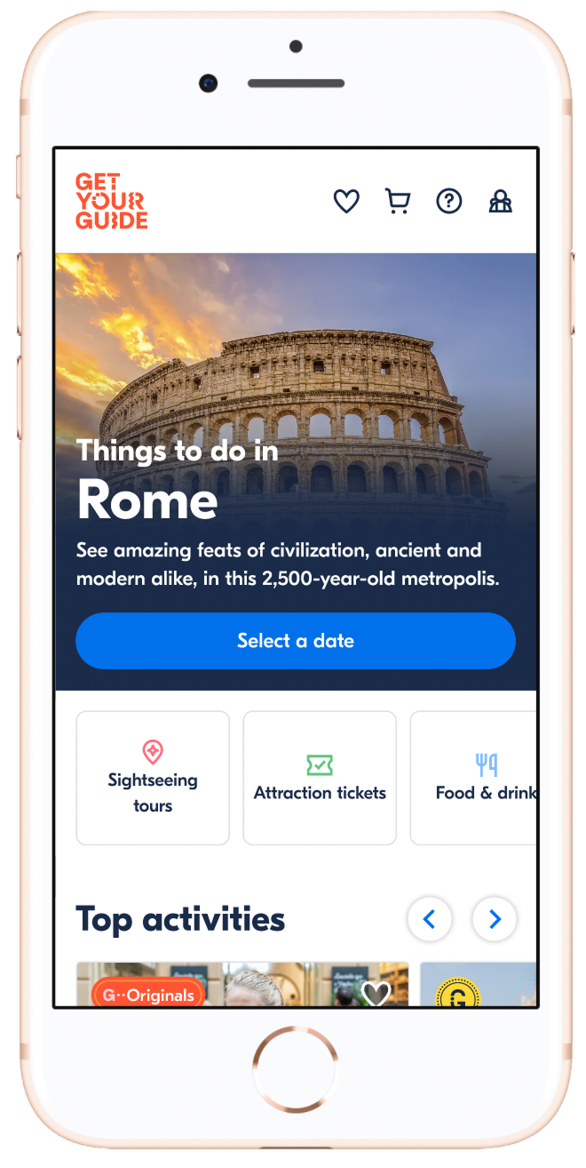
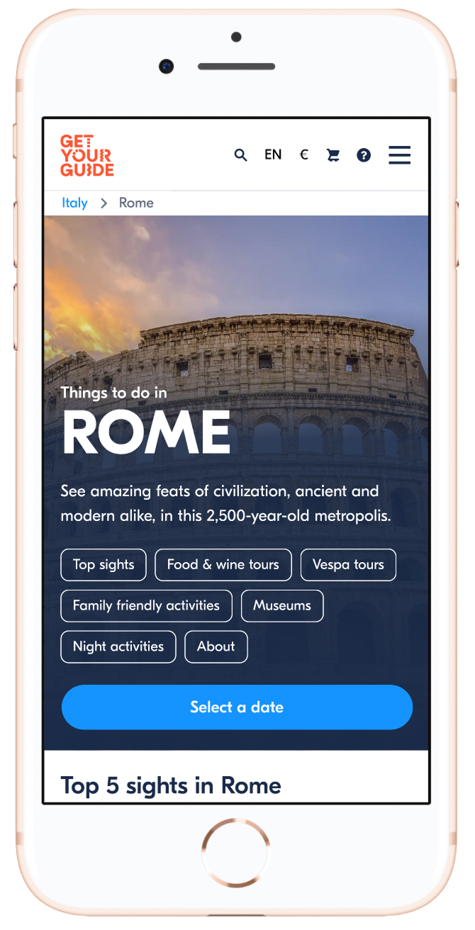
Pushing bookable activities down was causing confusion around our value proposition. We pulled the activity list back toward the top of the page.
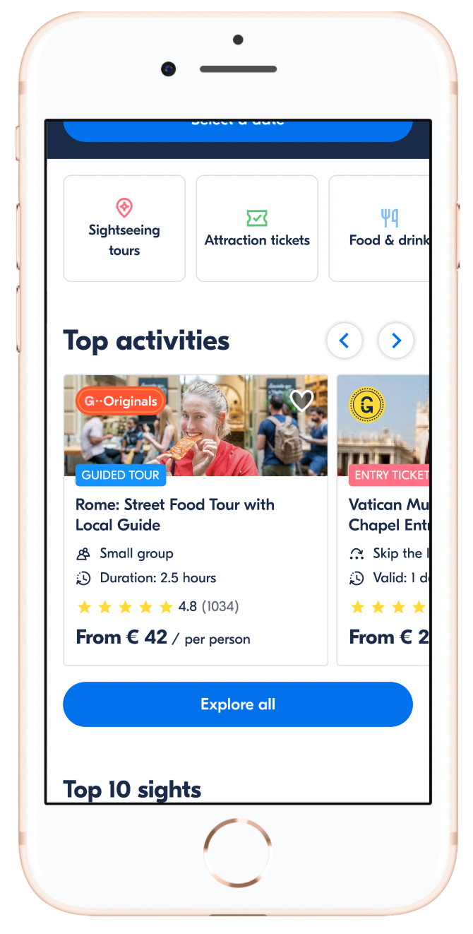
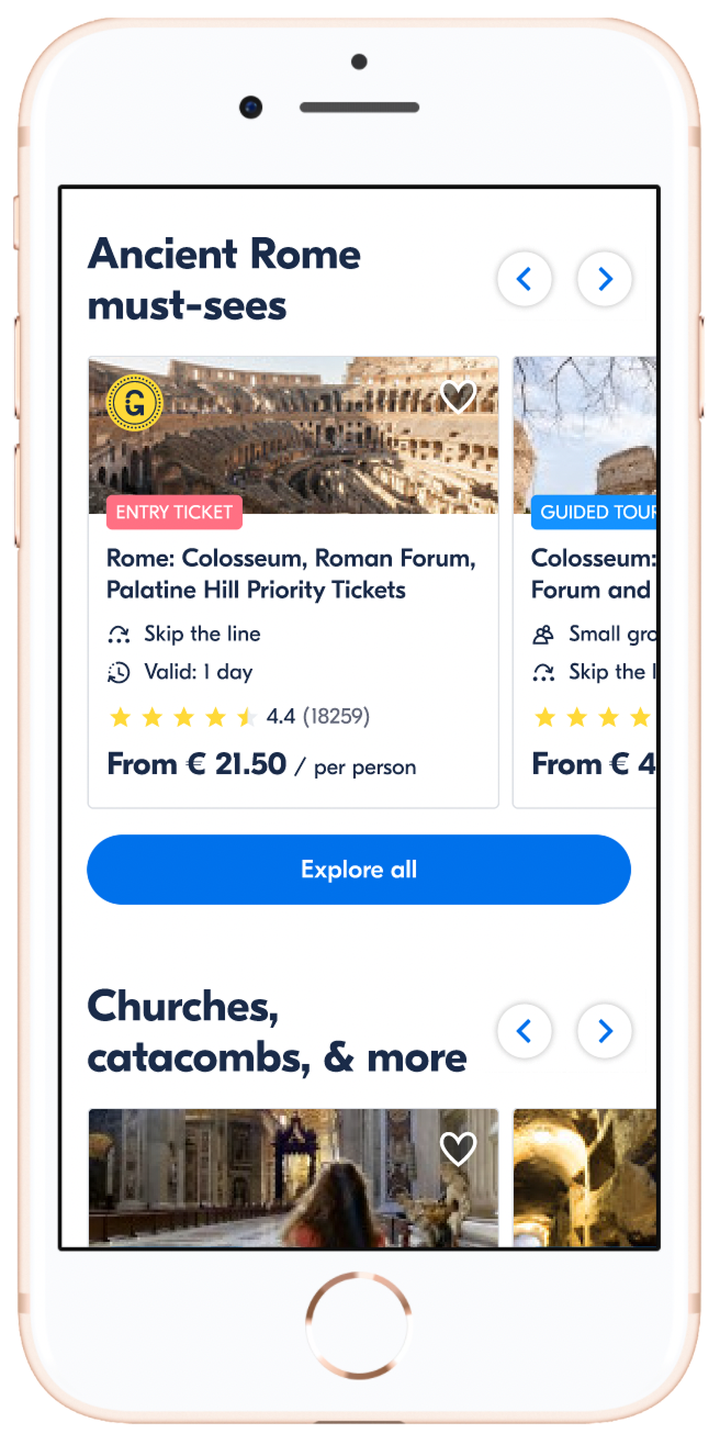
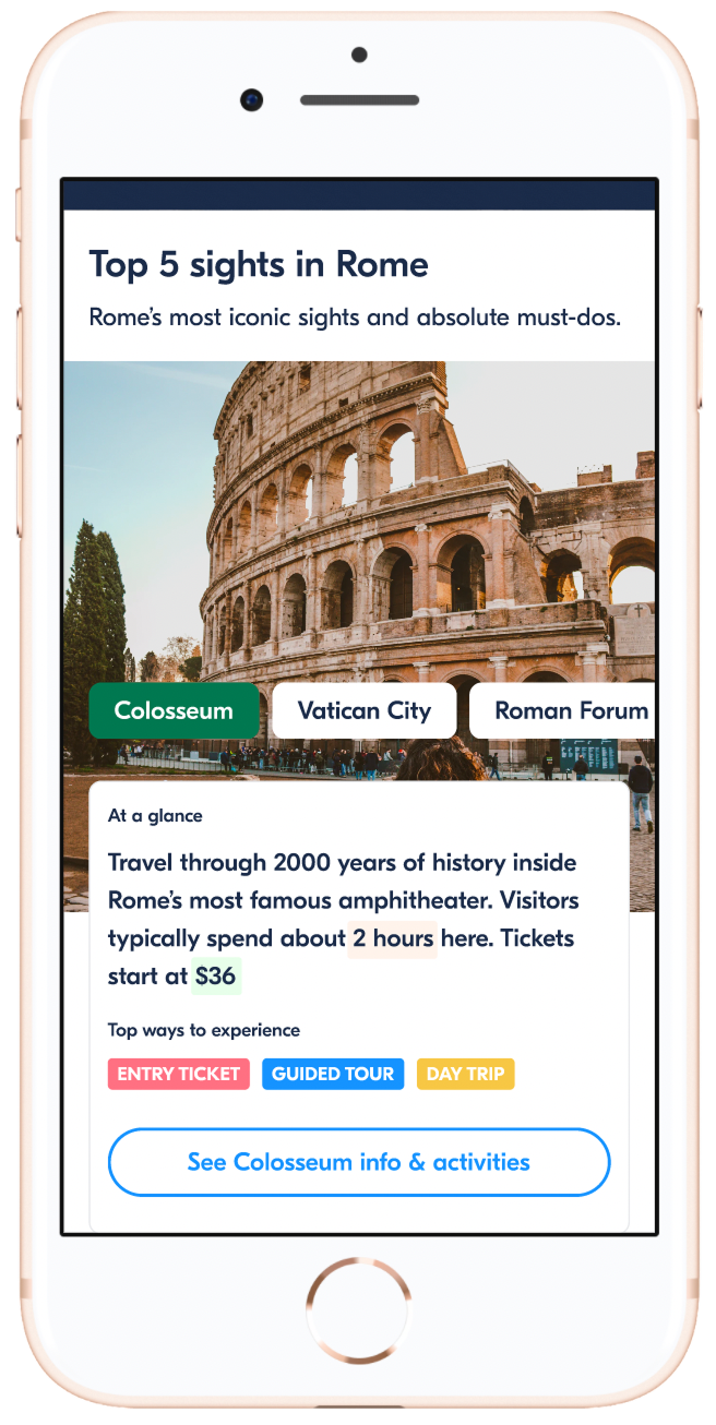
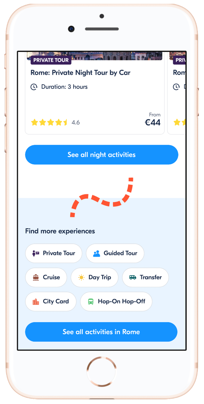
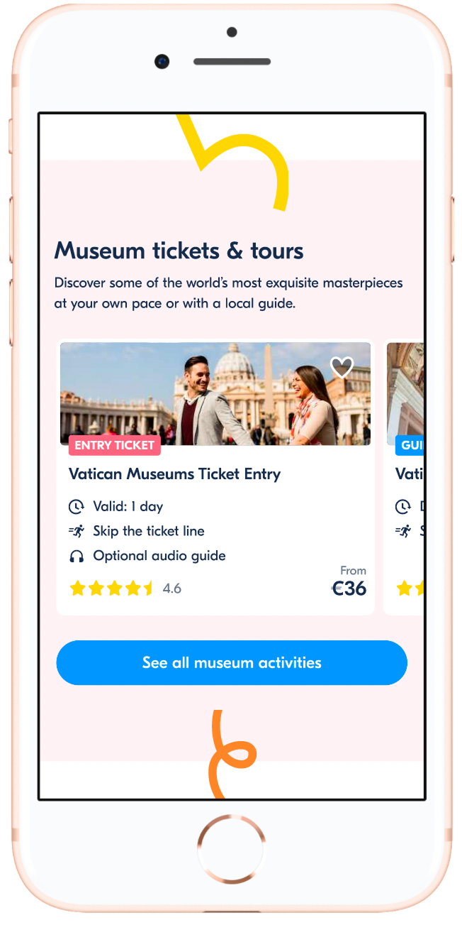
Grouping activities within collections was key to helping people navigate a city. We iterated across multiple cycles — including a "top activities" collection and hand-picking collections for test cities.
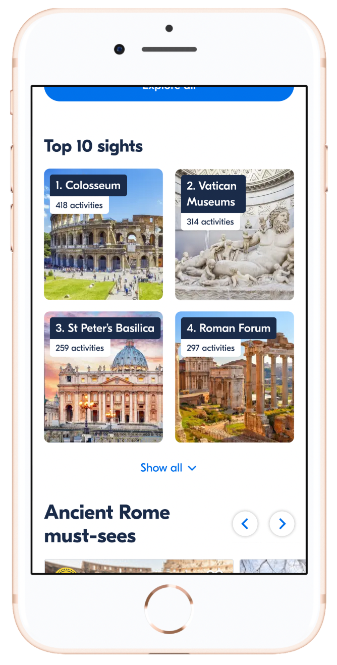
Travelers anchored themselves through the top sights in a destination. We improved this module and placed it near the top so it was one of the first things users saw.
By the 6th iteration, a mobile-focused usability study drove UI changes to collections and a quick category-filter navigation that made scanning much easier.
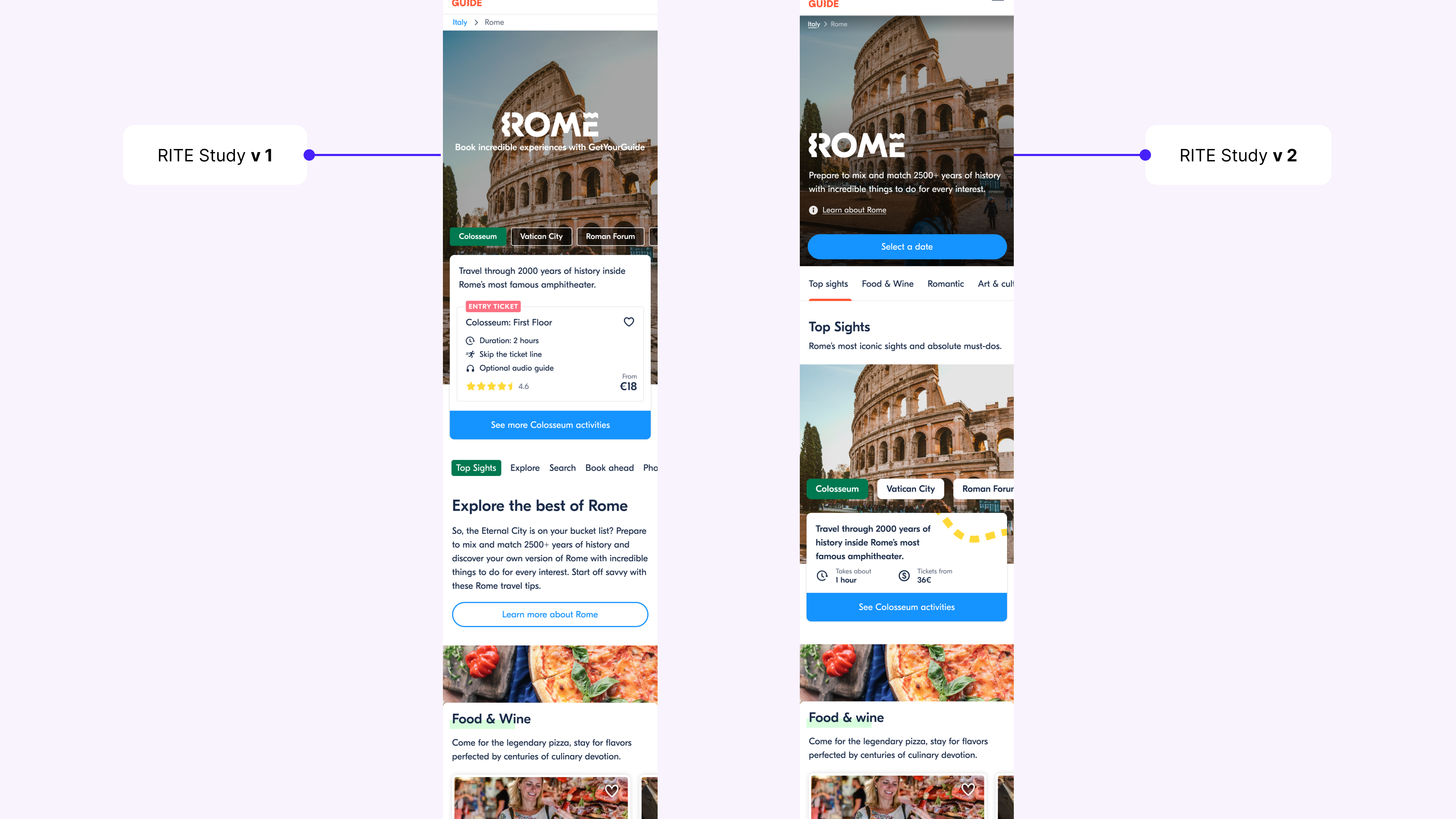
Final design — Experiment 06
Experiment 06 Results
drop in Bounce Rate — fewer visitors leaving without interacting.
uplift in Quoter Rate — more visitors clicking through to an activity.
uplift in Check Availability Rate — more visitors searching real dates on an activity.