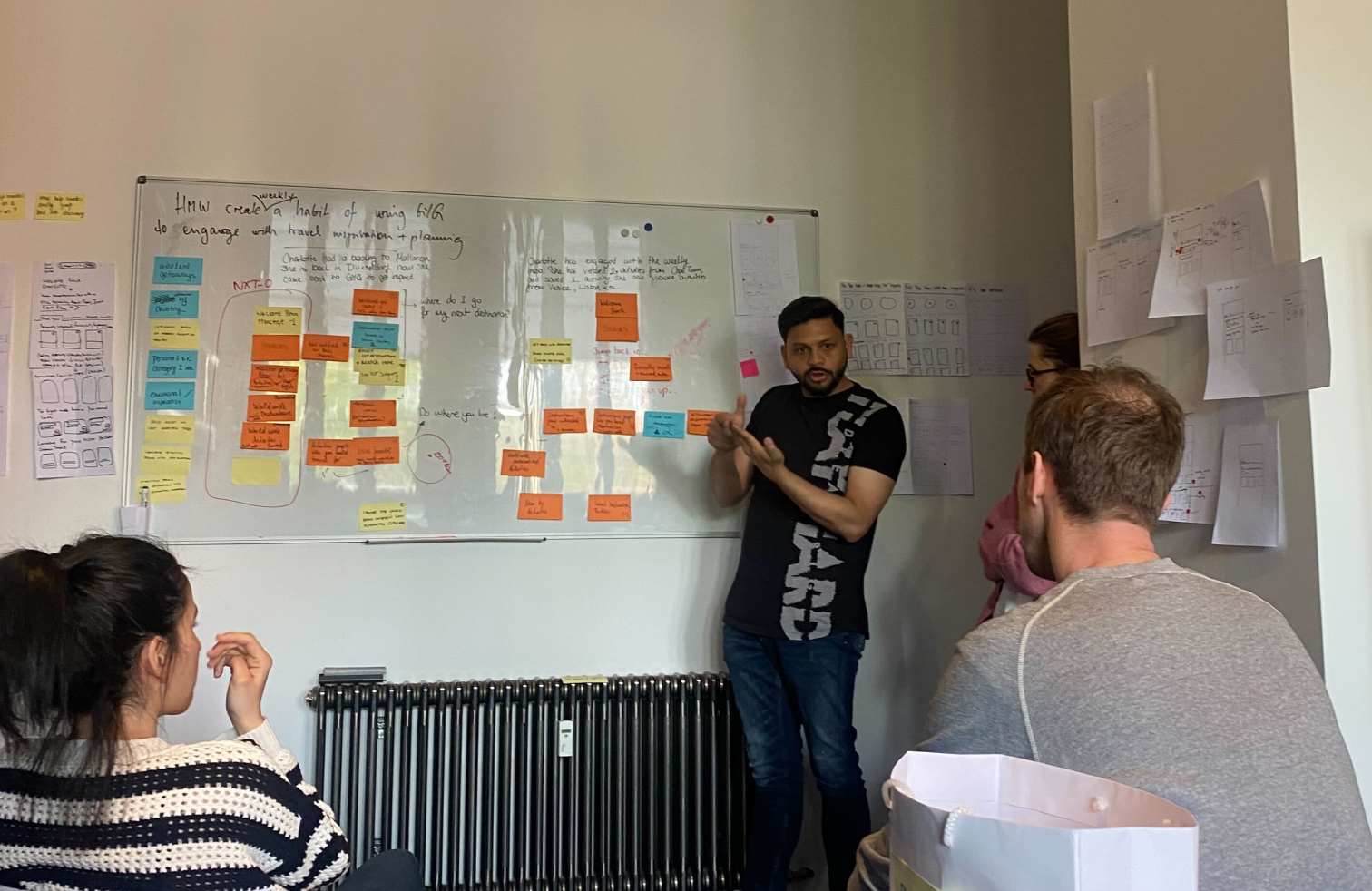
← All projects

Case study · GetYourGuide

Homepage design for returning users.

Setting a six-month design direction for the segment our previous redesign had deliberately left behind. Case study about using strategy to create executive trust and drive experimentation.

Role Strategy, facilitation, exec alignment
Duration May — Dec 2023
Company GetYourGuide
Team Product, Design, Engineering, Research, Data
Two phone mockups previewing the redesigned homepage for returning users

At GetYourGuide, we had recently completed a redesign of our homepage. Our next objective was to develop a homepage tailored for returning users.

The team faced challenges in formulating effective hypotheses and a clear vision for the next six months. As the UX Manager overseeing the responsible teams, I collaborated with our Product team to address this issue.

We established a sound 6-month product strategy with the team, got buy-in from our executive team, and used this to scope an MVP. Based on this, we conducted many A/B tests to create a “baseline” new UX for returning users.

Given the tight deadlines, we scoped 2 different use cases for a 3-day workshop, based on the size and impact of the target customer segment.

My role was to work with our Director of Product to define scope, prepare the workshop, and facilitate the event.

We answered 3 different questions:

  1. General homepage structure: How we would add the returning user modules to the current homepage
  2. Segment definitions: How we would identify user segments and what their primary needs are
  3. Vision: What we wanted to build within the 6-months to answer the primary needs
Workshop team gathered around a whiteboard mapping returning user journeys
Workshop sketches of homepage variants taped to a wall
Workshop session in progress

The homepage design was a modular structure that adapts to the context and primary user needs of the returning user segment.

When a user was identified as a returning user, they would see a "for you" tab alongside other brand categories. We kept UX consistency between this tab and the other ones.

Homepage structure: two phones showing the For you tab with upcoming activity and weekly inspiration

We identified two segments, each with distinct moments, intents, and measures of success along the travel journey.

STR

Same Trip Repeat Customer

Customers who have an upcoming booking with GetYourGuide, until the end of their trip (7 days after their activity date).

Goal for GetYourGuide: help these customers find additional activities for their upcoming trip, measured by conversion rate.

Same trip customer timeline from booking to in-destination
Same trip customer needs across the timeline
NTR

Next Trip Repeat Customer

Customers who have no upcoming booking and have been on an activity between 8 days and 180 days ago.

Goal for GetYourGuide: increase engagement frequency of these customers to increase probability of future bookings.

Next trip customer timeline
Next trip customer needs

For each of the segments, we defined user scenarios and needs, and wireframed modules for these specific needs. The modules would be turned on/off and reordered based on the prioritization of the needs. The engineering manager assisted us in understanding the technical feasibility of our plans, which helped break down the vision into smaller, actionable components.

STR wireframe — first phone showing upcoming trip
STR wireframe — second and third phones showing recommendations
NTR wireframe — first phone showing weekly inspiration
NTR wireframe — second and third phones showing nearby and matched recommendations

Final design for MVP

STR high fidelity mockup — main screen
STR high fidelity — second screen
NTR high fidelity mockup — main screen
NTR high fidelity — second screen

Getting buy-in

We presented the plan to the CPO, then the CEO, CMO, and CPO to gain trust in the direction and secure approval.

The direction was positively received. We had discussions about scope, expectation setting (direction vs MVP & hypotheses testing), and agreed on monthly progress check-ins.
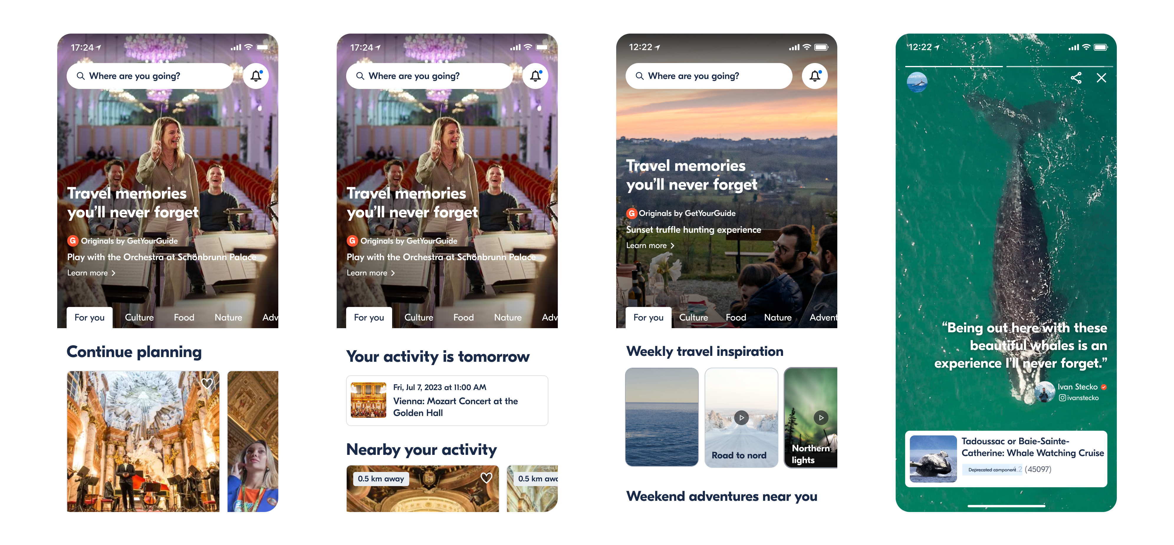
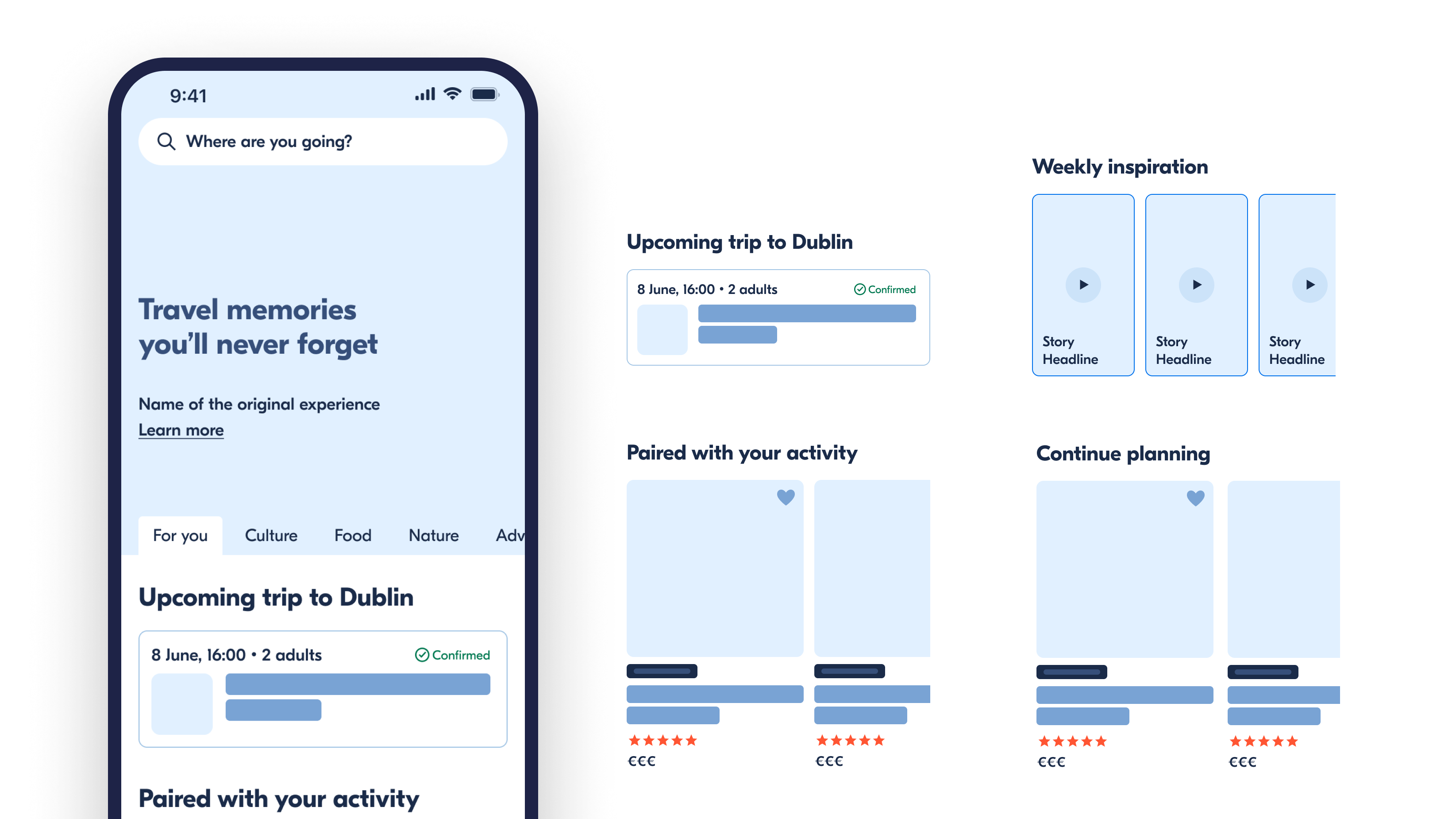
MVP launch

Decisions made for the MVP mainly relied on the PM and the EM, based on impact and effort. For example, we decided to descope complex personalization algorithms in some cases to be able to launch and learn quickly.

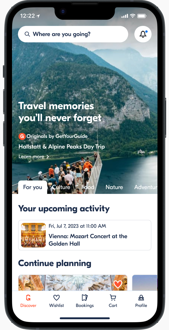
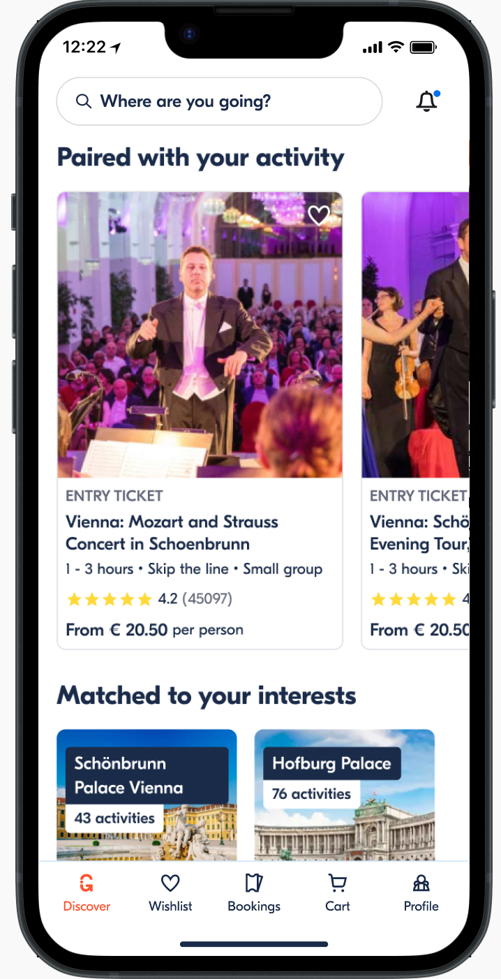
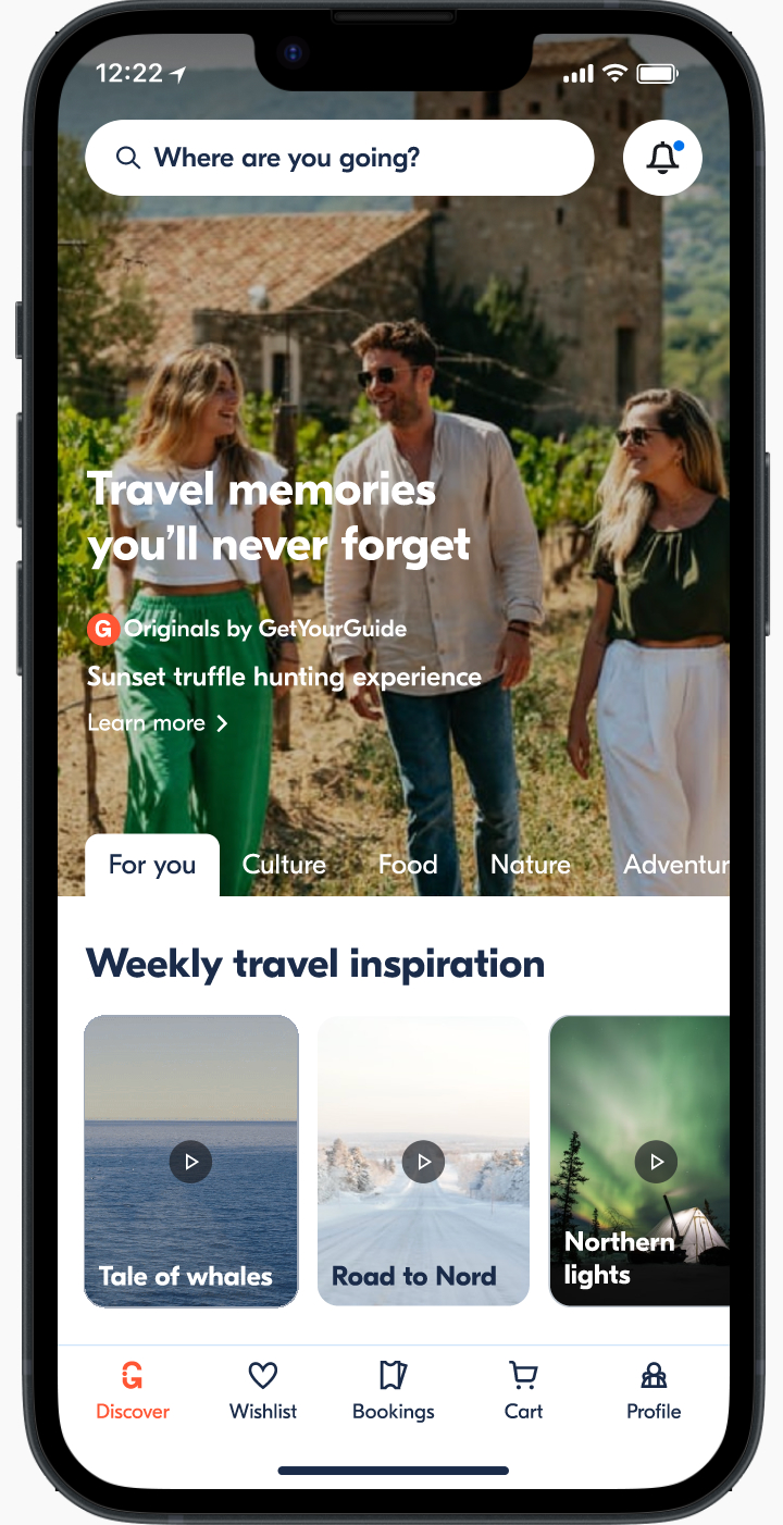
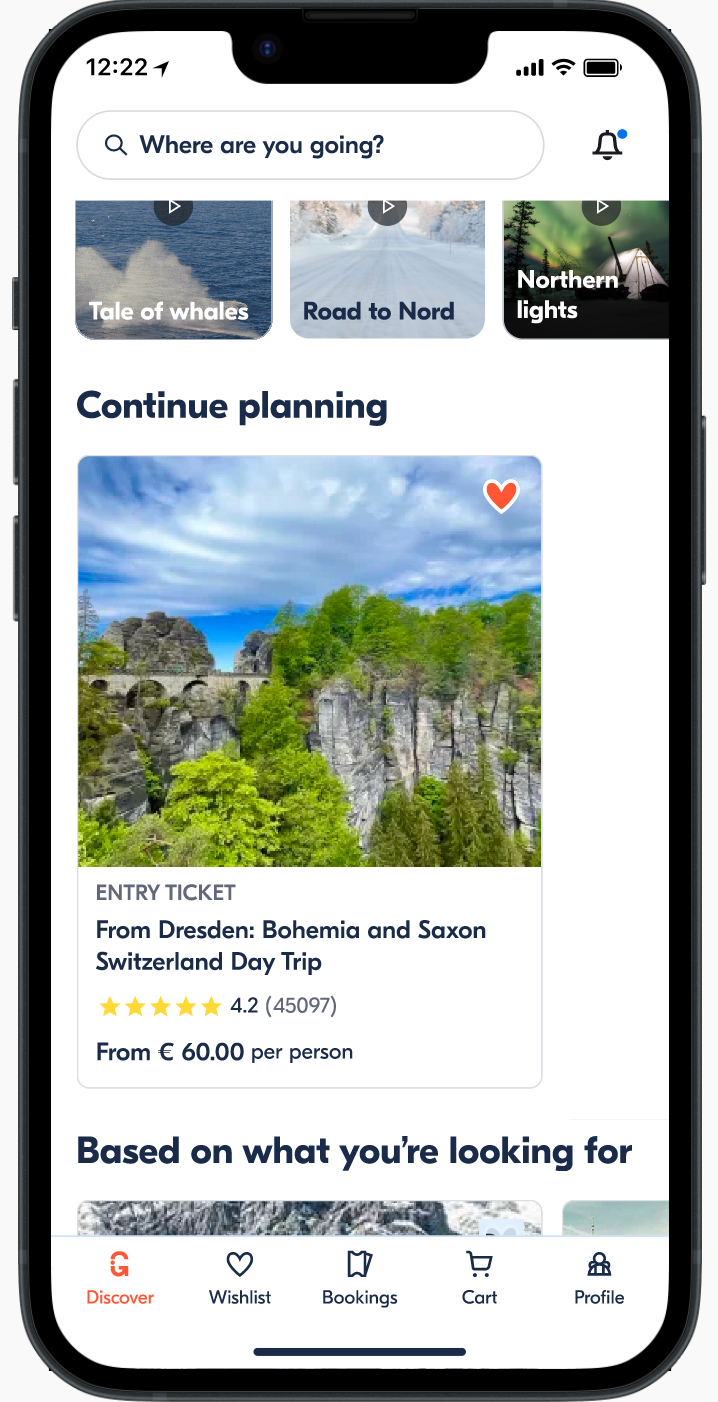
My role in this stage was to work with our content and product designer to get the high-fidelity designs ready and give feedback on the MVP.

Results in market

What shipped, what stayed, what got cut.

13

experiments on inspirational content. Engagement was there — but not enough operational justification. We eventually removed the module.

"Jump back in" history sections drove the largest metric uplift across every returning segment we tested.

Bounce rate dropped for next-trip users. Booked-activity modules engaged same-trip users but hurt conversion — so we pulled them too.

Communicating to earn trust

The workshop, while only taking 3 days, allowed us to formulate a sound strategy that we could confidently communicate to our executives. This gave us time and space to launch experiments and learn iteratively with exec buy-in.

Involving engineering early on

During the initial strategy creation, the engineering manager helped us understand our capabilities. This both made the strategy feasible, but also allowed the team to get a head start on engineering. The workshop also allowed us to create context and bond as a team.

Starting with segments & diverging needs

We assumed different visitor segments had distinct needs, but similar modules performed well across all of them. A leaner approach would have been to start with 1–2 similar experiences and diverge through testing; we did the opposite.

Playing to our strengths

“Weekend getaways” was grounded in research showing travelers take shorter, more frequent trips. But making it successful requires a broader company strategy: different inventory and a repositioning of GetYourGuide as a go-to resource for this type of travel. So we omitted this as a module.