Ziraat Bank is one of the oldest and most established banks in Turkey. In 2014, they did not yet have a good mobile presence and wanted to work with us to carry all of their web banking into mobile platforms (iPhone, iPad, Android phone, Android tablet). Their current brand, associated with stability and trust, also carried an image of being old and gloomy. They wanted us to change that perception to being an innovative and financial partner. We set out to build apps that were easy to use, fast to navigate, consistent in look and feel and matched current design principles.
Skills
Interaction Design, User Research, Workshop Facilitation
Year
2014-2015
Design Team
Cansu Tecimer, Baris Ertufan
Understanding the business and user needs
Business Goal
Our client had pinpointed one specific problem: They had a big user group among university students and retirees because of the pension and student plans they offered. These audiences were using their services because they had to, but they couldn’t retain customers between these life stages.
Our challenge was to build a mobile experience that would create life-long customers for the bank.
User Needs and Segments
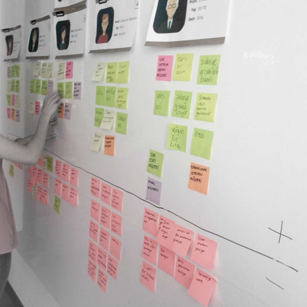
To better understand the customer, we conducted interviews with 12 people who used e-banking and 2 customer representatives from the bank to understand behaviors surrounding financial institutions in Turkey.
Our research lead to 4 personas:
- The first time user student
- The ‘always in debt’ credit user
- The loyal and wealthy retiree
- The ones with a linked salary account (in Turkey, companies work with specific banks)
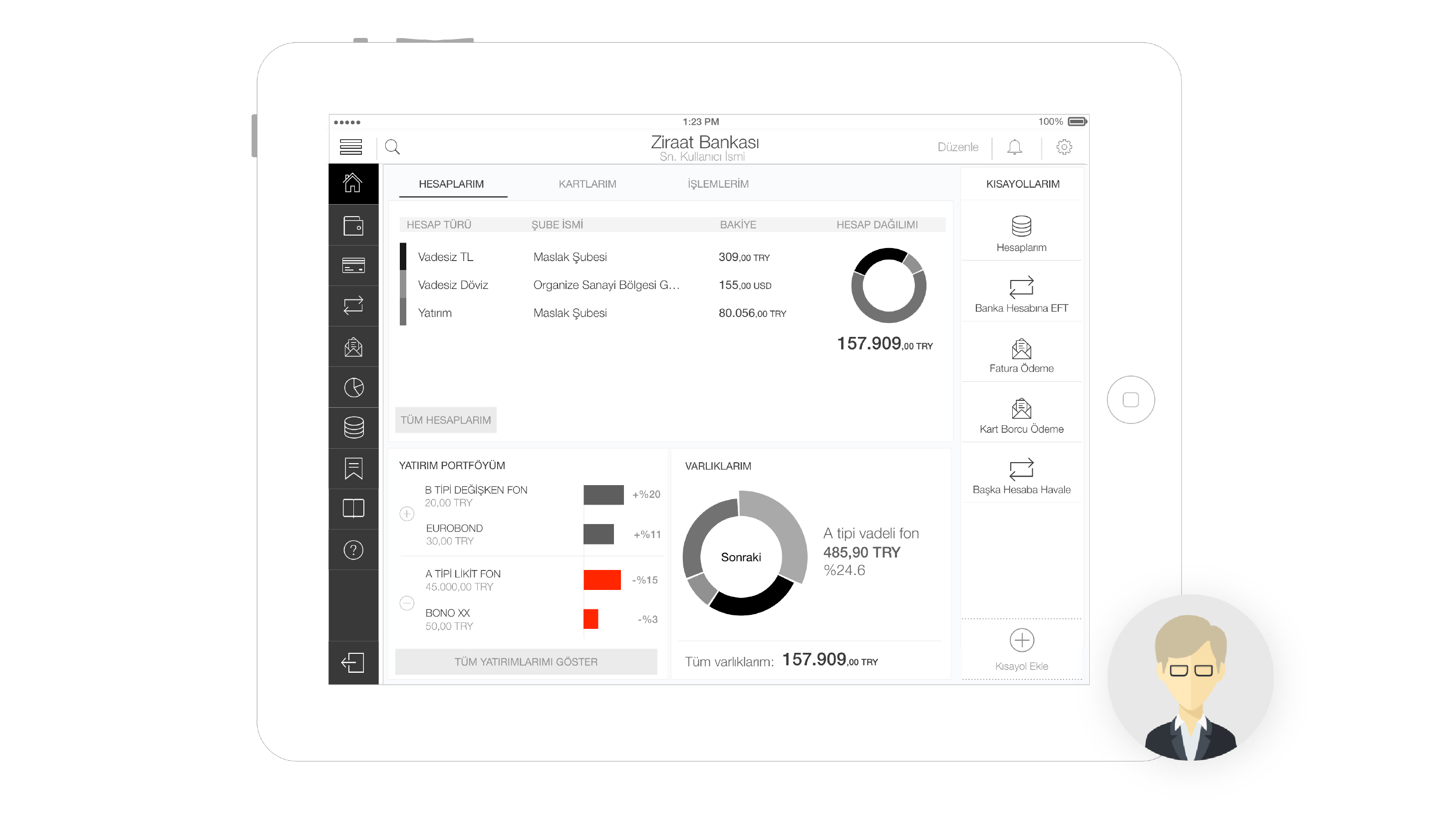
Solving the navigation of the app
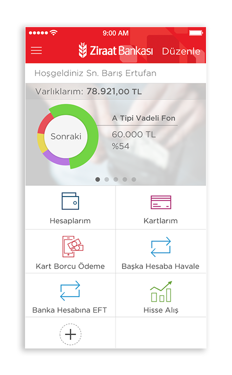
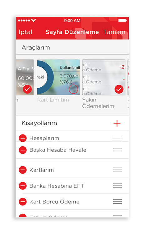
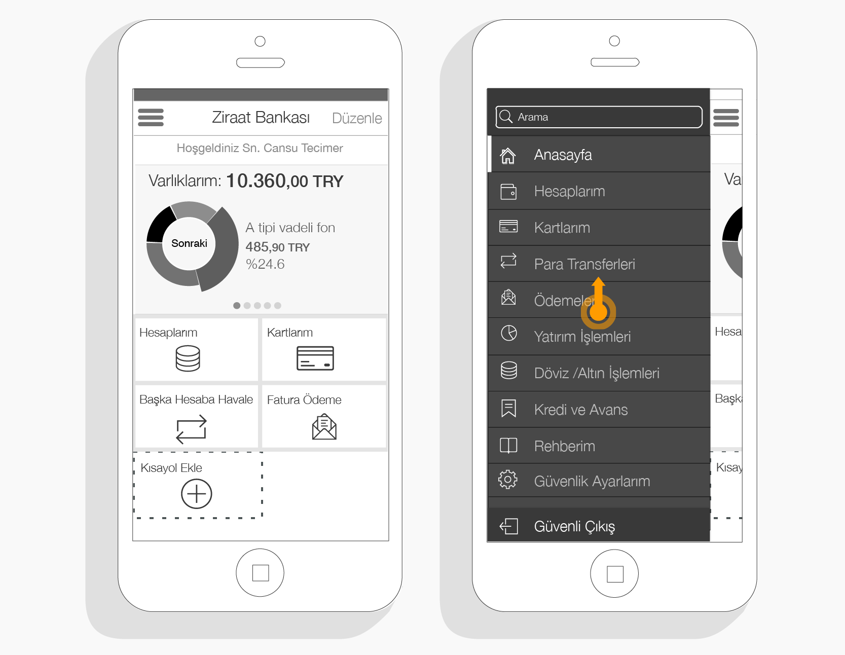
Usage data we collected from our client and our qualitative research showed that majority of bank customers only use 5-6 different bank functionalities. People send money to a few regular contacts, check out their account and card balance, pay their credit card debt and transfer money between their accounts.
With 160 transactions planned to fit in the app, we wanted to create a dashboard where users could add shortcuts to transactions they mainly used. This would allow users to access what they needed easily without being bogged down with all of the functionality of the app.
The main menu would give users access to all 160 of the transactions, categorized into carefully sorted items and a search function
Creating repetitive patterns and systems
Familiarity… Because Ziraat Bank caters to a big retired population, one of the key aspects of the app needed to be ease of use. We wanted to create interaction and UI patterns within every part of the app, so a user would not have to learn more than 3-4 things in order to know all 160 functionalities.
We divided the app features into 2 categories: status screens and transaction flows. These needed to have overall systematic patterns.
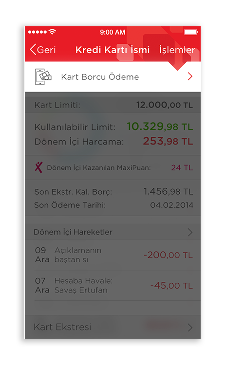
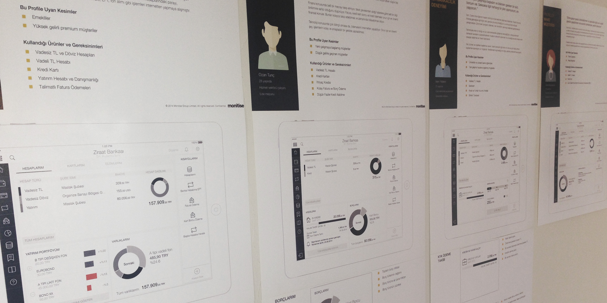
Status Screens
Whether it was an account or a credit card page, a status screen would always have a similar layout, information hierarchy and structure. The user would know where to look for specific type information and access related actions.
Transaction Flows
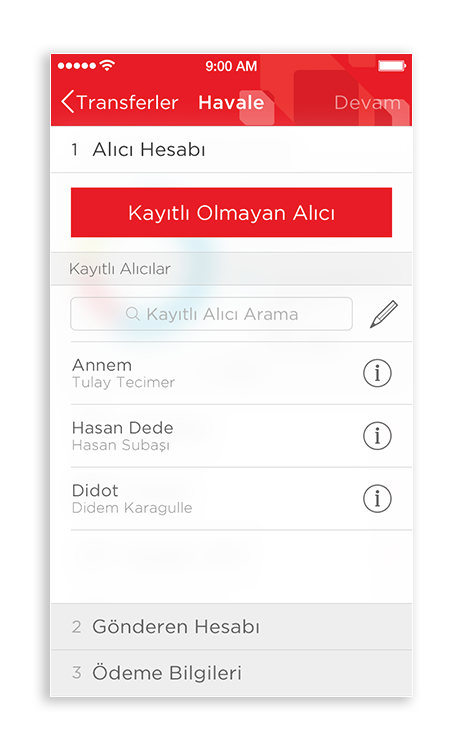
By the time we were done, there were more than 50 different transactions planned to be in the mobile apps. This why, we spend a few weeks at the beginning of the project to create a pattern and structure that would fit nearly all the transactions. The idea was, id the user learned how to complete one transaction, he/she would know how to do them all. Whether it was sending money to their landlord, paying their bills or investing in bonds, we saw that all transactions could be clustered to a three part process that made sense.
For every transaction, the person would be done in 3 steps and a confirmation: One. Two. Three. Done.
With our interaction patterns in place, it was time to start the very-detailed wireframes of all the features included in the minimum viable product.
MVP launch & Next steps
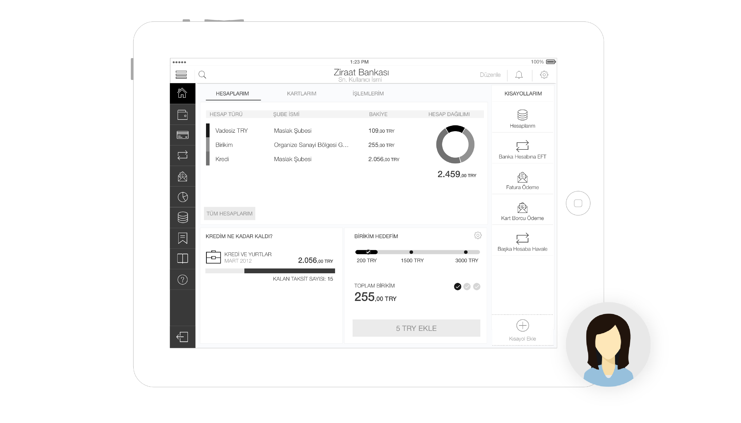
We launched the app in the iOS App store and Google Play, at the end of 2014. It was downloaded 2000+ times in the first 2 days and rated 4.5+ in the Google Play Store (majority of the bank’s users were in the Android platform). After completing the design & development of the MVP (minimum viable product), we wanted to start developing specific services tailored to the 4 personas we had created in the beginning of our project. Before starting the tablet design, we went back and looked at our customers closely.
Our aim was to go beyond a generic experience and create new services based on user research. We knew that the tablet screen was the ideal platform to make a difference and add features like tracking investment portfolios, getting information for credits, starting & tracking goal-oriented savings etc.
Collaboration
This project was done through a very closely collaboration between our business analysts and visual designer to ensure the final product was both feasible, functional and fun to engage with.