“My Menu” is the space within the HelloFresh account area where users manage their plan on a recurring basis. It encompasses all functions including scheduling of deliveries to choosing the contents of those deliveries. This area is only available to users who have an account and one or more HelloFresh plans.
We kicked off a design-initiated project to deep-dive into the problems and improvements that could be made within this area, especially targeting management of future deliveries. We wanted to solve the issues around navigating through the weeks, information overload in each weekly screen and communicate the key functions within each week better to the users.
Skills
Design Research, Information architecture, Interaction design, Visual design
Year
2017 – 2018
Design Team
Cansu Tecimer, Joanne Wong, Isabel Wellbery
Background Research
Understanding current pain points
We analyzed the status quo going through cancellation reasons, fullstory recordings, doing competitor analysis and using insights from past user tests.
- Customers were getting unwanted 2nd deliveries because they did not understand HelloFresh’s recurring business model
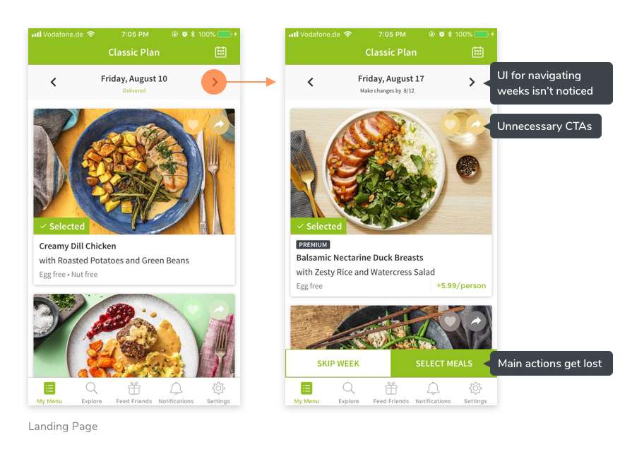
- The main functions of “Skipping” and “Selecting Meals” were getting lost in the UI, causing people to cancel or call customer care about these
- The weekly navigation at the top was getting lost and users struggled to navigate to upcoming weeks
“What is the first thing you’d like to do when you log into your account?”
To understand the main actions users wanted to do, we launched an on-site survey asking them the first thing they would like to do when they log into their account. Across 4 English-speaking markets (US, UK, Canada and Australia), the results showed that HelloFresh users wanted to see an overview of their deliveries. The numbers shown (42.6%, 33.9%, 23.5%) are a breakdown of US respondents.
HMW communicate the recurring nature of our business, information about delivery status and cut-off dates better to our customers?
We believe that our customers are struggling to plan their future deliveries because navigating between weeks is unintuitive
So if we redesigned this area to show all future deliveries on one screen as an overview (1) / redesigned this area to display future delivery dates more prominently (2)
We would see an increase in future delivery planning (meal choice / pause / unpause rate) and a decrease in CC contacts / cancellations regarding these features.
Prototypes
2 Prototypes addressing the 2 hypotheses formed
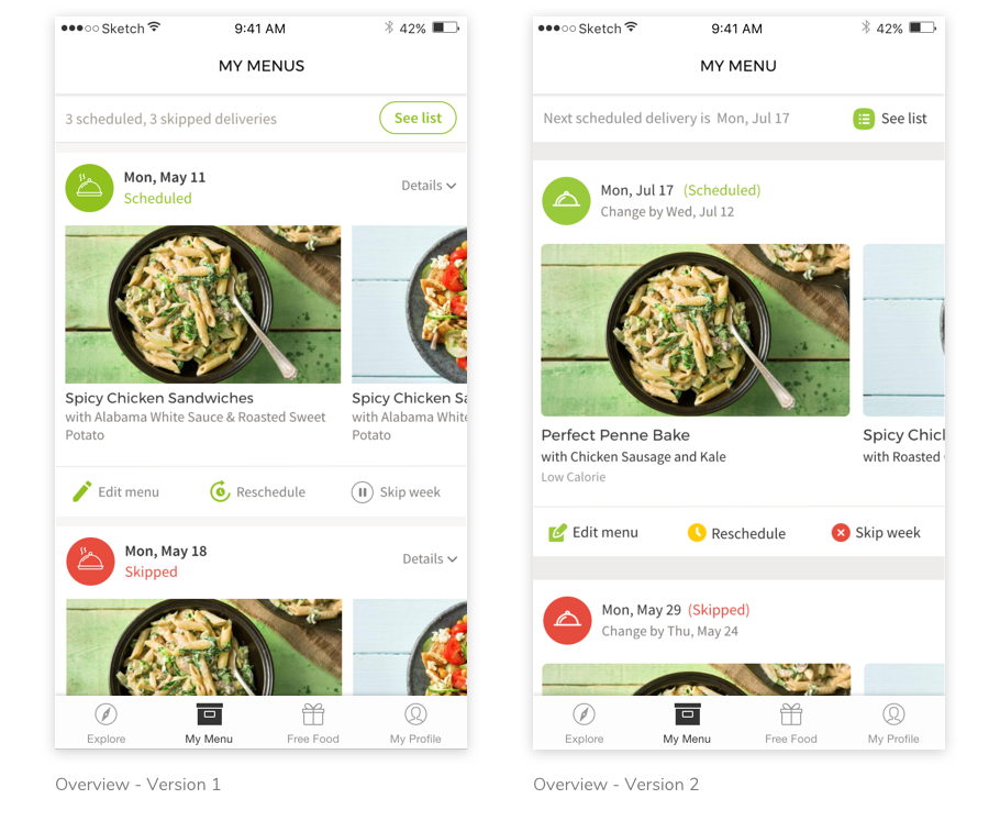
Overview
The “Overview” prototype showed a feed of all upcoming deliveries on one screen. The goal was to allow users to see the status and date of all upcoming deliveries easily in one scroll. The contents of each delivery was of secondary importance.
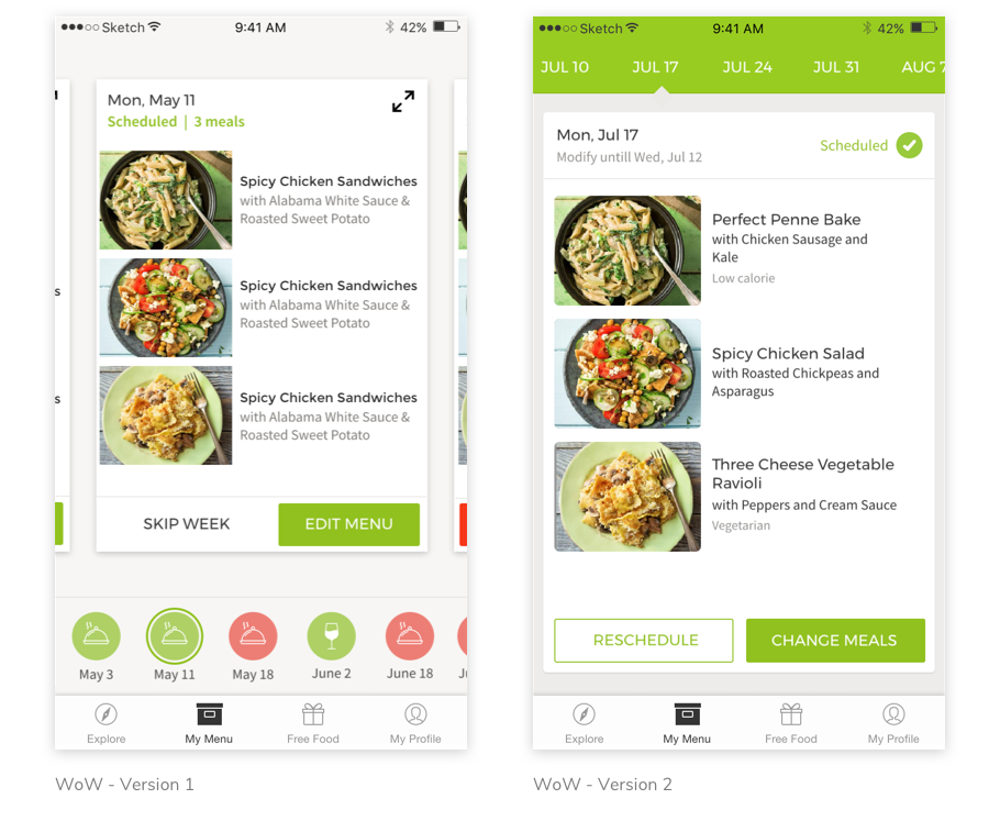
WoW
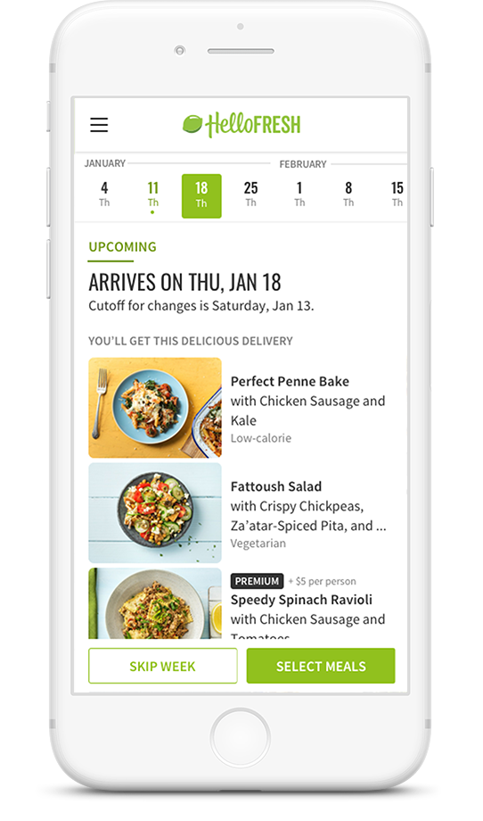
The “Week over Week” prototype displayed the upcoming delivery dates at the top of the screen to increase visibility and make it easier to navigate. The contents and actions of each delivery was displayed more prominently compared to “Overview”.
User testing the 2 prototypes
We conducted 2 user testing rounds (one with new joiners from work, one with external participants) to figure out if we should go with the Overview or a WoW prototype. These sessions came back with overwhelmingly even results, where each variant was preferred by approximately 50% of the participants.
- Participants wanted to see the cut-off and delivery dates clearly.
- Participants preferred big and bold CTAs, even though smaller links were also discoverable. The feed version used these smaller links in our tests.
- Participants reacted positively to color changes indicating delivery status.
- Participants showed a preference towards familiar UI patterns. In the first version of the WoW version, the main concern participants had was that it looked too complicated and the feed version was familiar to apps such as Facebook
- Although participants liked familiar interfaces, there was a light preference towards green elements since they represented HelloFresh-ness.
Visual Explorations
Based on the findings from the first 2 user test rounds, we started creating the final visual design.


Final UI & Experiment Setup
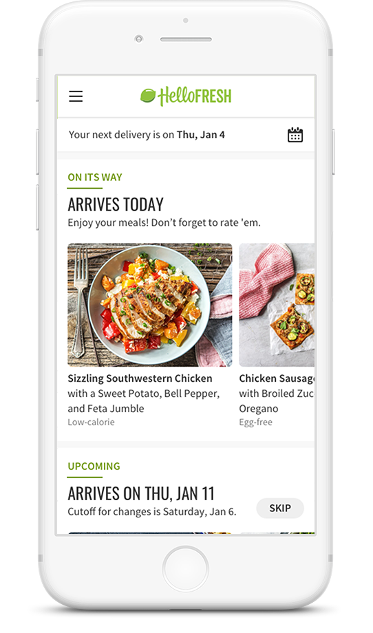
We launched the 2 variants (Overview and WoW) as an A/B test, targeted at 10% of all new US customers who checked-out with a Classic plan on mobile web. After checkout, half of these users would see the Overview variation, and the other half would see the WoW variation.
Analysis & Next Steps
Analysis
After 10 weeks of running the experiment, the “Overview” variant showed more promise compared to “Week over Week”. Boxes shipped per customer went up by 2%, refunds per customer decreased by 9%, however there was no significant change in CLV predictions.
This was the first big retention experiment we conducted, therefore we were able to gather many learnings with regards to experiment set-up at the end.
Learnings
- This layout change was only visible on mobile web, whereas experiment participants interacted with their accounts mostly on other devices.
- We only targeted customers who converted on mobile web, so we perhaps introduced a selection bias as these customers might not represent our audience overall.
- We changed many aspects of the UI, including the delivery status area as well as how recipes were displayed. This made understanding the reason behind the numbers very difficult.
Next steps
- To understand the full impact of the redesign, we will expose the same experience in different platforms. Users tend to use iOS and desktop web for continued account management.
- To understand reasons behind the numbers, we will isolate specific parts of the redesign such as “delivery status and navigation” vs “menu UI” and launch smaller, targeted experiments.