The HelloFresh iOS app is the 2nd most used platform, after web, for our customer base and is on track to become number one.
Since HelloFresh is a weekly subscription service, we see a large percentage of our customers adjusting their settings as their circumstances change. Easy access to changing delivery day, plan size, address, etc is important to prevent customers from leaving and to decrease plan management related customer care calls. Therefore, any improvements we make in the settings area of the apps, will contribute to increase in CLV and decrease in CC calls.
Skills
Information Architecture, Interaction Design, Visual Design
Year
2017
Design Team
Cansu Tecimer
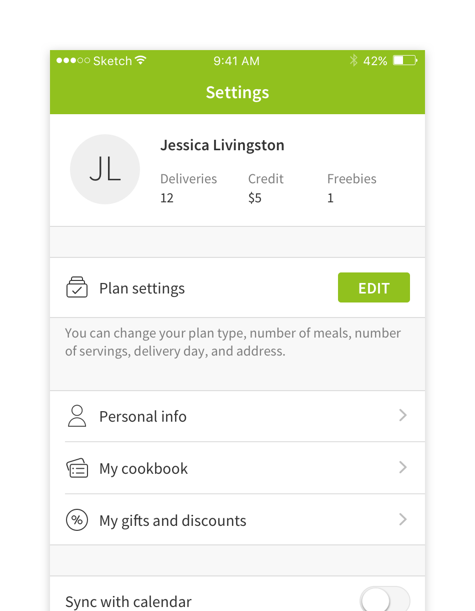
Understanding the Status Quo
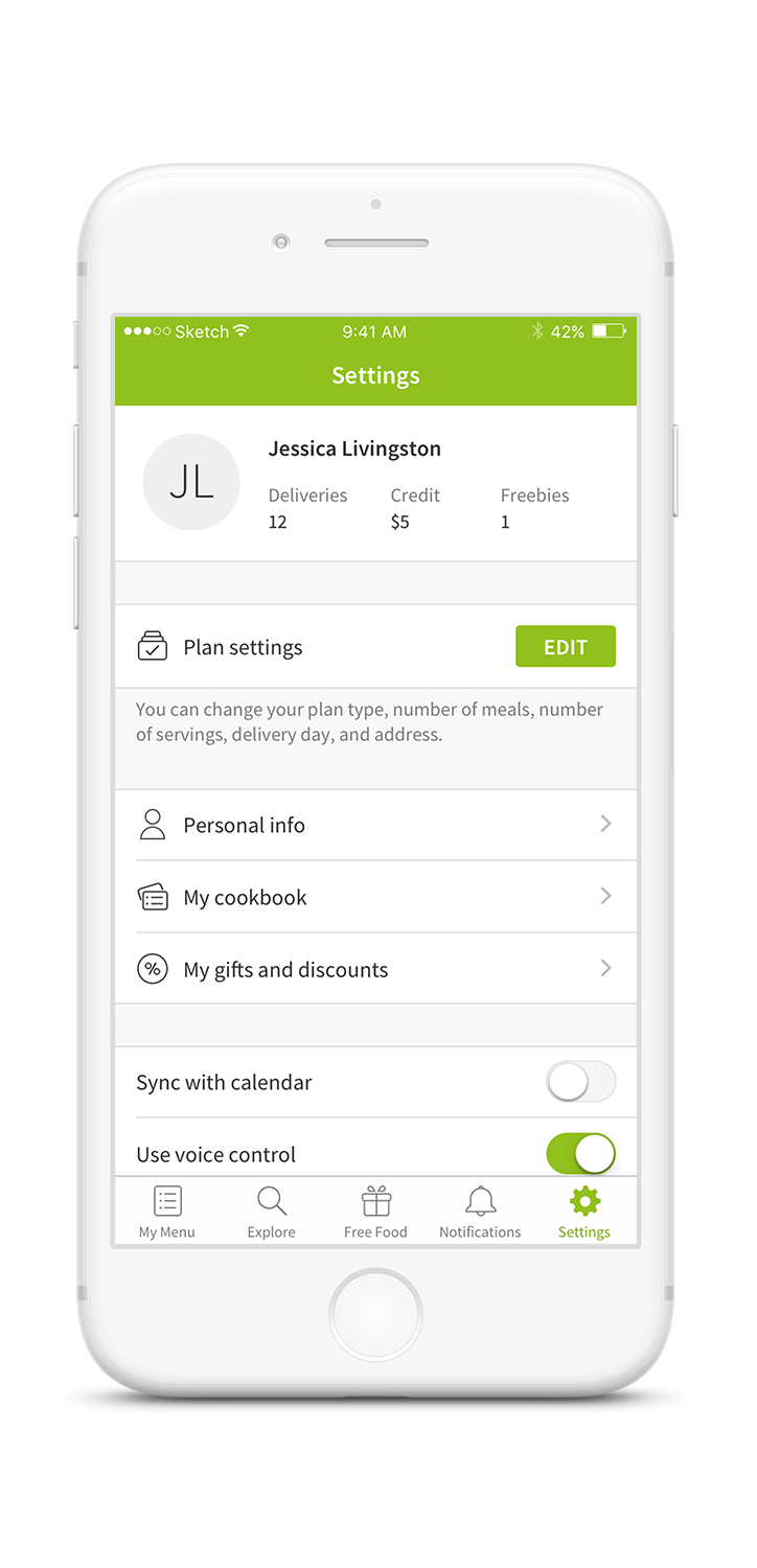
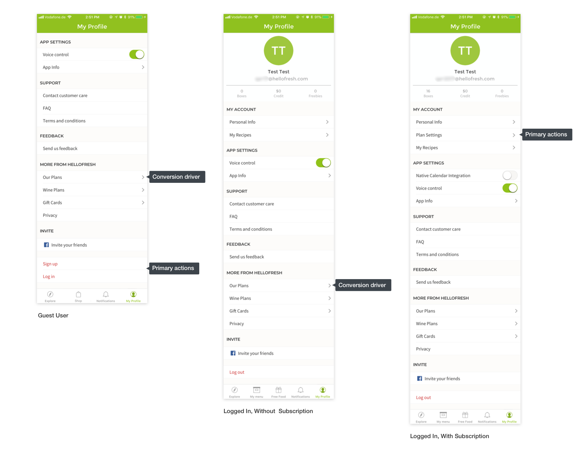
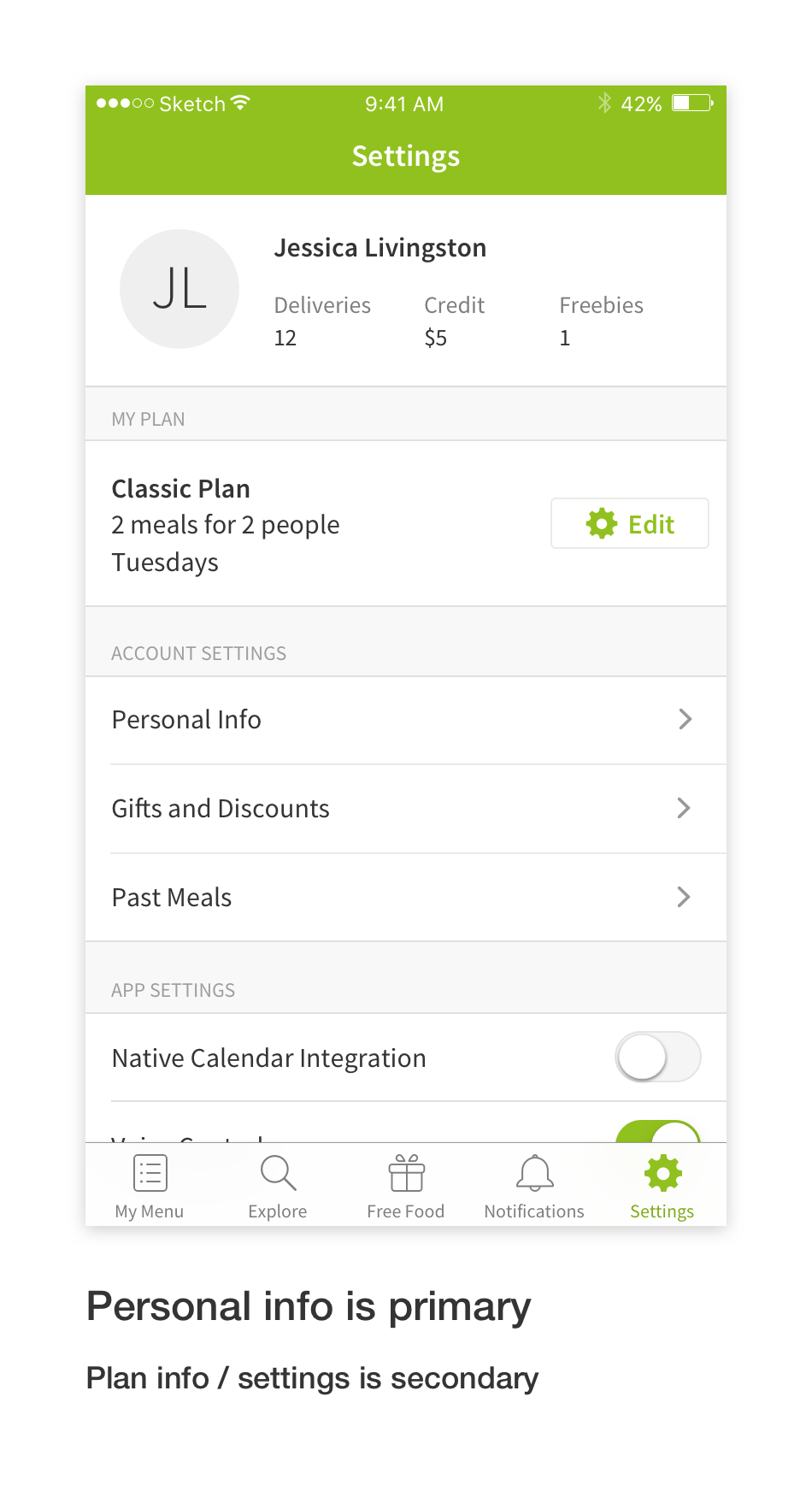
- There was no clear hierarchy that led users to “Plan Settings”. Participants tried to find many features in “Personal Info” first, as it was the first item on the list.
- Usability test participants didn’t know where plan-related features were nested and there wasn’t any information to help them navigate.
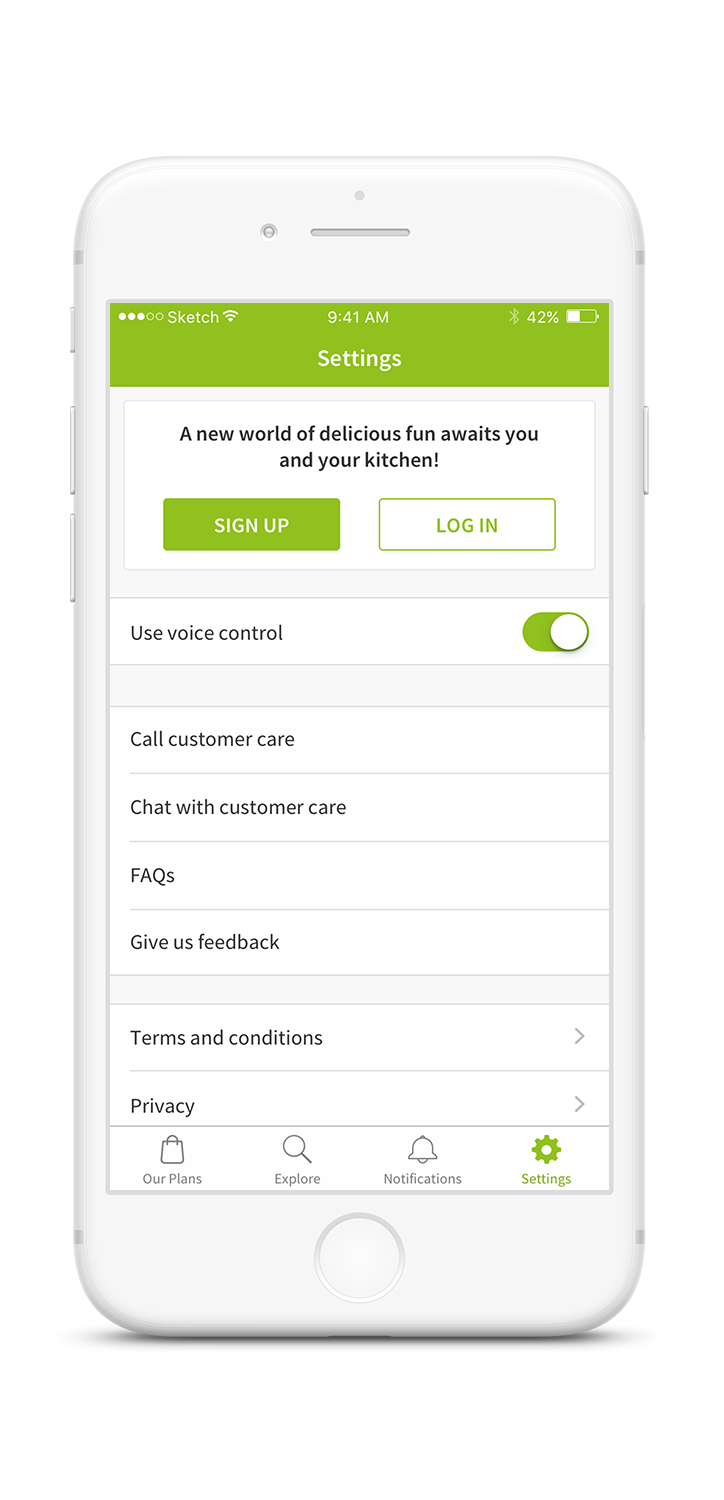
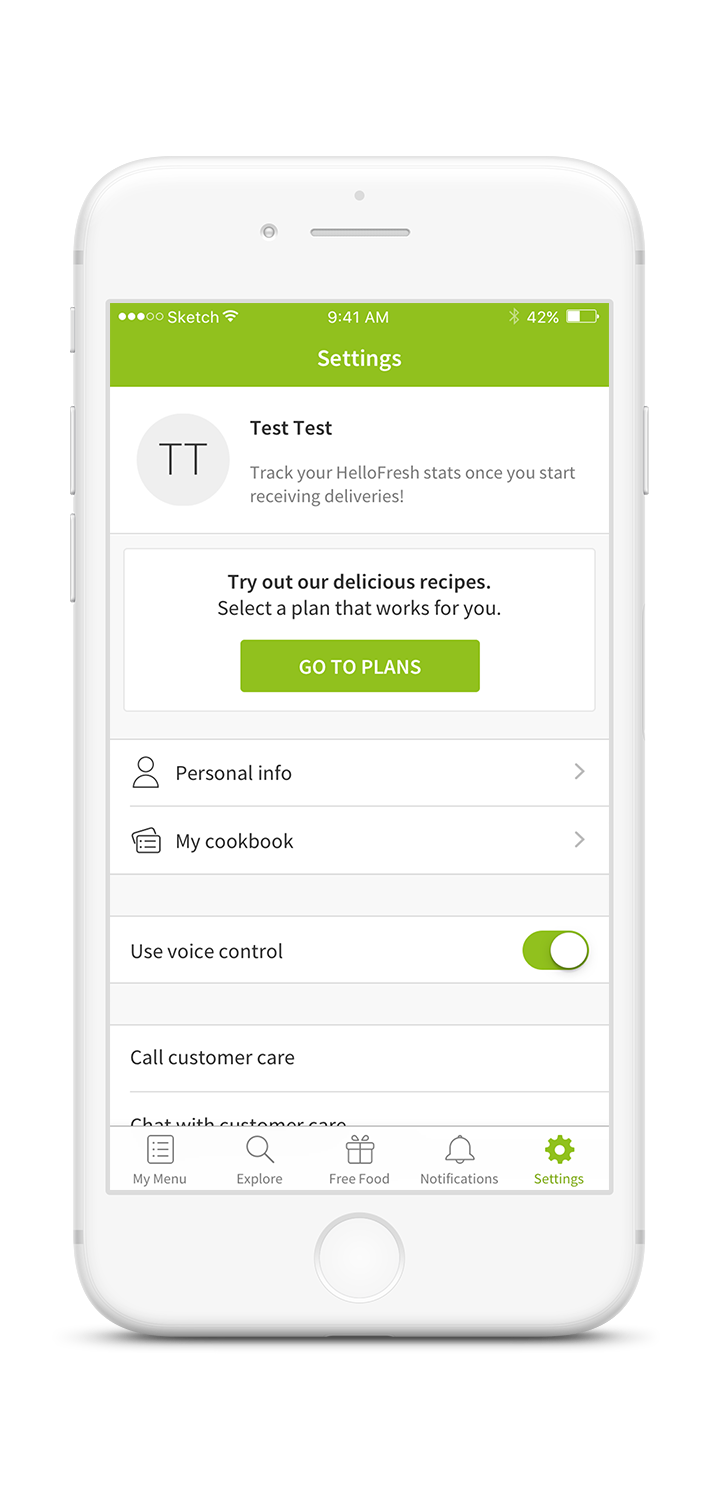
- The settings area did not highlight the most important elements based on the user’s status: Guest, logged-in without a plan and logged-in with a HelloFresh plan.
Our design objectives were 3-fold.
- Ensure that “Plan settings” was easy to find and access
- Differentiate the settings screen based on the user’s status
- Create visual consistency and clean-up the screen to get rid of unnecessary elements
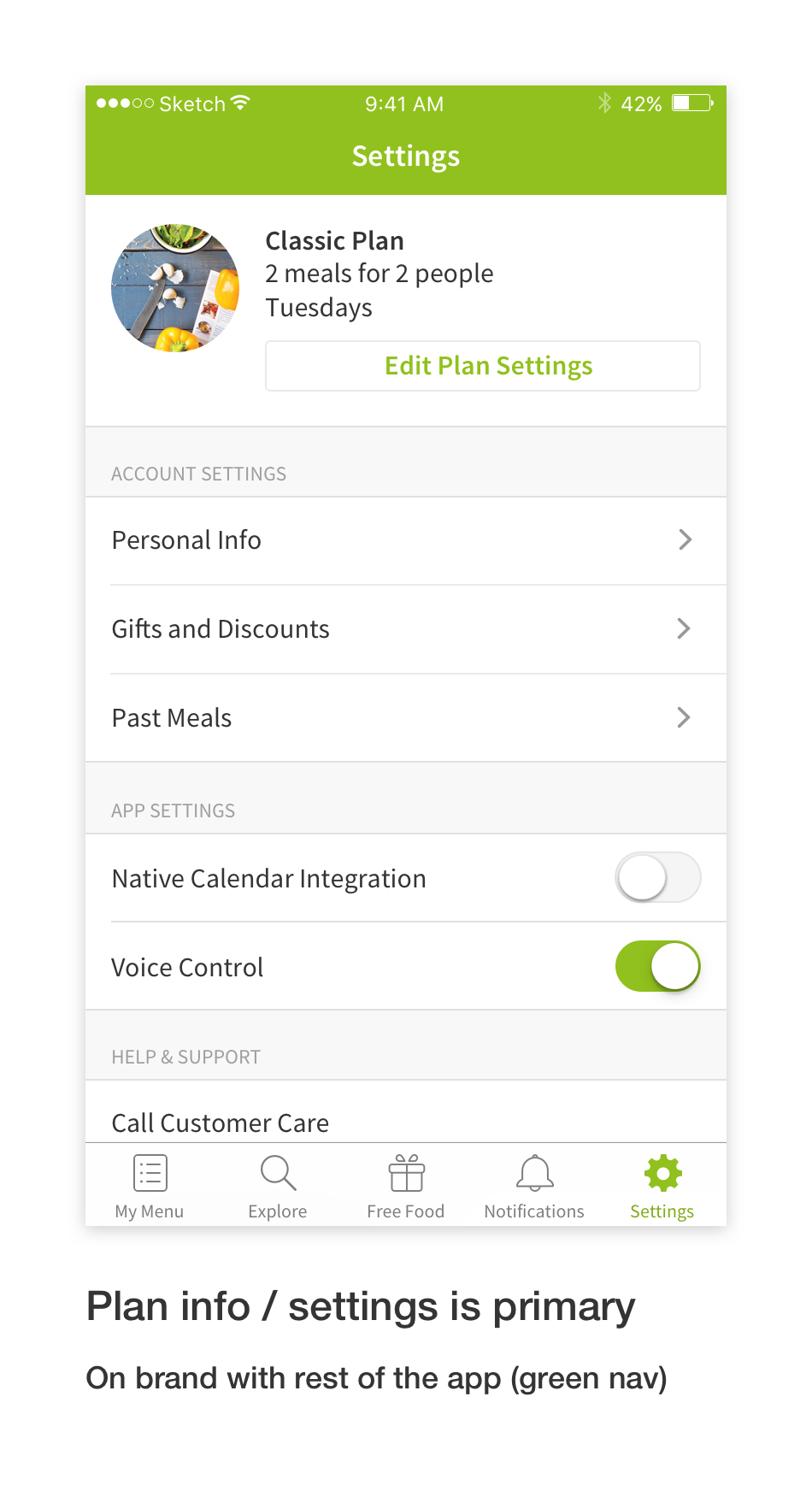
Initial visual sketches…
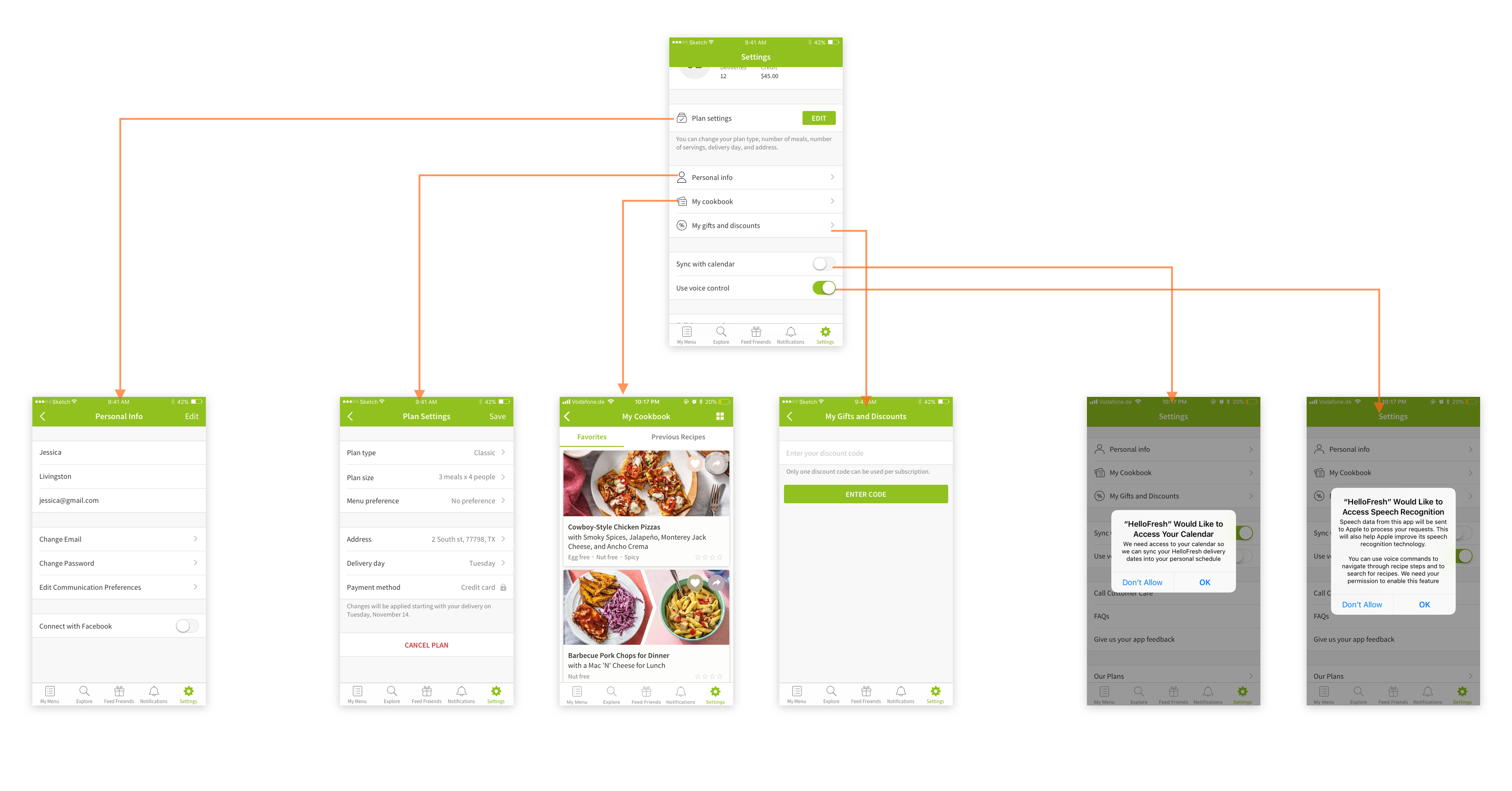
The initial sketching aimed to highlight the user’s plan, as the main element on the settings area. However, because pulling this information immediately on the settings screen would cause performance issues, we opted out of this. Instead, we added a small explanation at the entry point of “Plan Settings”.
Guerrilla testing on UI
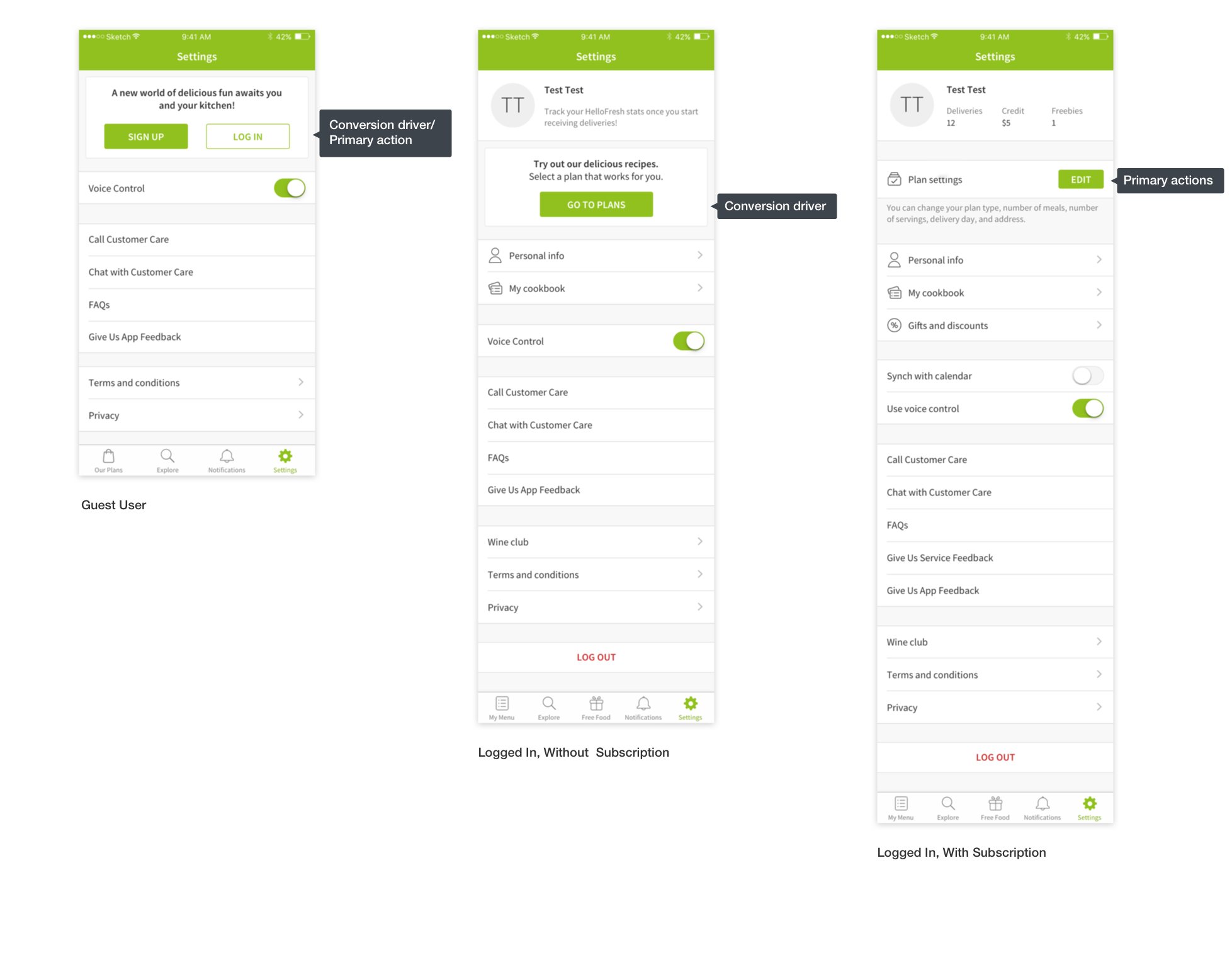
Taking the technical constraints into account, we created 2 versions for UI. Guerrilla testing showed that 5 out of 7 people preferred the one version developed, mainly because:
- Giving information about the number of deliveries and achievements made the UI more personal and informative.
- The big chunk of green in the other version was distracting. The chosen version seemed more iOS.
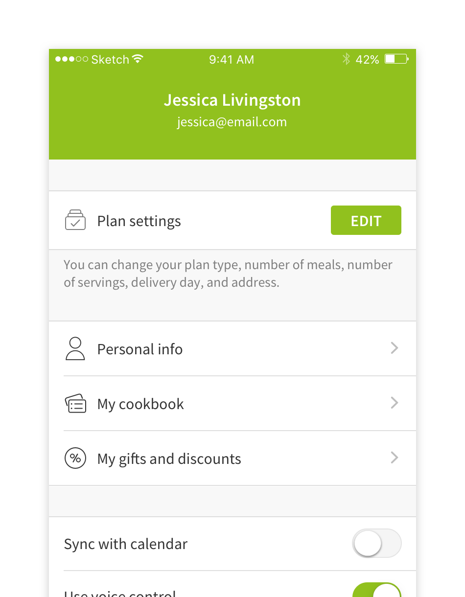
What we did…
Looking at the usage of the different features, we found that some features (eg. invite friends to app) were deprecated and removed those. We improved the grouping of features based on user needs and hierarchy.
We differentiated “Plan Settings” and explained what it entailed (technical constraints did not allow for the plan details to be shown)
We highlighted login and signup for logged out users, highlighted purchasing of the plan for customers and “Plan Settings” for customers.
The improvements in the settings area launched November 2017.
This project allowed us to quickly fix some known issues in usability as well as tackle UI alignments in the app. One thing we would have done differently if we had the opportunity is to roll this out as an A/B test to see the effects. We know from qualitative research that accessibility of some of the features increased, however we do not have comparable data to see the wider business impact