Beginning of 2018, we wanted to revisit our native apps, based on our vision of where they fit in within the HelloFresh ecosystem, insights from ongoing user tests and usage metrics of existing features. The goal was to improve navigation and access to features that would both boost engagement and improve ease of use in some of our core features.
The HelloFresh native apps are envisioned to be the quickest way for our customers to interact with their account, similar to a personal assistant that makes life easier for their user. This means that HelloFresh apps should accommodate different contexts that customers go through in their HelloFresh week.
Skills
Information architecture, Interaction design, Visual design
Year
2018
Design Team
Cansu Tecimer, Joanne Wong, Daniel Xavier
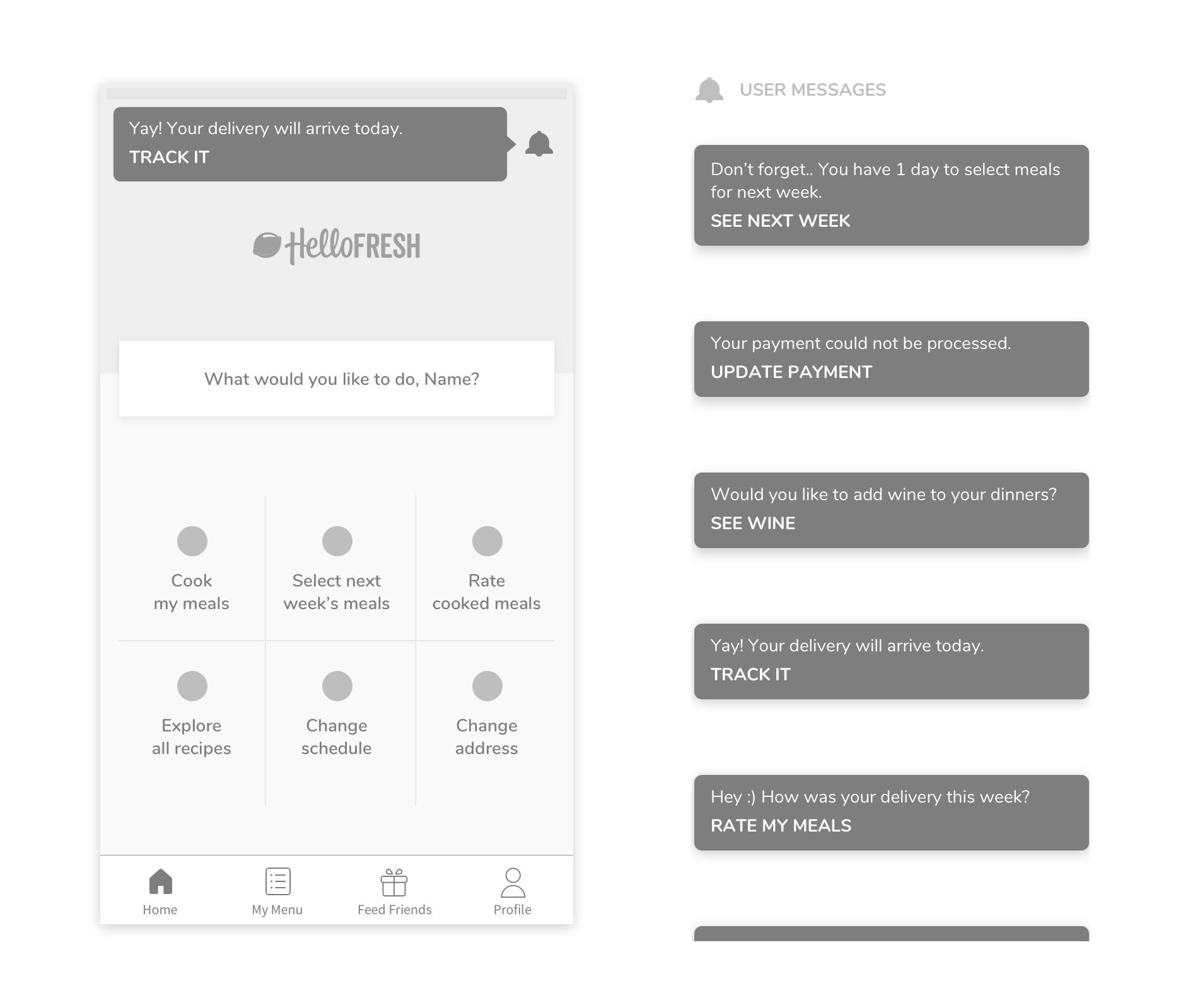
“HMW improve the visibility of context-based actions so our users can easily navigate based on their needs?”
Actions For Past Weeks
- Rate cooked meals
- Revisit old recipes
Actions For Current Week
- See meals before delivery
- Track delivery
- Cook meals
- Report errors
Actions For Future Weeks
- Select meals
- Skip / donate a box
- Changing plan settings
- Change address
Initial ideas and restrictions
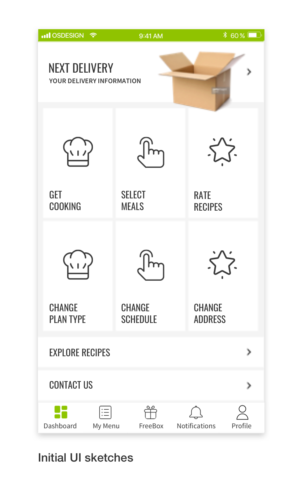
The initial idea generation with design and product had promising results, such as a context-driven, dynamic dashboard; a homepage that acts as a navigation; and dividing the main navigation into upcoming, past and present.
To test any ideas quickly, we restricted ourselves to no new feature development and everything that we designed would likely be a link to already existing screens.
Sketching with the team
To make some of the initial ideas concrete, we conducted a sketch session including product, design and engineering. During our sketch session, we discovered that we did not have enough information about our users’ behavior to design a context-driven homepage. The easiest way to find out would be to design and A/B test a dashboard that linked users to the main features we believed they would use (based on both data and our vision).
Experiment Goals
- Create easy navigation that caters to user mental models and gives them easy access to reach “hidden” features
- Enable us to track where users are going based on their place in the weekly journey and learn about their behaviors.
- Improve the current experience based on customer feedback, by adding a link to delivery tracking.
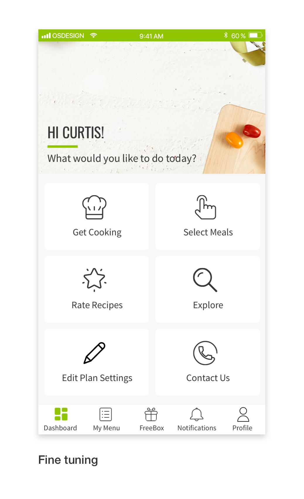
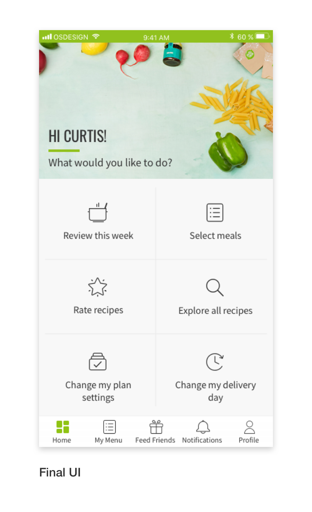
UI Iterations
From wireframe to UI, feature set was finalized. Elements were positioned on the screen so the hierarchy between them was as flat as possible and copy was chosen to be conversational.
+10%
Customer Lifetime Value
+16%
Orders per Customer
+4%
Meal Selection Rate
+103%
Recipe Rating Rate
Analysis & Next Steps
The dashboard was launched as an A/B test on March 2018, targeting new and existing customers in the US. After 10 weeks, the test group showed a projected uplift of 10% in “customer lifetime value” (CLV) and uplift of 16% in “order rate per customer”. We also saw an increase in engagement with meal selection and recipe ratings.
Although the main KPIs were positive, there was also an increase in cancellation rate and a similar decrease in skipping. We hypothesize that this change is due to the dashboard not having a clear path to skipping. For users who do want to skip, the only logical element is “Change my plan settings”, which leads to the cancellation funnel. The assumption is that the current design led some users to cancellation when they were looking to skip a delivery.
As a result of the good performance metrics, the dashboard will be launched on iOS. Variations on the dashboard, with improved designs to highlight skipping will be run as experiments. Next steps are also to make improvements in the settings screen to educate HelloFresh customers about skipping vs cancellation. This information exists in the settings area on the website and has shown high engagement on heatmaps.