Isbank, one of the largest banks in Turkey with the largest mobile presence had been redesigning their Android and iOS apps. When the new guidelines from Material Design came out, we felt it was crucial to get feedback from real users, before going forward with the Android design. As the user research team, our main goal was to understand the most intuitive navigation out of 3 alternatives and give design suggestions accordingly. We also gathered insights on user needs and expectations, the perception of data shown in the dashboard and the visual language of the app. Along the way, we decided to build a research lab that catered to mobile usability testing from scratch.
Skills
Design Research
Year
2015
Design Team
Cansu Tecimer, Asli Deniz Ozakar
User selection & Test preparation
We conducted 18 user tests over the course of 3 days. Our users were all Android users, both beginner and expert. They were a mix of female and male, 2/3’s bank customers and the rest non customers, with a mix of high and low resolution phones.
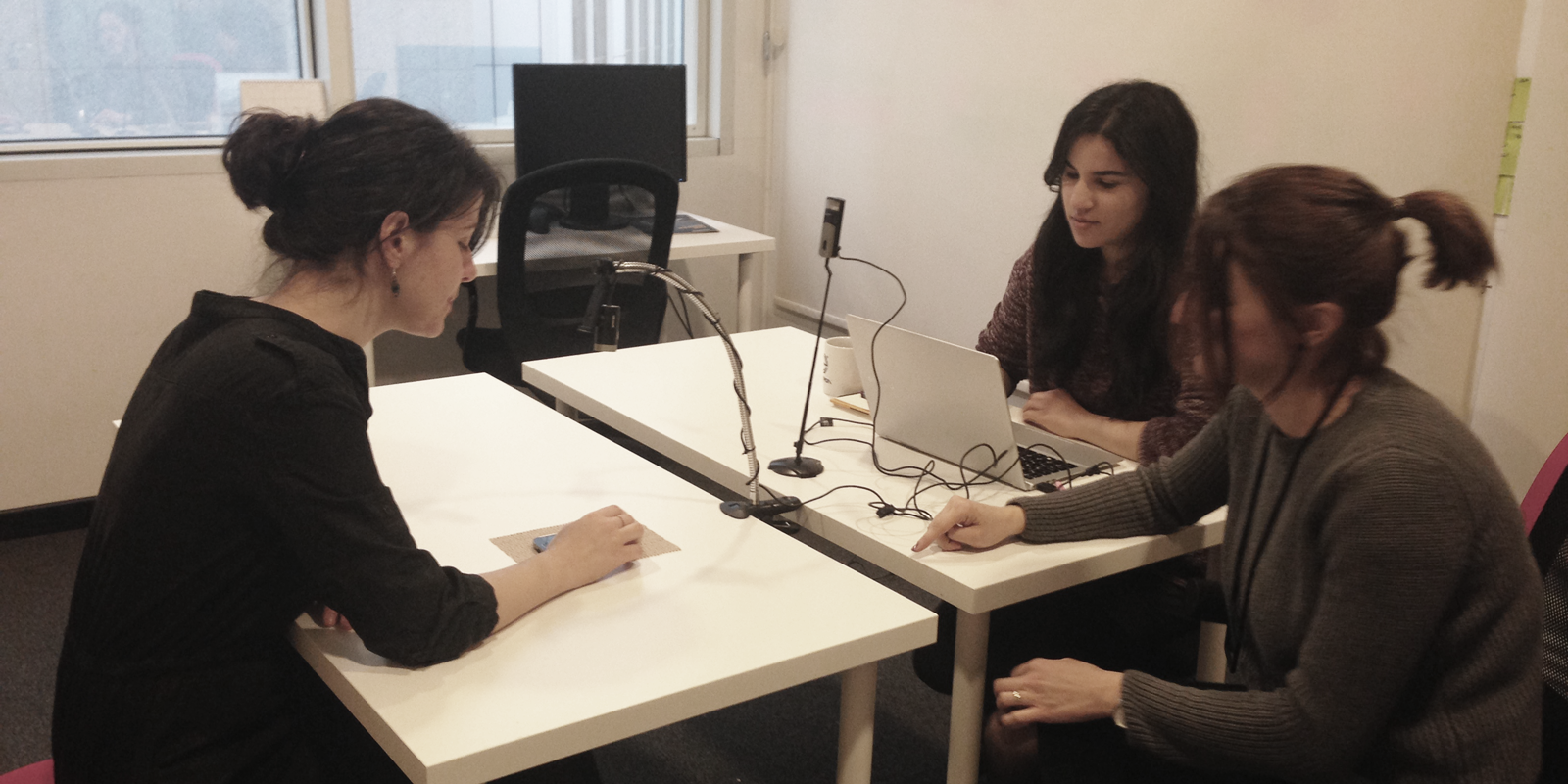
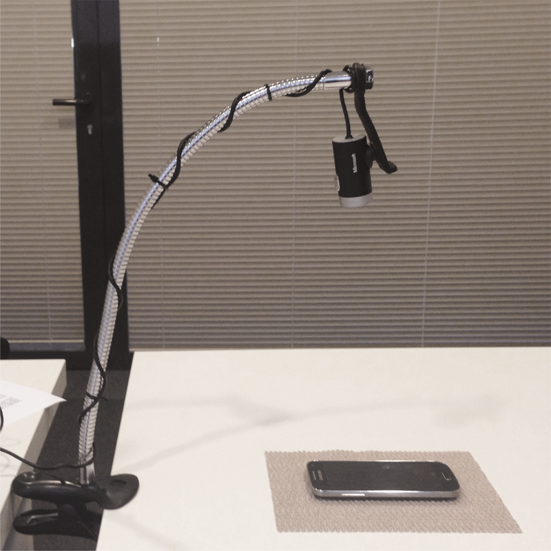
All of the tests were recorded by three cameras; one recording the face, one recording the phone and one recording the room. And, our client was welcome to watch the user tests from a room where all of these were streamed live.
Building our own design lab
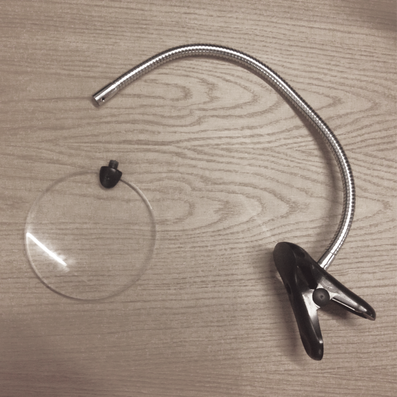
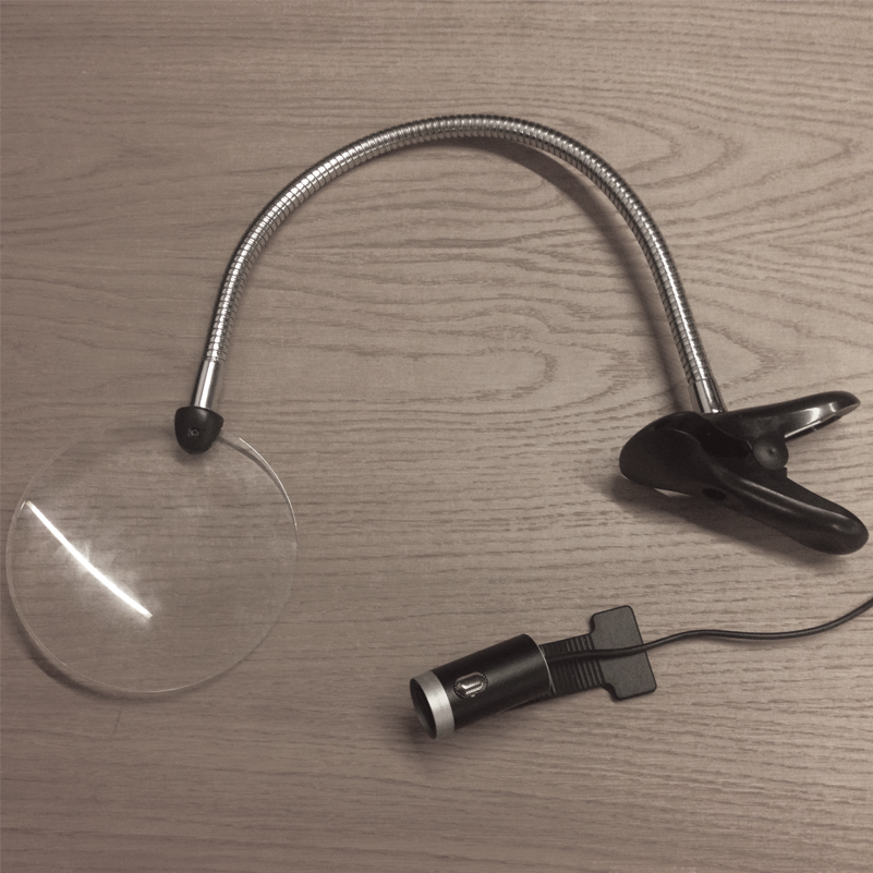
To make all this happen, we decided it would be a new challenge to build our own design lab at the office. We hacked different appliances to create our own document camera and turned one of our meeting rooms into the testing lab. And, one meeting room into a temporary observation room. We had some glitches along the way, but it was really fun figuring out how we would create the best environment for both our users and our clients, while solving technical aspects of streaming 3 recordings seamlessly.
We divided the user test into 4 stages:
Interview, Usability Testing, Desirability Testing & A/B/C Comparison.
Pre-test Interview
Each user was asked about their mobile banking habits and their expectations about the topic in general. We also used this to create a bond with the participants and put them at ease.
10 min
Usability Test
Each user was assigned one of the 3 prototypes and given tasks to complete. The aim was to understand where participants encountered trouble navigating, to collect feedback about content and data visualisation during the tasks.
10 min
Desirability Test
Each user was given 55 cards containing negative and positive adjectives to describe the prototype they had tested. They would choose 5 and we would talk through them together to understand their experience in depth.
5 min
A/B/C Comparison
Each user tested the remaining 2 prototypes and compared the 3 according to aesthetics, usability and ease of finding relevant information.
5 min
Quick design iterations during testing helped gain better insights overall
The test setup started with 3 prototypes, labeled A, B and C. During the first 12 tests, due to Prototype A receiving negative feedback from all users, we decided to introduce Prototype D (a new design with a different navigation) into the tests. We stopped testing with Prototype A and fine-tuned Prototype B according to user feedback. While this would skew some of the final analysis, these changes proved to be helpful, as both of these new design alternatives gathered positive feedback from the users.


Analysis & Insights
At the end of the testing phase, each prototype was scored according to task success rates and how well they did in the comparison study. And, all of the navigation patterns along with the content pages were evaluated separately to understand the negative & positive patterns from the user feedback. All, of this was gathered in a detailed report and presented to both the client and the design team.
Due to NDA agreements, I am not able to share the specific insights gathered during our study. 2 of the prototypes were preferred by the users for specific reasons, the user test allowed us to understand and pinpoint user behavior around navigation for our content. We also saw patterns forming about visual language, information architecture and content strategy. All of these will be used to guide the choices effecting the final design.


