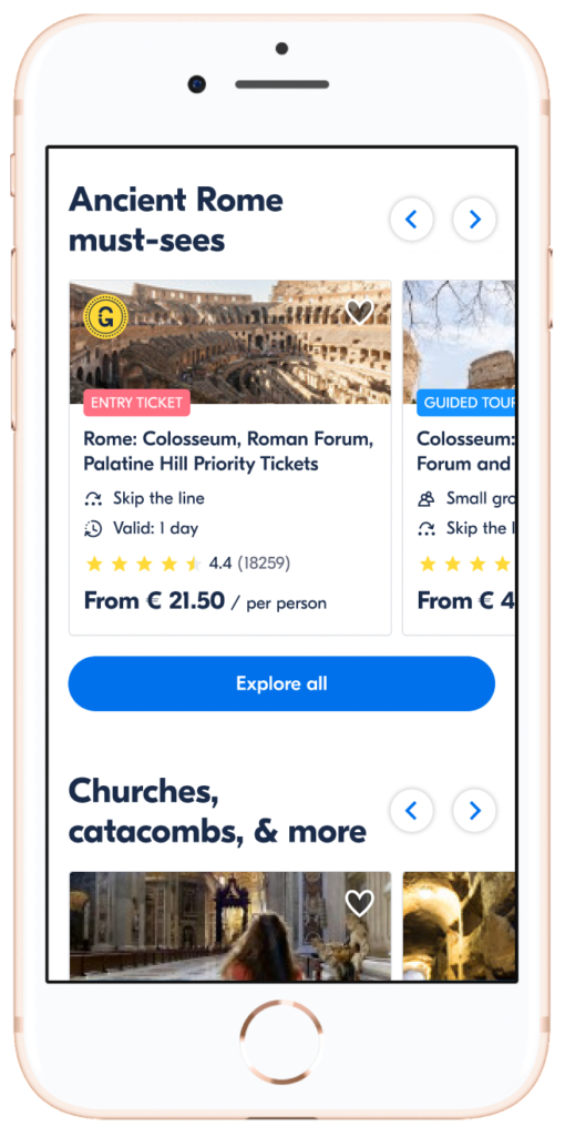
GetYourGuide is one of the world’s largest “travel experience” marketplaces. It connects travelers with activities offered by travel agencies. A traveler can use the platform to discover experiences anywhere in the world, as well as, booking them on the platform.
The company’s mission is to “Give the world access to unforgettable travel experiences”.
The company has been very successful in attracting travelers who come from search engines with a clear idea of an activity they want to book.
In mid 2020, we kicked off a project to improve our product for travelers who were still in the research and discovery phase of their travel planning. This would allow us to tap into the traveler journey earlier and increase opportunities to build a bond with our users.
Project method
Mid-term vision & concept creation, then iterative experimentation
Date
July 2020 – May 2021
Design Team
Design manager (me), UX researcher, Product designer, Content designer
Understanding our users
The target audience is defined as a “Modern Explorer”: A traveler who goes on vacations frequently — estimated to be 4-6 times a year— to experience new cultures. Traveling is a part of their identity and they take pride in this hobby. They want to see the tourist spots as well as experience off-the-beaten track activities.
We had identified 3 different intent levels based on visitor data.
High-intent customer
Travelers who have already decided on the experiences they want to do. Most likely booked their flights and hotel.
Mid-intent customer
Travelers who know their destination but are still researching experiences they want to do. Most likely booked their flights and hotel.
Low-intent customer
Travelers who are deciding on their destination. No flights or hotels have been booked.

Main customer problems
At the start of the project, these were the top 3 customer problems (gathered through previous research):
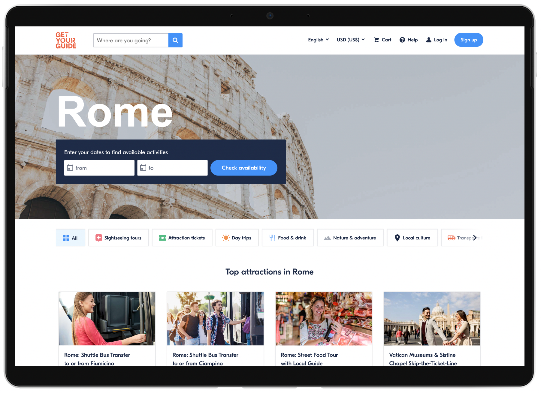
- When landing on our website, users didn’t get a good understanding around how to experience a city.
- Users found it difficult to scan and understand activities to do.
- There was no easy way to conveniently narrow down choices based on their needs and preferences
Problem statement
Help travelers who know their destination understand what makes that destination special and discover unforgettable experiences to do (that match their interests and needs).
Concept design & testing
Concept design goals
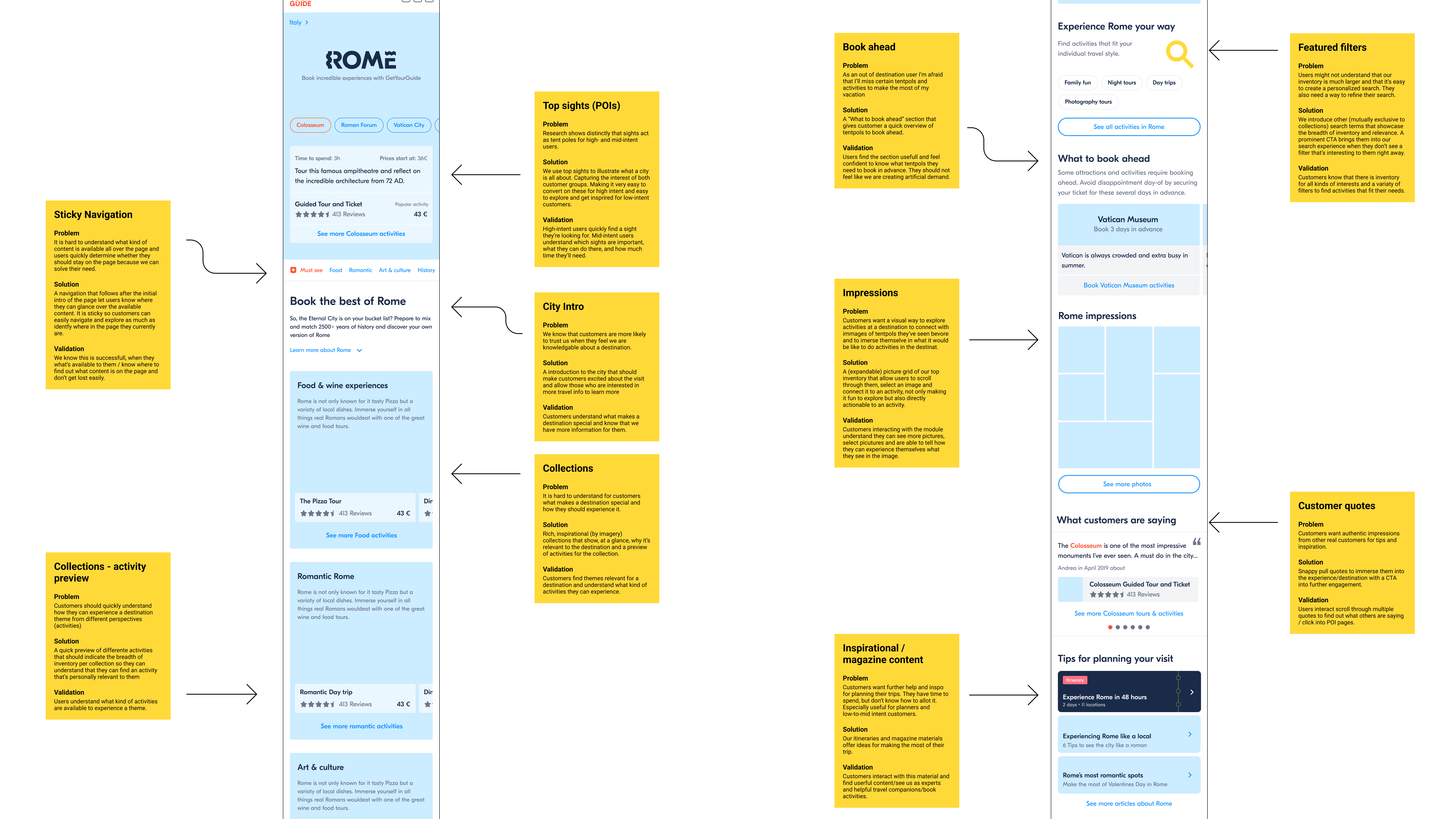
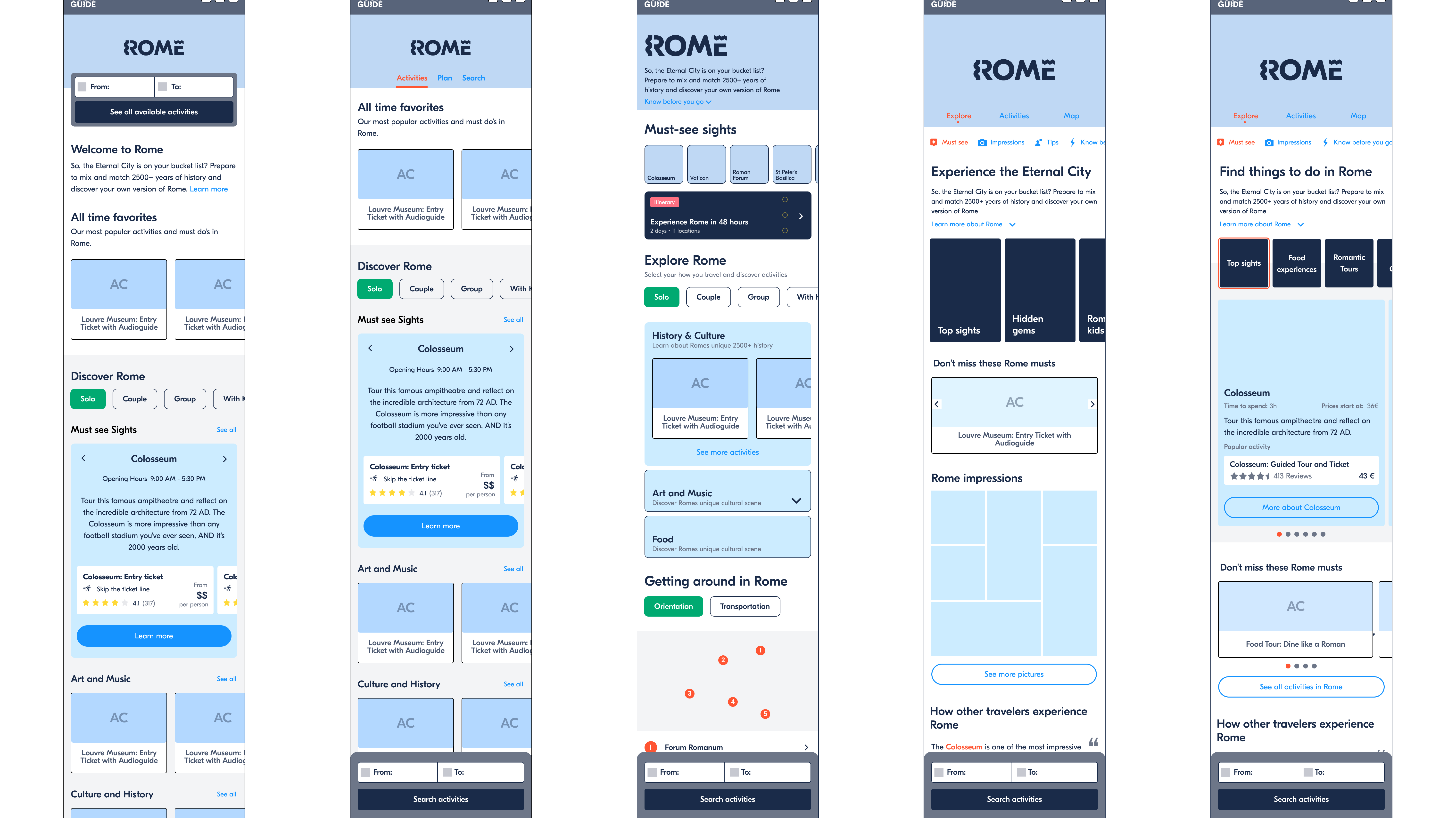
At this point, there were many different solution ideas floating around in the company. The main challenge was to synthesize organizational knowledge and customer data to design a cohesive first concept.We developed this initial concept for 2 reasons: align on an initial scope within the organization & get feedback from users on a direction.
There were 3 main ideas in the initial prototype:
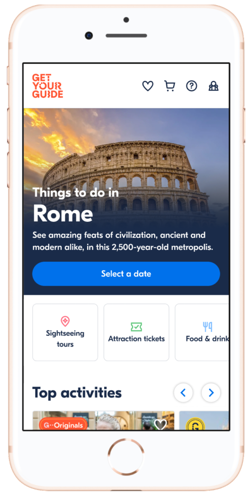
- City information: We added a small intro text and short information about the city to give users an overview.
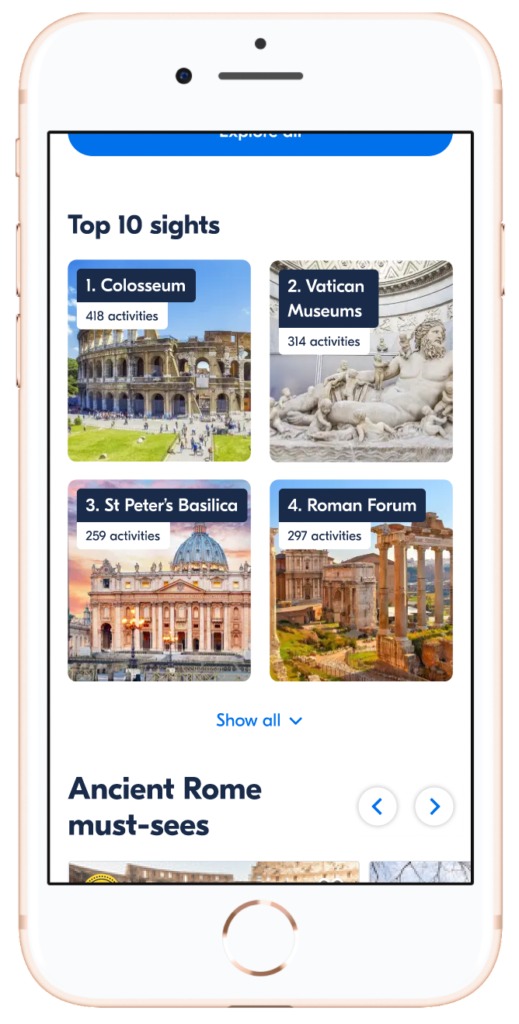
- Top sights: We wanted to orient users to a destination by showcasing the most popular attractions early.
- Collections: We wanted to help users understand a destination by creating interest-based collections of our activities.
My role
My role was to work with the UX team to define scope and support them on communicating. I primarily focused on craft, gave feedback on design options, and co-designed solutions when a designer was stuck.
Some main feedback points:
- Focus on information architecture, content, and interaction.
- Do not overcomplicate interactions to facilitate browsing behavior
- Highlight activities on the platform
Concept test findings
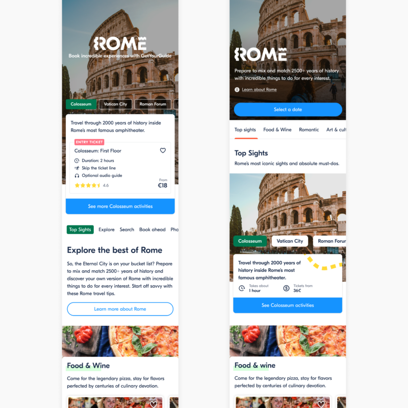
2 Designs — Ultimately, we did a small RITE study. We decided to iterate on the initial design mid-study as we got consistent and clear feedback improvements we needed to make in our solution.
The findings from the study were positive once we made the changes.
- Top sights & collections together helped users understand a destination and help them narrow experiences.
- The components helped users understand the our value proposition as a travel companion.
- We saw 2 mindsets regarding information — those who wanted to explore activities with some additional content & those who wanted in-depth information.
Initial design & results
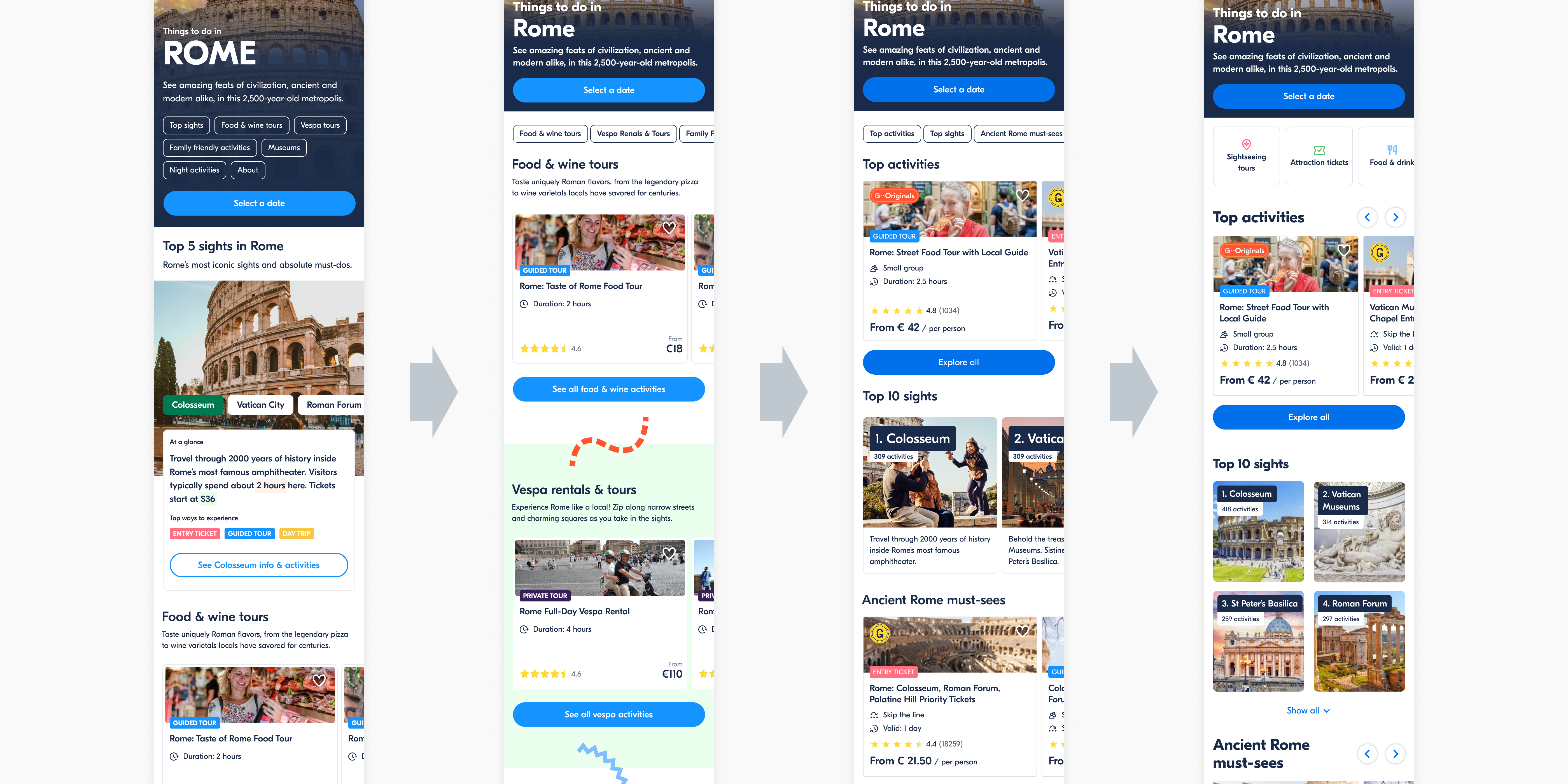
The design for the first A/B test kept many of the components from the concept test prototypes — a city intro, top sights, and collections. Minor changes were made based on the feedback and technical capabilities. (ie. a more visible page navigation for an overview, improvement of collections, removing collection images)
Initial A/B experiment
We launched the new city page in 26 cities with curated collections. The experiment ran for 21 days at the end of 2020.
Results
At the end of a 21 day A/B experiment, we we saw our success metrics go in the wrong direction. There was a clear signal that we had problems in our solution and needed to iterate.
– 10.5%
visitors clicking on an activity (Quoter Rate)
+ 17%
visitors leaving w/o interacting (Bounce Rate)
Key Takeaways
We tested too many competing hypotheses at the same time, so with negative metric impact, it was hard to learn.
Moving activities too far down the page created confusion and didn’t match the expectations of many of our visitors.
Iterations
Over the next 4 months, the team launched 5 experiments. The goal was to isolate hypotheses we had conviction in, learn quickly, and arrive at a solution that solved customer problems. Then we could scale the solution and use it as our new baseline experience.
Main challenge was working on a highly optimized part of our product and dealing with low data coming in because of the effects of COVID 19.
In 2021, my role shifted to being more closely involved in product decisions (ie. definition of success). To become a full strategic partner to product, my focus was on one product group.
My main contributions were:
- Working closely with the designers, my product partner, and the cross-functional team to define hypothesis and success metrics.
- Motivate designer to explore and push for ideas to test
- Rapid feedback cycles
We worked on 4 main themes
(In order of priority & sequencing)
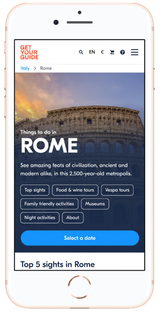
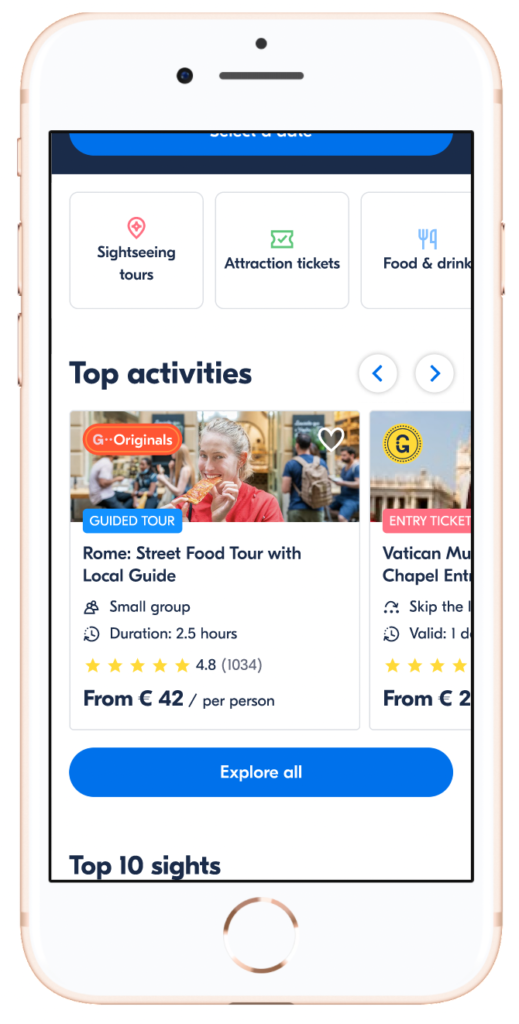
#1 Moving activities up the page
We believed that pushing bookable activities down the page was causing confusion around our value proposition — a marketplace for bookable activities — and causing potential customers to leave our product.
#2 Improving the collections
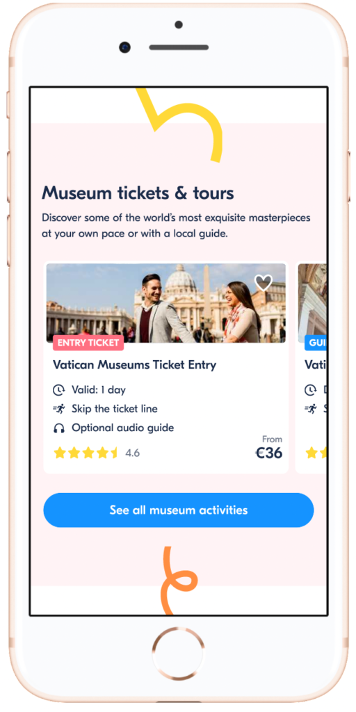
We believed grouping activities within collections was key to helping customers navigate a city. We iterated multiple test cycles in order to get collections right (incl. a top activities collection and hand-picking specific collections for our test cities).
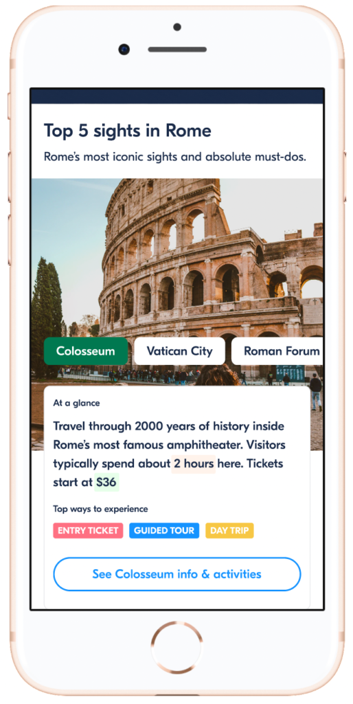
#3 Improving the “top sights” module
We had conviction that travelers anchored themselves through the top sights in a destination. We worked on improving this module to place it as one of the first pieces of information.
#4 Interaction and visual design improvements
On the 6th iteration, our team conducted a usability study focused on mobile (data showed mobile was performing poorly). Based on this we iterated on collections UI and improved the quick “category filter” navigation.
Final design & results
The changes we made in the 6th iteration (based on information from the usability study) resulted in our first experiment where all success metrics were in the green 🥳
We could now scale this solution 🙌
– 3.3 %
Bounce Rate
Visitors leaving w/o interacting
+3.6 %
Quoter Rate
Visitors clicking on an activity
+ 3.14 %
Check Availability Rate
Visitors searching date availability on an activity
Key takeaways
Ways of working
#1 Best approach is to have a general direction/guiding principles and to test out small hypotheses.
#2 We can only learn from failure if we go into each experiment with a clear rationale and intentionality.
Attitude
#3 Perseverance is key to success. When working in an unknown space, there will be failure. However, when we have conviction in our ideas, supported by customer research, work becomes meaningful. When work is meaningful and learning happens, our teams find a way to persevere through failure and obstacles.
Leadership
#4 As managers, we play different roles depending on what the team needs. Being able to have a balance between these modes takes building trust and changing the tools based on the type of problem.
