Category

Tinkering

WeWant Working Prototype

WeWant

By Tinkering

WeWant is an interactive space that allows residents to bring any amenity they want into their neighborhood using the power of crowd-sourcing.

From food-trucks to pop-up shops, temporary urban planning is a rising trend in cities around the world. Not only are these mobile businesses profitable for the entrepreneurs, they revive spaces that are lacking amenities or abandoned buildings not being used. Looking at a few years in the future, our design team created an interactive experience that gaged the specific needs of neighborhoods to bring them exactly what they were looking for. We called this new urban fixture ‘WeWant’.

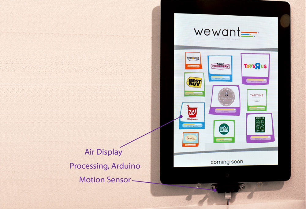
WeWant is an interactive touchscreen installation that allows people to vote on what they want to see in that specific location.

Businesses set minimum amount of votes they require to mobilize themselves and if that quota is reached, WeWant gives them the resources they need to show up at a predetermined date.

WeWant is aimed to benefit both businesses and communities in meeting their specific needs. Businesses know before popping-up in a neighborhood, that there is a market for their resources. And, the users have the satisfaction of creating site-specific trends and customizing their neighborhoods.

WeWant is specifically meant to be a  site-specific interactive space and not just another app, because the people voting need to have a connection with the physical space. And, when a business comes to that specific location, it creates a festive occasion for people to get together.

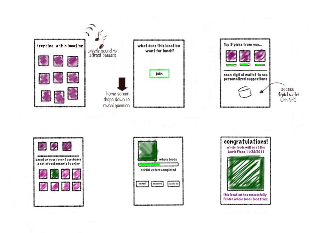
WeWant Initial Wireframe

Initial Wireframe of WeWant UX

THE PROTOTYPE

With the high-level concept in mind, our team aimed to create a user experience that was fun, seamless, quick and secure. There were two areas of focus: Attracting the people near the WeWant station and allowing them to have a quick and customized voting process.

To attract the passers, we researched new face detection technologies that were being utilized by some businesses, to determine the age and gender of customers. WeWant uses a camera and face detection technology to detect a person and creates a whistle sound at programmed intervals. This was also in line with the whimsical approach we were taking with the brand identity.

More importantly, our research led us to look at how people use new technologies to carry personal information securely, through applications like digital wallets. For our prototype, WeWant accesses Google Wallet using Near Field Communication if the user allows the interaction to take place. This way, using the history of the person, WeWant generates a database of amenities the person might be interested in.

To simulate our concept, we created a working prototype using an iPad for the touchscreen interaction and Processing & Arduino to detect passengers and use audio feedback to attract them.

Project Team: Cansu Tecimer, Aaren Esplin & Ally Speakes
Robopet Working Prototype

Robopet

By Tinkering

How might appliances and our interaction with them change as they get smarter & have personalities?

INSPIRATION

The field of robotics within our domestic spaces opened up new kinds of interactions between users and man-made objects. As a researcher, I was inspired by the way people form an emotional bond with their Roombas: naming them, dressing them up in pet costumes and excusing their inefficiencies more than they would towards other appliances. The simple design decision to give autonomous movement had created a new metaphor for the vacuum cleaner: the household pet.

Looking at current technologies, I explored strengthening the metaphor of household-pets in order to evoke stronger emotional bonds and create a smarter household appliances that trained over time. The exploration yielded in a concept called RoboPet, using emotional design and increased efficiency.

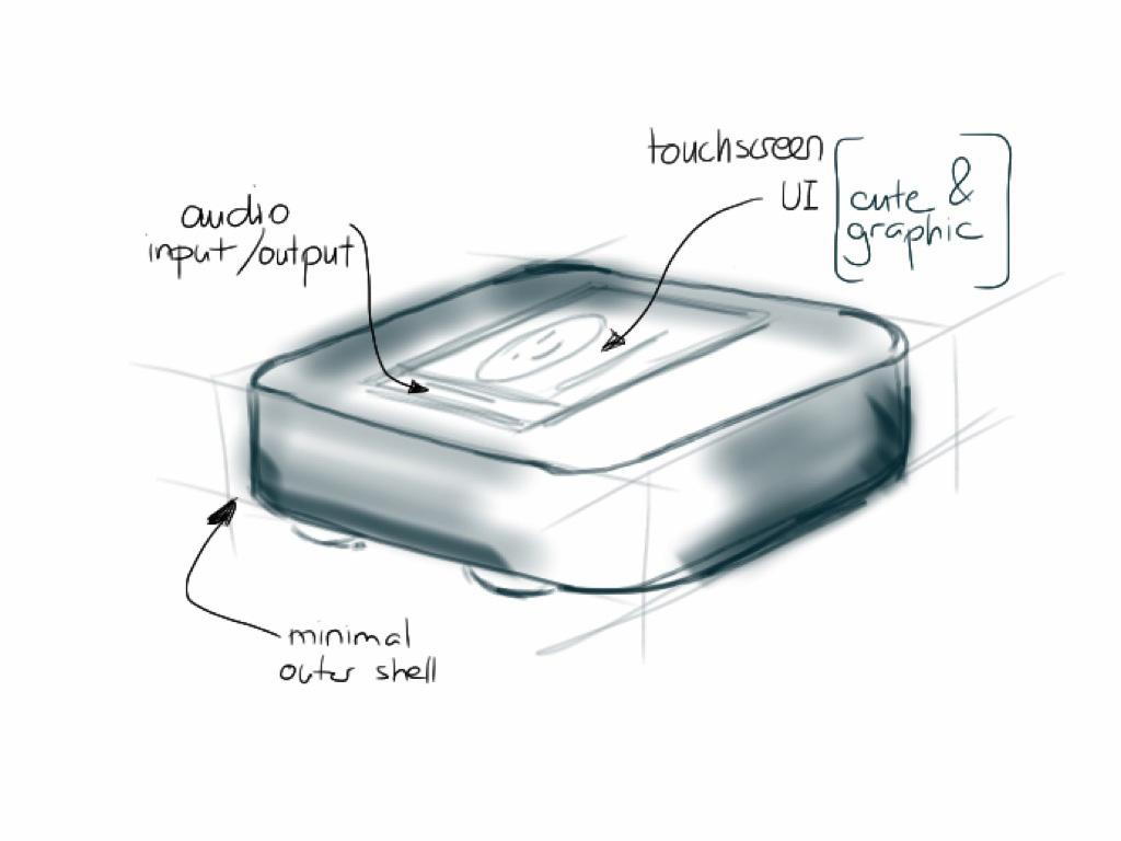
Robopet Product Sketch
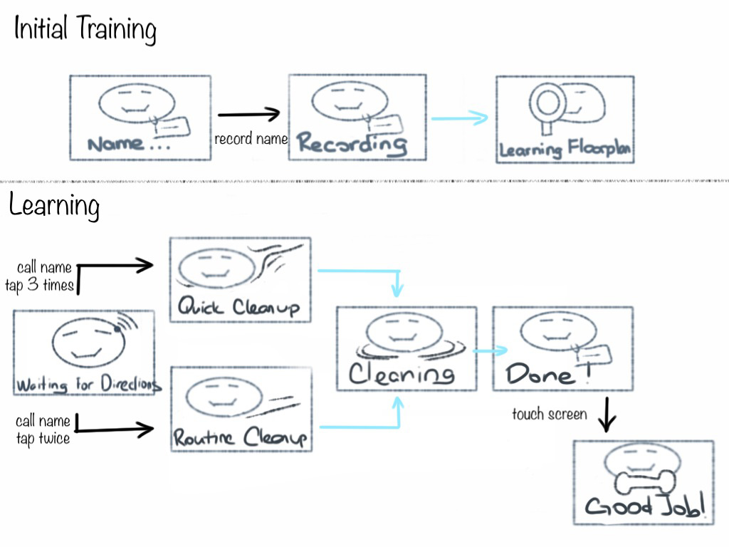
Robopet Workflow
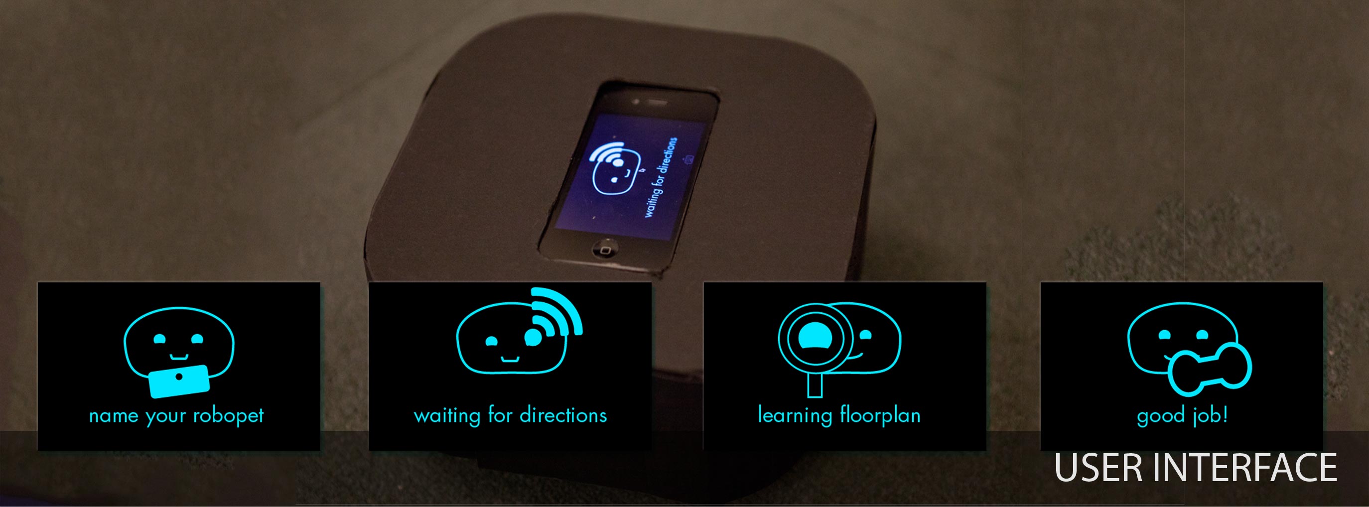
Robopet UI Design

STRENGTHENING THE PET METAPHOR

To enhance the development of bonds between RoboPet and the owner, the user experience mimics the acquisition and training of a puppy. The user activates the device by giving it a name and is encouraged to give it positive feedback through the training process.

The behaviors of a dog, like wagging its tail when happy or rushing to its owner when called, are mapped onto RoboPet to enhance the pet metaphor. The visual design of the UI reflects a cute and personable brand identity.

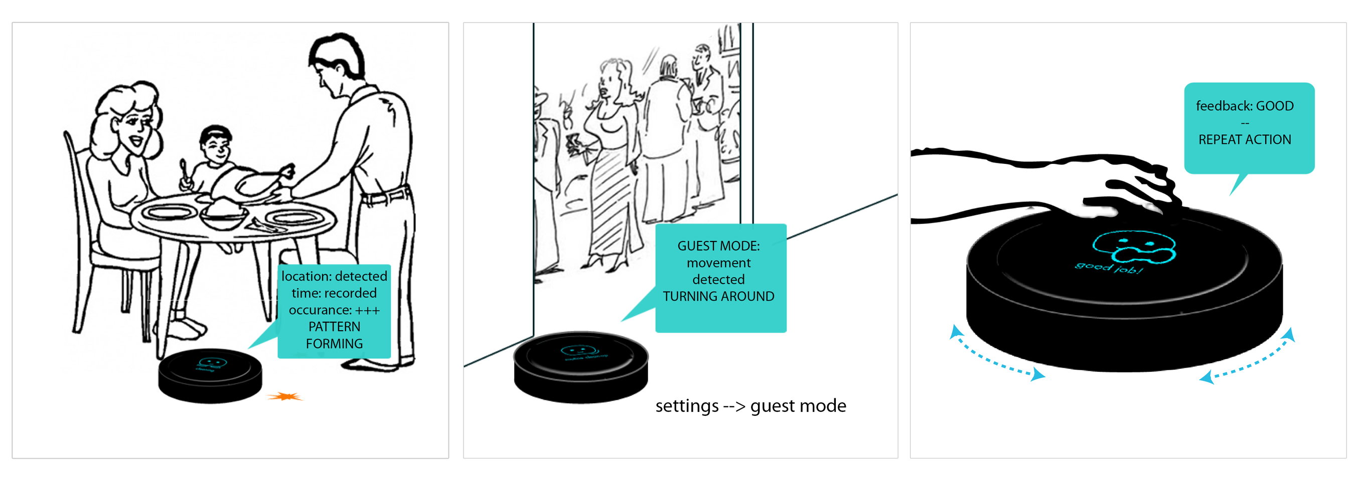
The ultimate goal of RoboPet is to create a vacuum cleaner that is efficient and smart. Robopet responds to being called and certain gestures to clean specific locations. As it is trained by the family, it also learns patterns of household activities, by matching location with time. And, like a household pet, it can be programmed to not to enter rooms when guest are around.

This project focused on exploring few scenarios specific to the mobile vacuum cleaner. However, as devices become more synced with the home smart systems they will become smarter and more efficient. And in terms of personality, what would it look like if we started buying our appliances according to certain personality traits? Like, a robocat or a robodog as a vacuum cleaner that portrayed different behaviors?

Sift'n Drink Working Prototype

Sift’n Drink

By Tinkering

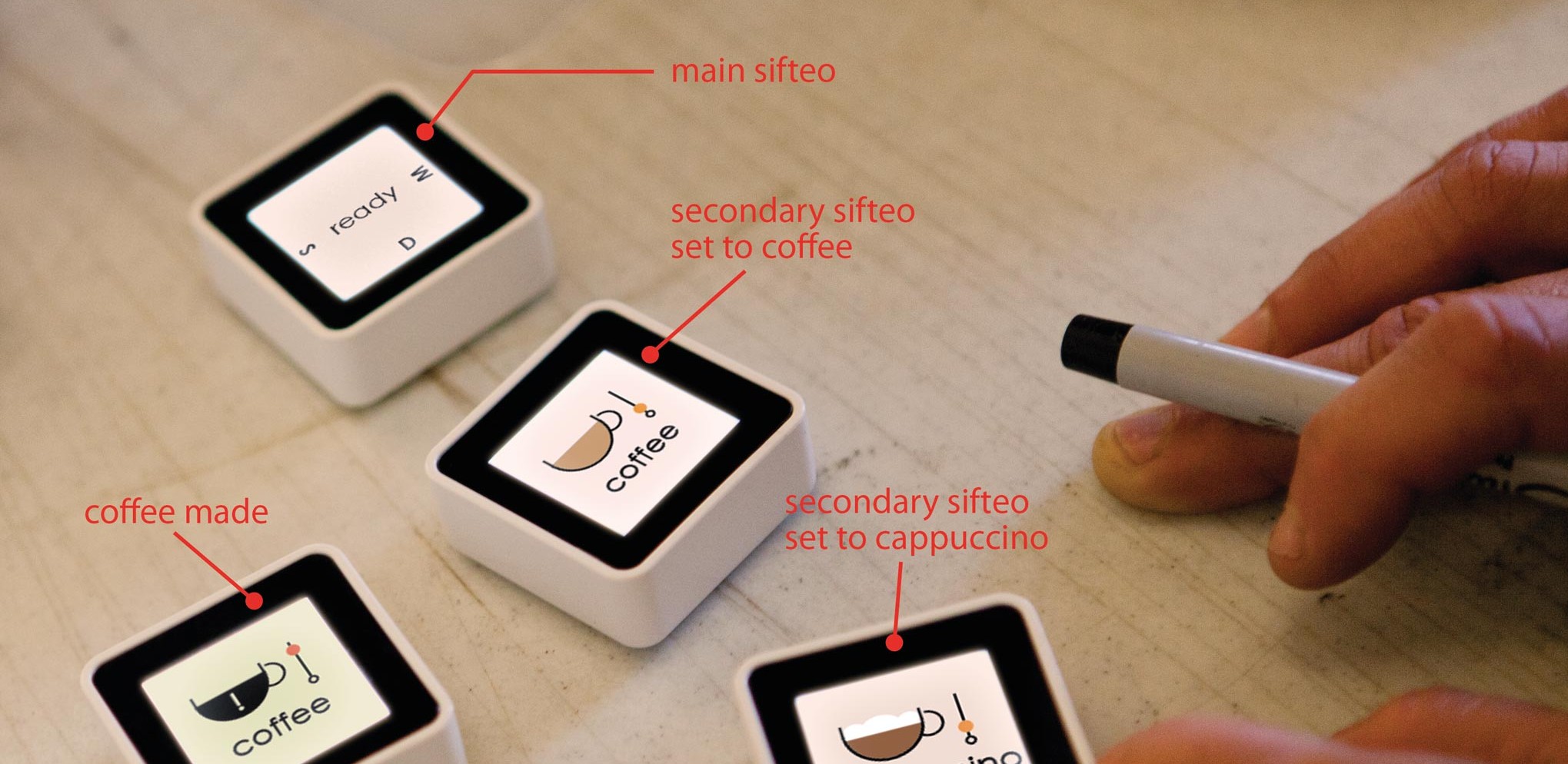
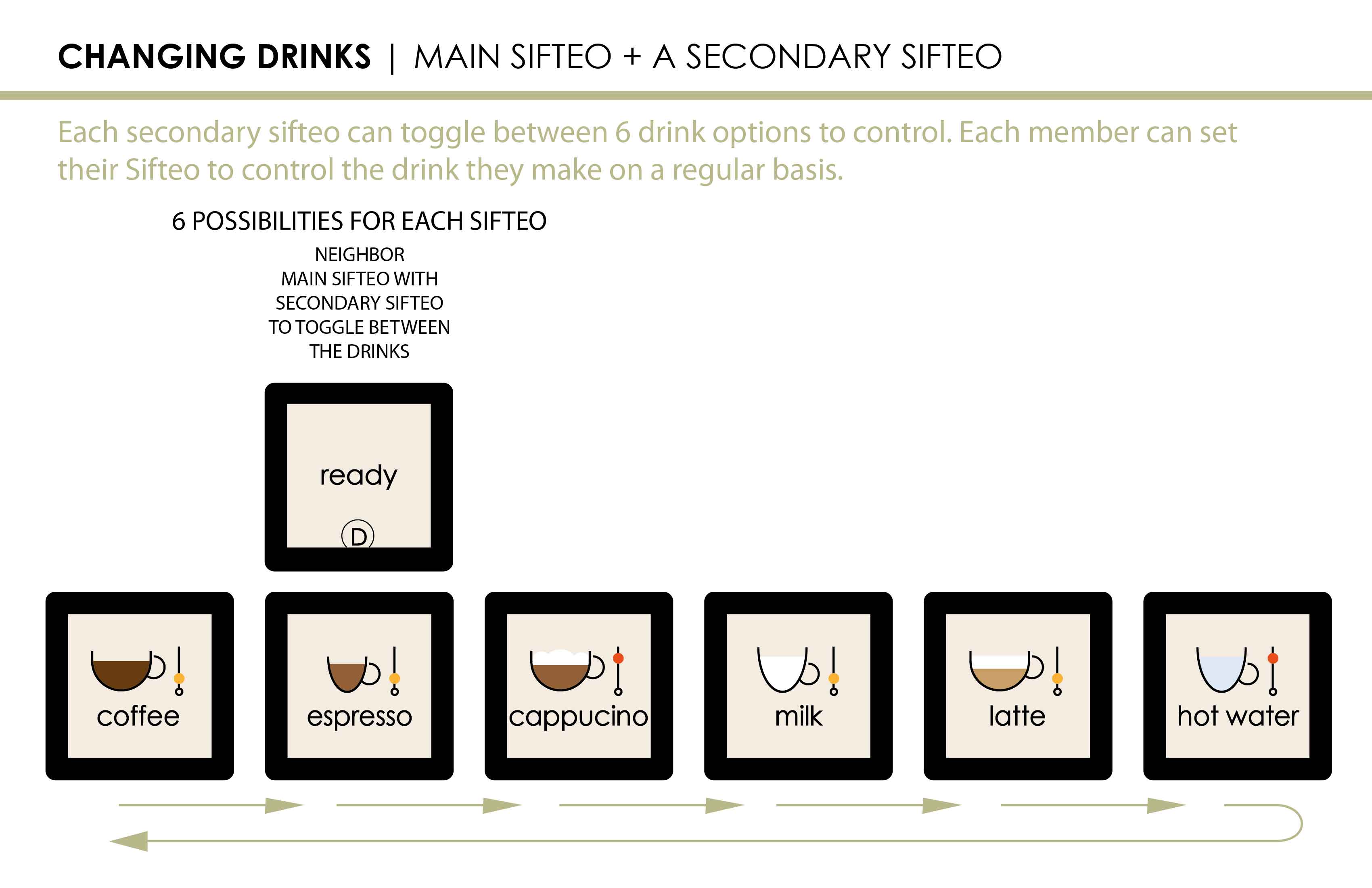
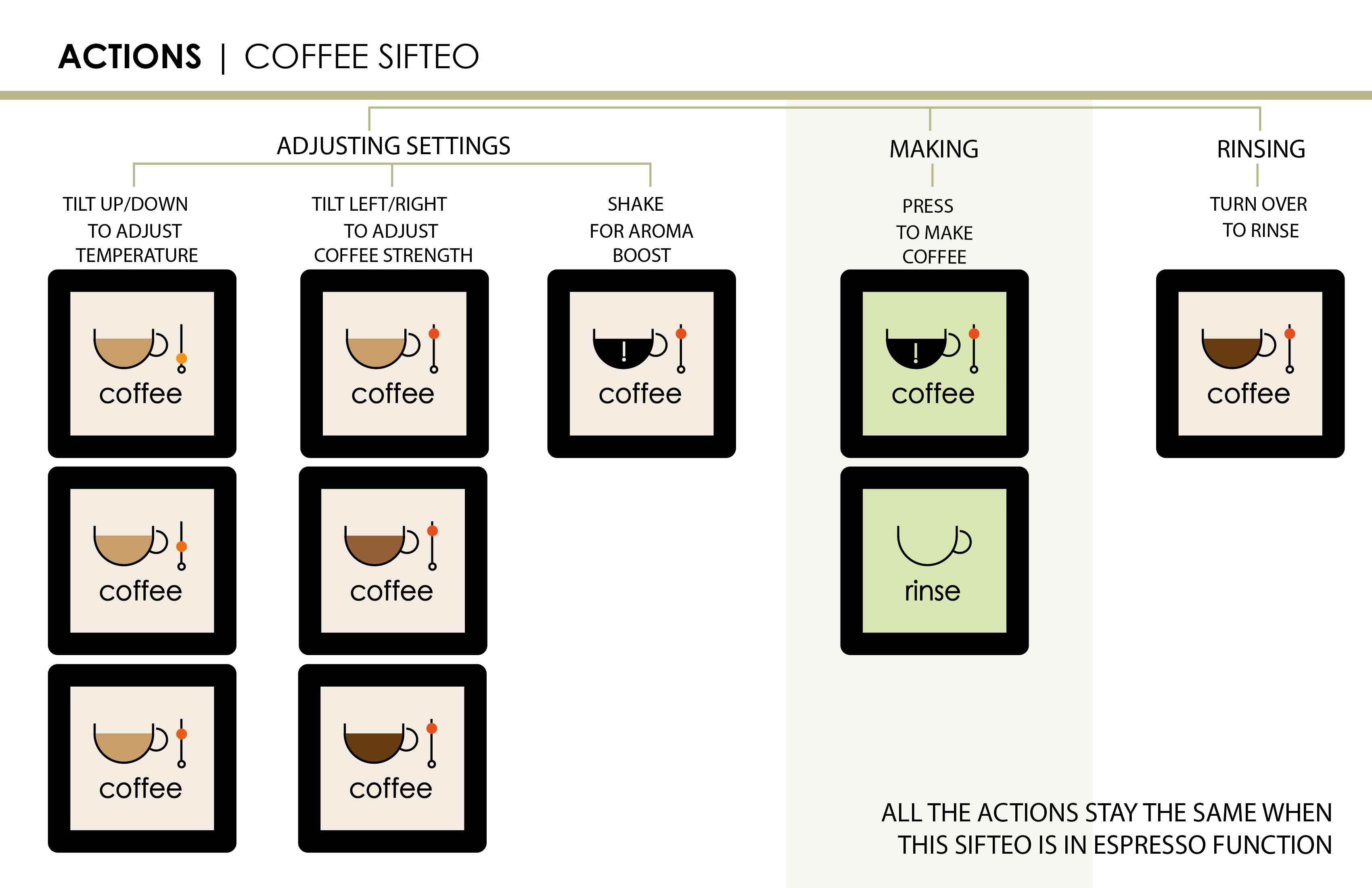
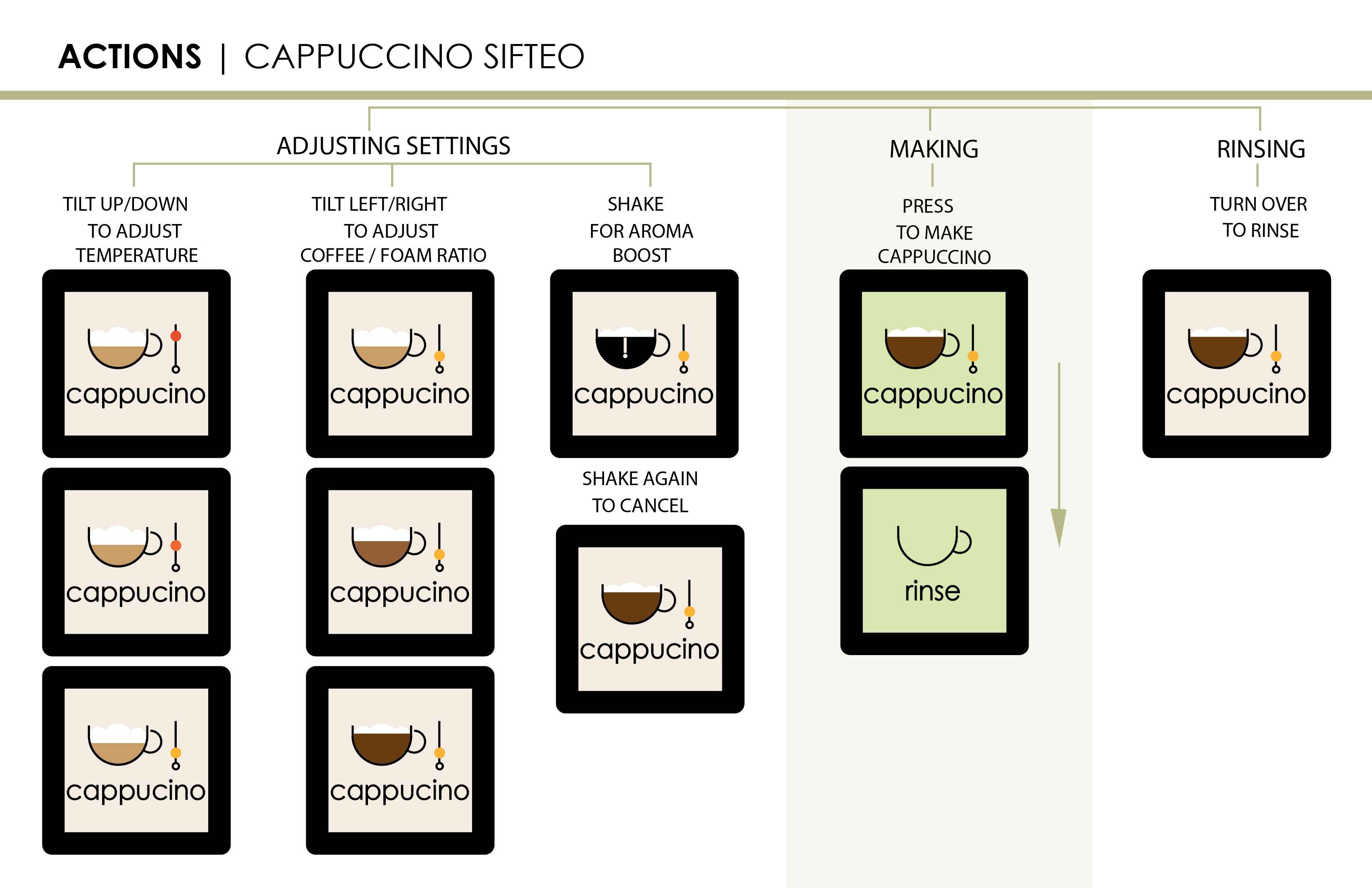
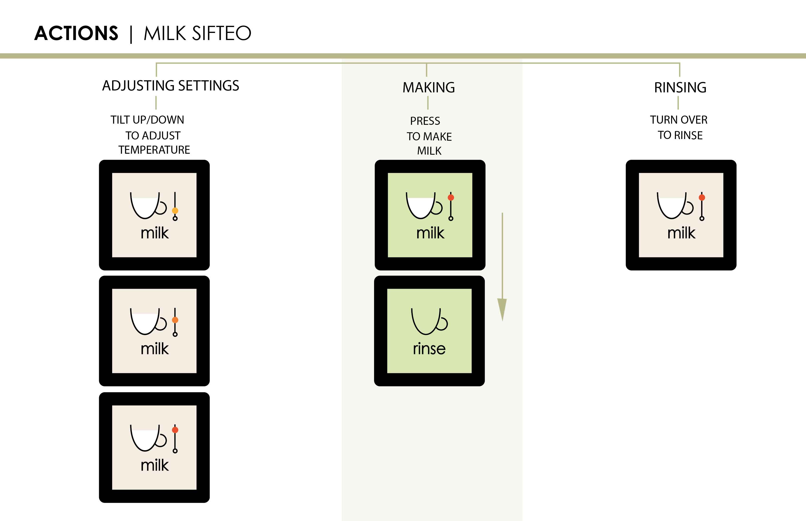
Little Sifteo Cubes control a household espresso machine using different gestures and a simple interface.

In collaboration with Sifteo, Sift’n Drink looks at a new way of controlling household appliances, specifically an espresso machine. Like all platforms Sifteo cubes have advantages like being portable and lending themselves to different gestures, but also some drawbacks because of the small size of the interface. Using the Sifteo development platform, I developed a prototype to demonstrate the UI and unique gesture controls.

In a nutshell, Sift’n Drink is a remote access system for a high-end espresso machine that is shared by a household.

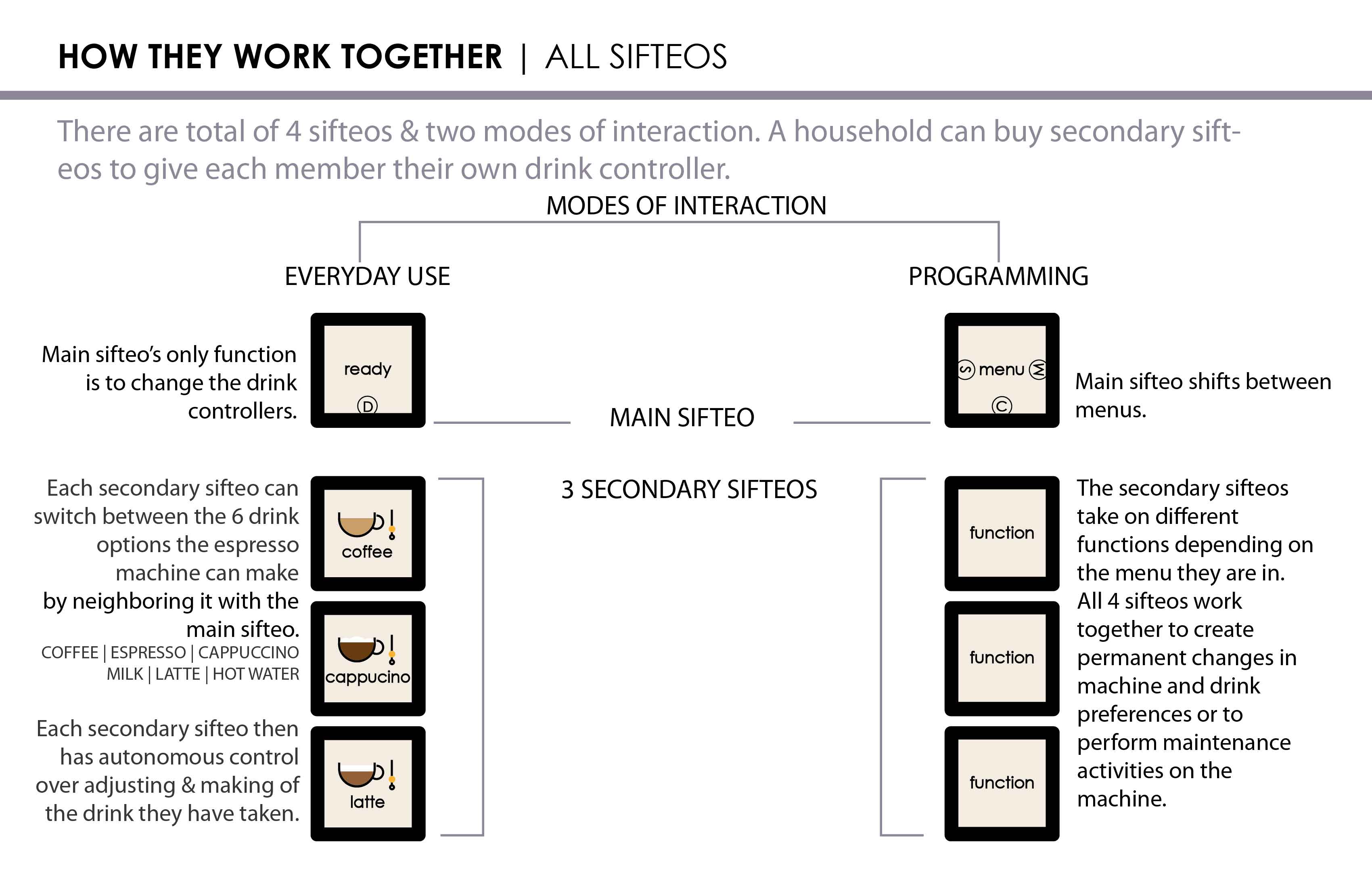
The idea behind the concept is that, in our everyday lives, we rarely need access to function or maintenance settings for these devices. What we want is to get our drink fast and just the way we like it. Sift’n Drink features 3 cubes dedicated to different drinks that can be customized simply with a variety of gestures for remote access to make a drink. It aims to create a quick and simple interface to control the parts of the espresso machine we need everyday, get feedback about the status of our drink and not worry about all the buttons and settings in the rush of hectic schedules.

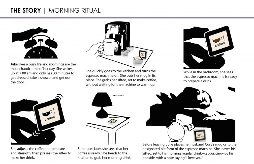
Sift'n Drink Storyboard


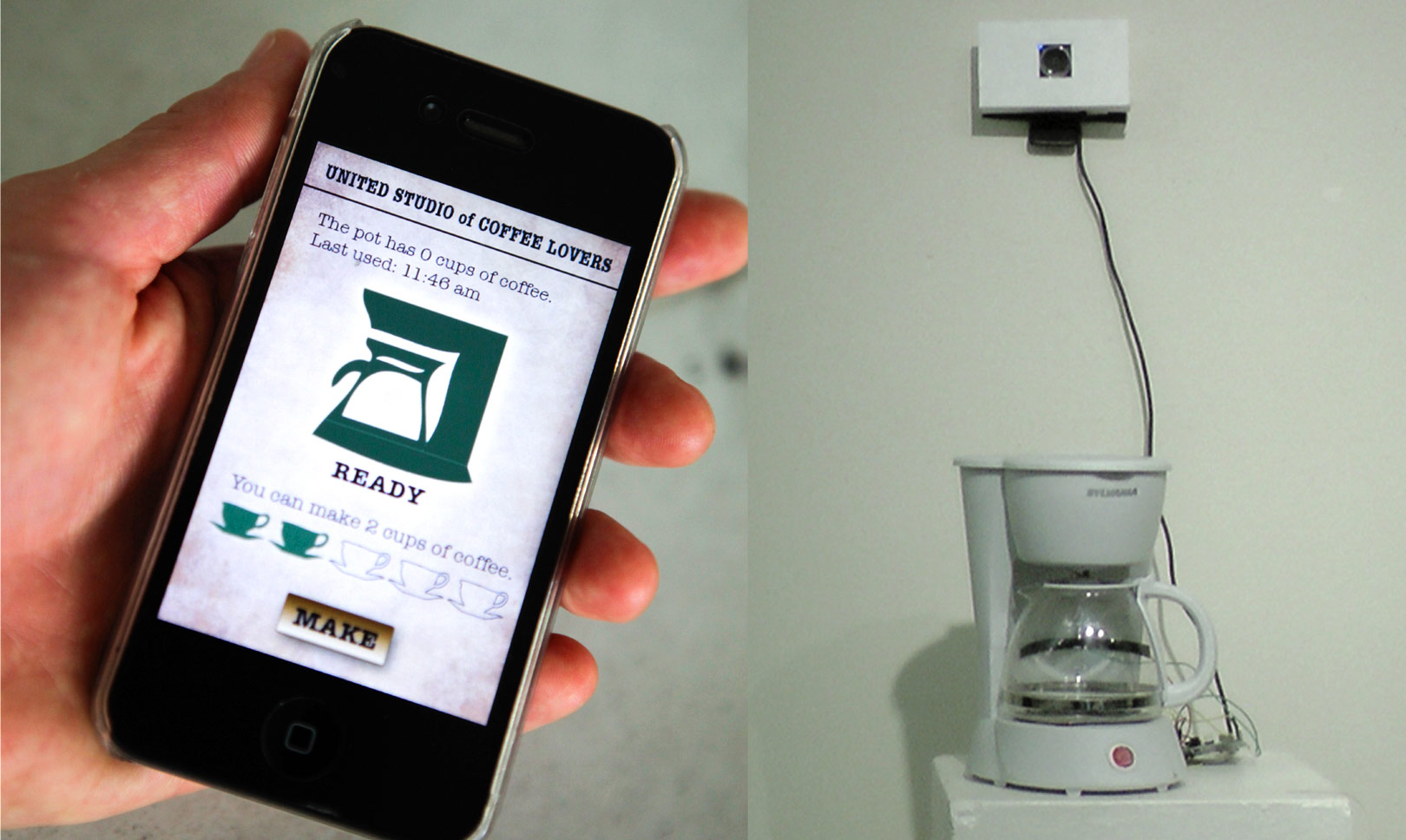
Coffee Share Prototype Setup

Coffee Share

By Tinkering

Looking at novel ways of controlling appliances, I designed a whimsical and efficient system for people to share a coffee maker in communal spaces.

INSPIRATION

Whether it is cramming for an exam or working on a project with a deadline, we spend hours in communal spaces like dorms, studios or workplaces. We consume enormous amounts of coffee to keep us going, but it can be a hassle to interrupt our workflow to get it. It makes sense to use current technologies to access these appliances remotely. However, when the appliance is shared by a community of people, there are new problems that arise from that context.

THE PROBLEMS WITH SHARING

With any remote controlled system, there is always a problem about the readiness of the machine.

  • Is the coffee maker ready to produce a drink at the moment?
  • Does it have water?
  • Are the coffee beans in place?

In situations where a multiple number of people are using the same machine, these concerns are exacerbated. I wanted to try and solve those problems using the powers of emotional and whimsical design. 


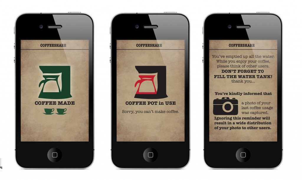
Coffee Share Application Screenshots

BRANDING AND UX DESIGN

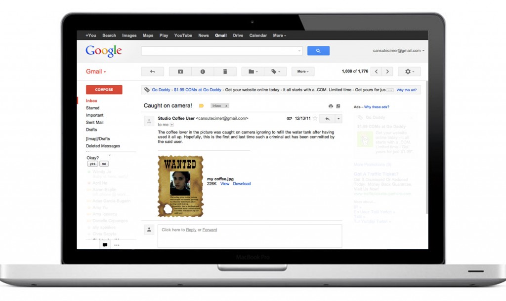
Coffee Share Email‘CoffeeShare’ is a system where a communal coffee maker can be accessed through a smartphone, tablet or computer and controlled remotely.
To deal with the issues that arise from this shared usage, the brand “CoffeeShare” was created to encourage communal behaviors. The look and feel of the UI and the design language support the concepts of sharing, community and nostalgia.

The whole experience is also designed to keep the people conscious of everyone else using the same appliance. With a little bit of whimsy and scare tactics, CoffeeShare aims to keep the users on their toes about leaving the machine ready for others to use. A face detection system triggers the webcam to take photo of the last person who uses the appliance, and kindly warns them to leave a mug for the next person, fill the water tank if it is empty and put coffee beans for the next person who will want to access it. If they don’t comply, the photo is featured in a ‘wanted poster’ and sent to everyone registered to use that particular machine.


THE PROTOTYPE

Coffee Share Prototype


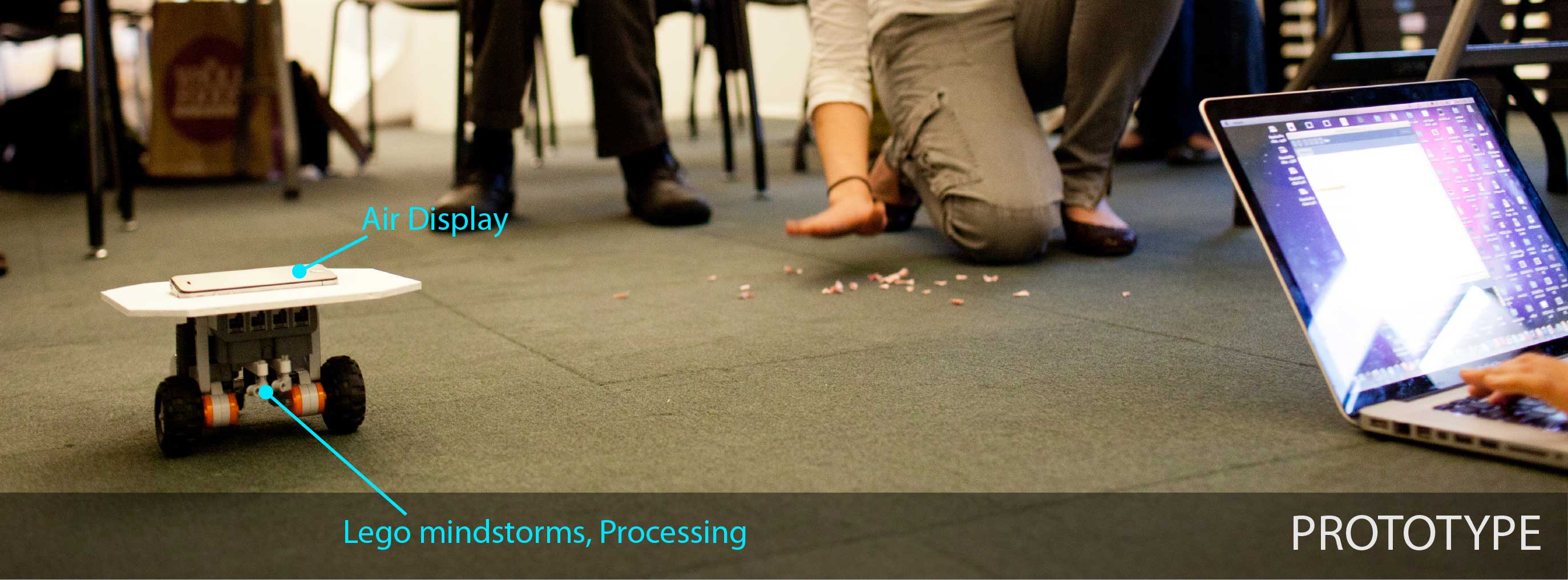
In order to gage the reactions from others, I built a prototype using a remote control to switch the coffeemaker on/off controlled by Processing & Arduino, and a webcam to detect when a person was present, take their picture & send an email. The user interacted with the appliance through an iPhone which was also controlled by Processing and airDisplay.

The general feedback I got from the users  was positive and many people stated that the user experience gave enough incentive without being off-putting.


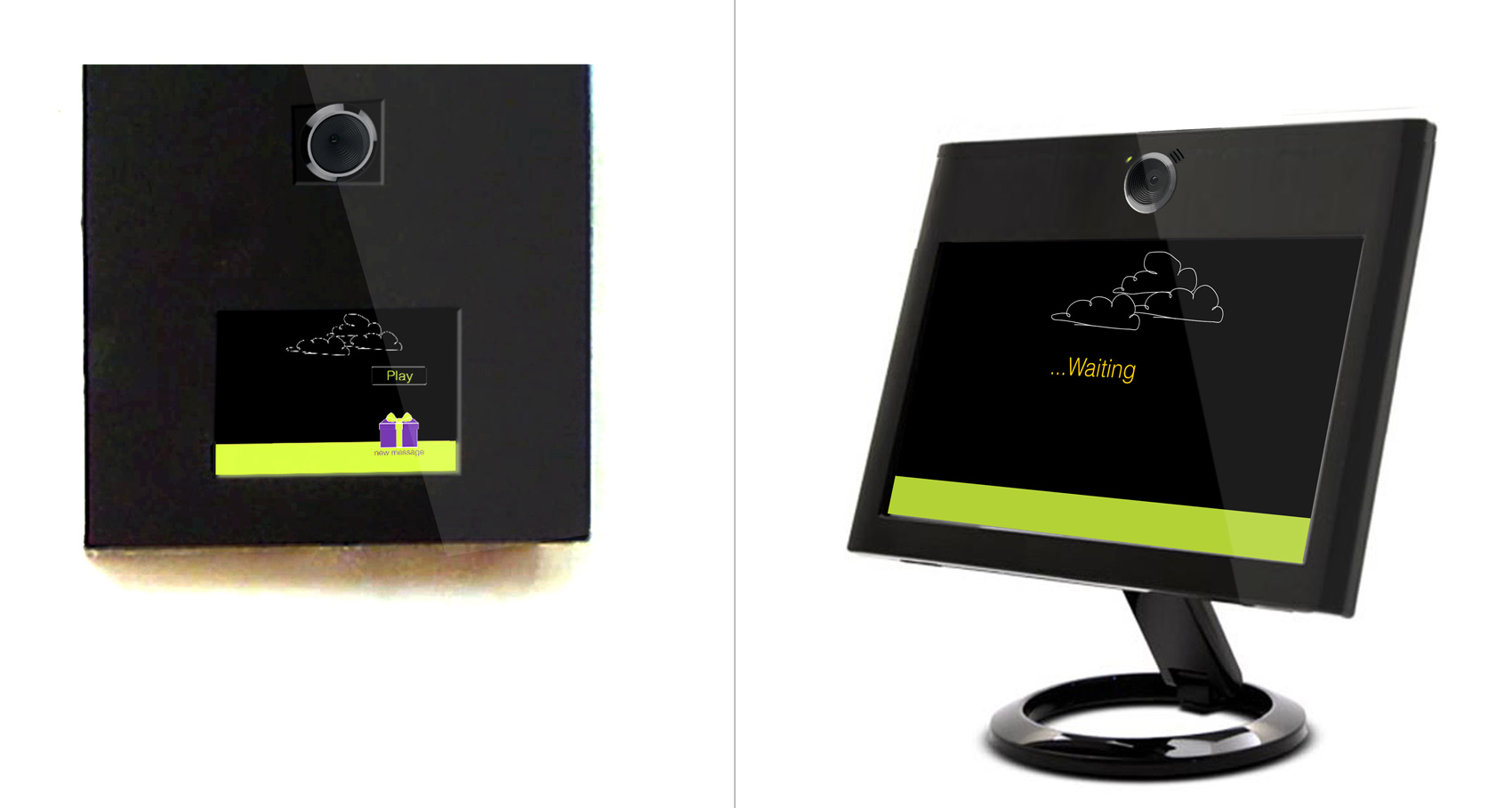
VIDBITS devices UI 1

VIDBITS

By Tinkering

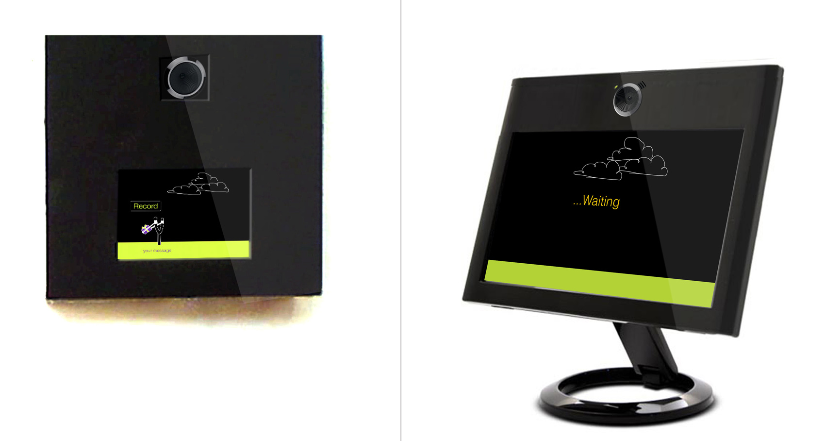
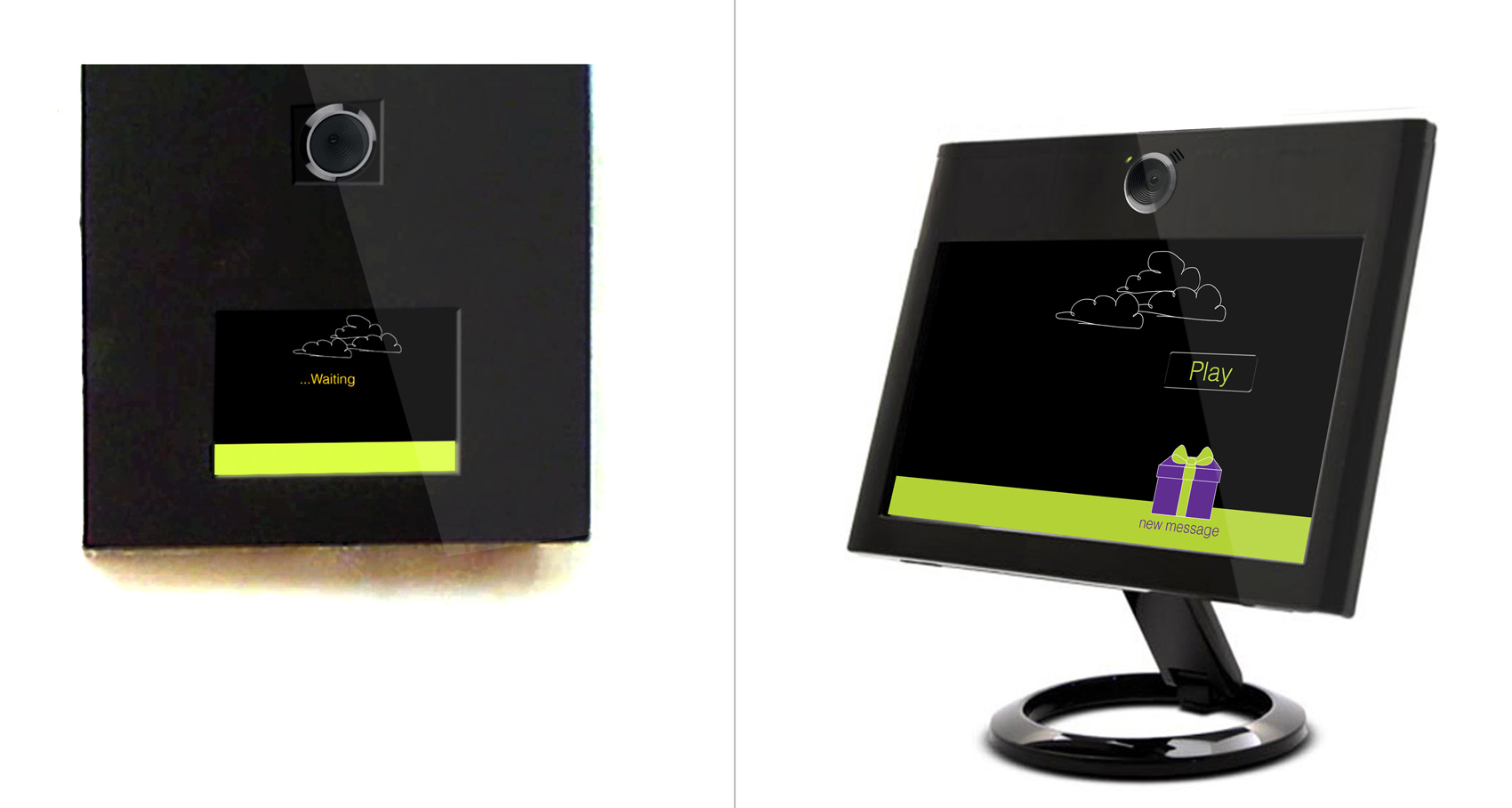
To maintain the bonds between geographically dispersed family members, we designed a new communication system that delivers presence and personality like a skype call, but is as fast, easy and flexible as a text message.

The aim of this project was to design an intervention in the context of family rituals. Living in the Bay Area, we noticed the abundance of people who have relocated from all over the world to pursue their dreams, just like us. And, even though we all have different levels of connection with our hometowns, all of us have a need to maintain strong emotional bonds with our loved ones.

The problem is, with our hectic daily lives and the time differences between the cities, scheduling or committing to a long conversation through phone calls and Skype can be demanding, even stressful. Email and text messages can feel impersonal and insufficient. A simpler method of keeping the bond strong between families is missing.

VIDBITS aims to create a new ritual through casual, quick and personal video messaging.

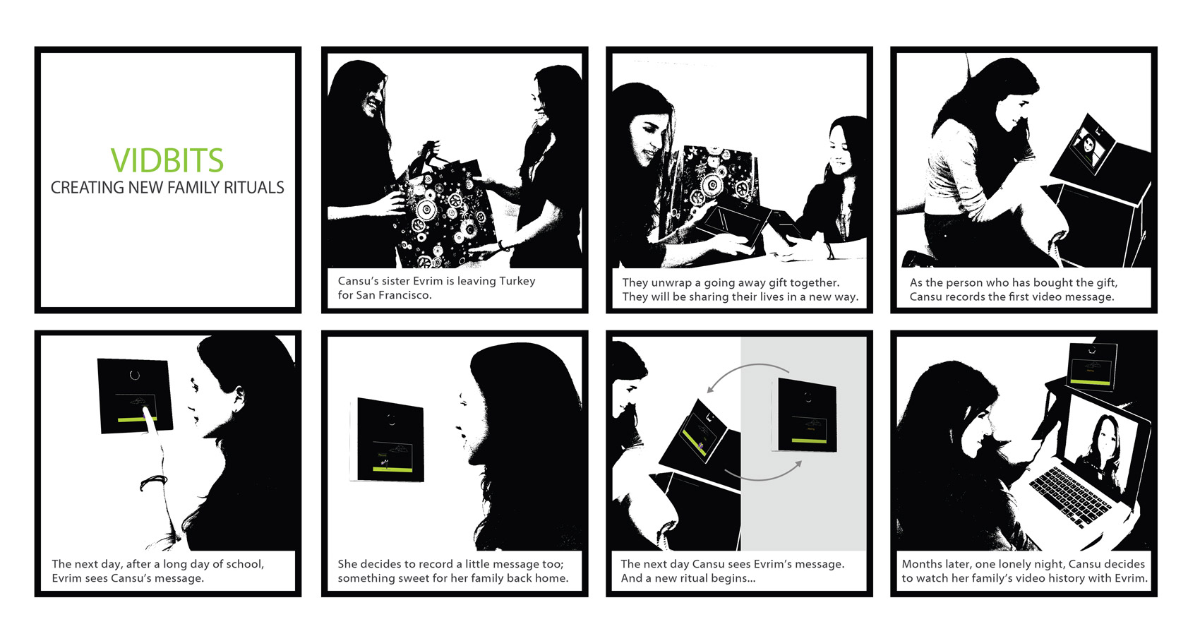
The ritual begins with one family member’s purchase of a set of paired devices, one for the departing member and one for the ones left behind. The initiator uses the device to record the first video message, and sends it to the second user’s device abroad. That user will be prompted to play the short message, and then record a response message. Once the second message is sent, a cycle is complete, and the message ritual continues back and forth. One can’t record and send a message without receiving a response first. And, all the sent videos are compiled in a database that can be accessed through the web.

VIDBITS storyboard

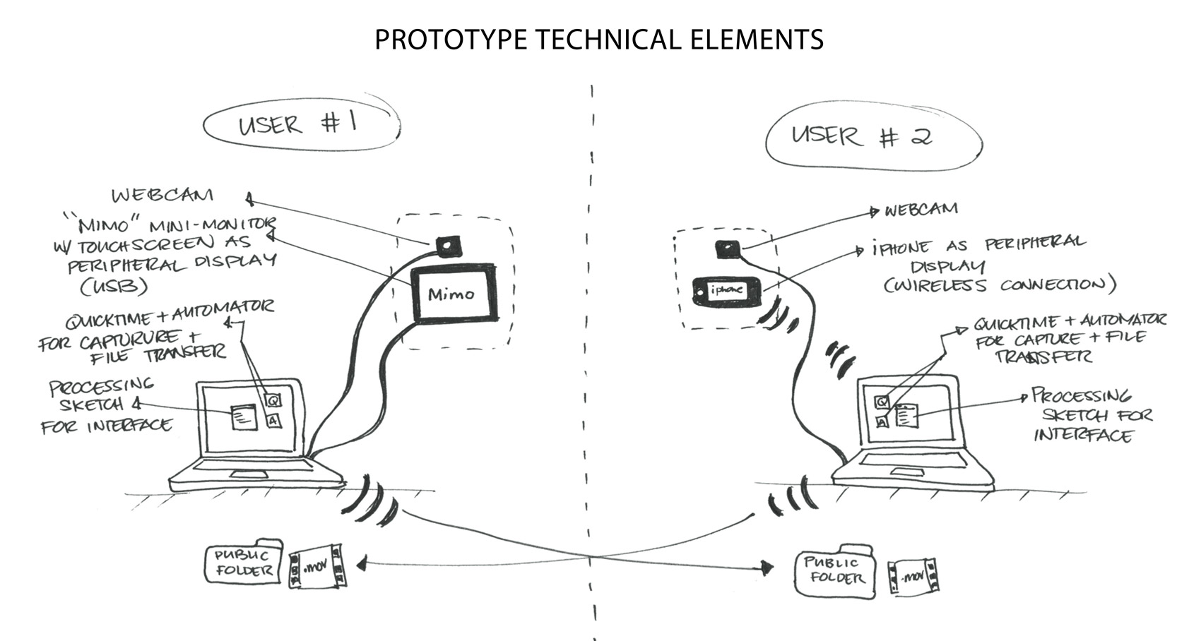
We created a working prototype using Processing as a programming tool. You can check it out in this video:

VIDBITS Prototype Technical Elements

When designing VIDBITS, we focused on three key elements: Video length, the interface and the form of the devices.

The recording time for the videos is 15 seconds. This is just enough time to wish someone luck on a test, say you have gotten home from a trip safely, or simply wave and smile. We felt that the short length would highlight the ease of participation in the ritual, and keep the feel of the interaction very separate from a skype call.

The interface is simple and intuitive enough for a grandparent or a 5 year old to use. On either end of the pairing, these devices might be shared by a group of people, or used by one. The intent to connect two households influenced the screen interface’s controls and visual style.

The paired devices are meant to live inside the home, and not be carried around – like a mobile phone or a tablet. We wanted the user to not stress over being connected to it all day and discover a new message when they pass by it. The user should feel free to delay recording a response.

Project Team: Cansu Tecimer & Danielle Cojuangco