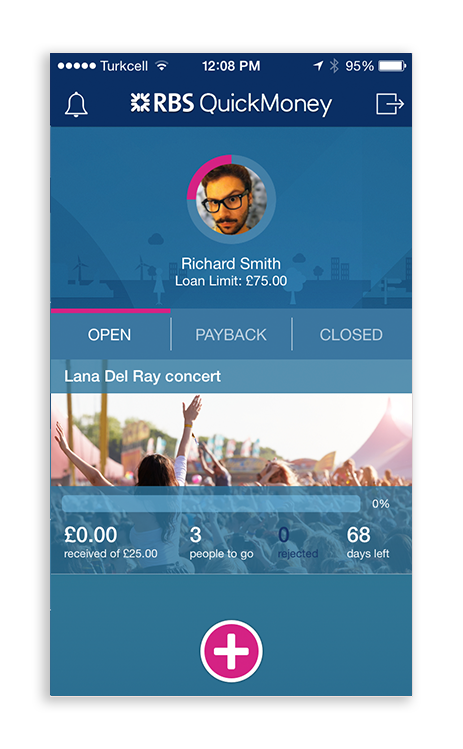
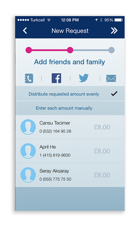
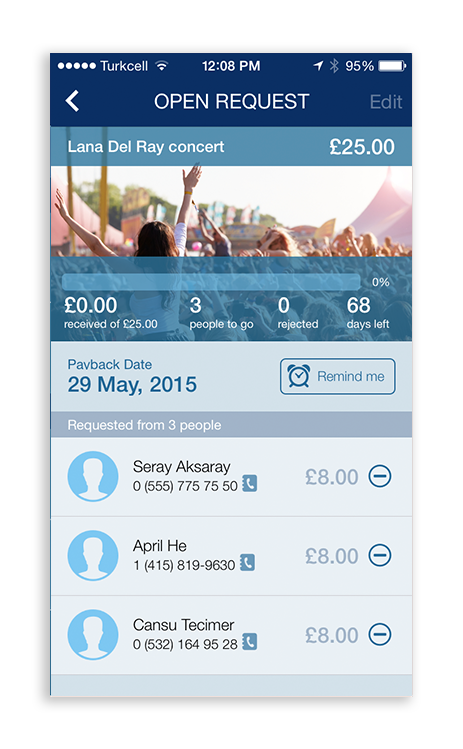
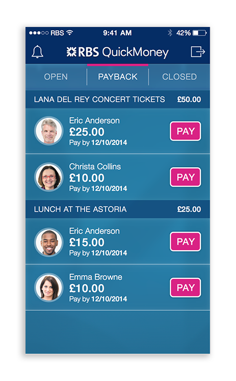
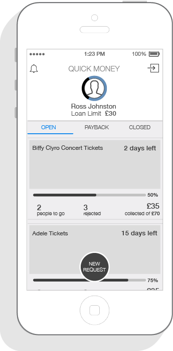
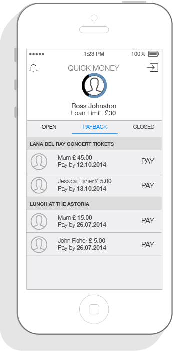
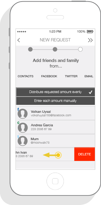
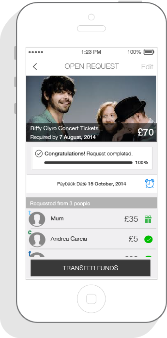
Our client, RBS spotted an opportunity in the UK market to increase engagement with their brand among young student population. According to their research, this target group frequently loaned money from their network of friends or family and paid them back whenever they had money. As the design team, we created an experience around this already existing behavior, where young students could “crowd fund” their needs and easily pay people back later on. What we delivered was an iOS app aimed at students and a responsive web payment page for the lenders.
Skills
Concept Design, Interaction Design
Year
2015
Design Team
Cansu Tecimer, Volkan Uysal, Arda Erdogan
How might we enable engagement in a “loaning” platform aimed at young students and their network?
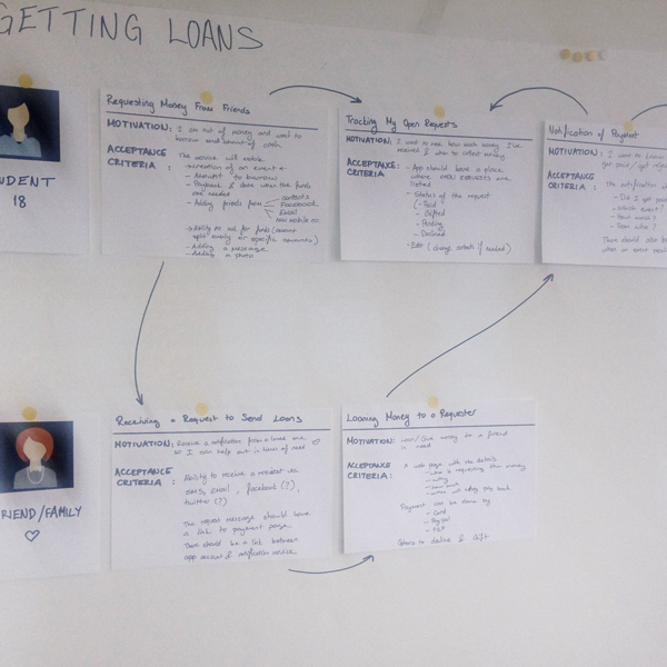
To create engagement in our service, we first needed to understand the motivations of our target users. We mapped out the entire journey around the two user personas we catered to:
- Students with financial needs would use the service to ask for loans
- Their friends/family would become the lenders
Looking into the user stories, we determined:
- Motivation of the user
- Features in the service to fulfil defined motivations
Understanding of the motivations helped us gear the app around “crowd funding” special events for students, as this would create an emotional reason for their social network to loan them money. We also understood an app would not be used for small loaning events, and they would most likely be larger sum loans that happen infrequently.
Designing the app
User stories to sketches
Having done the initial user stories, we had a rough idea about the information hierarchy and the most important features. Sketching allowed us to get many ideas on paper quickly. Sketching with a pair designer and doing a voting session with the whole team, enabled us to build ideas together. In half a day, the app architecture and navigation system was figured out for the iOS app.
Sketches to wireframes
Sketching done, main ideas agreed upon.. We designed detailed screen flows and screen architecture for each of the 9 user stories we had created earlier, such as requesting money from friends, tracking open requests, getting reminders to pay back the loans.
.
.
Branding and UI
Our visual designer turned the detailed wireframes into brand aligned screens as we continued working together.
